


As part of my data school training this week, I have learned how to use dates in tableau to find valuable insights. I will take you through how calculate the differences between dates for use in visualisations and calculations. This can be useful for displaying data over time, comparing different time periods, or analysing trends and patterns.
I will use a dataset on a Superstore, including dates for when each product was ordered and when it has been shipped. I will create a new calculated field showing the time it takes for each product to be shipped, in other words, the difference between order and ship date. I will then create a bar chart visualising these insights.
To create a ship time calculated field, first you want to connect Tableau to a data scource that contains the dates you want to use. This could be a data file, a database, or a web-based data source.
1. Create a calculated field.
Once the data source is connected, you can create a calculated field to define
the range of dates. To do this, click on the "Analysis" menu and select "Create
Calculated Field".
2. Enter a name for the calculated field and define the range of dates. In the calculated field editor, give the calculated field a name and specify the range of dates using the appropriate functions and operators.
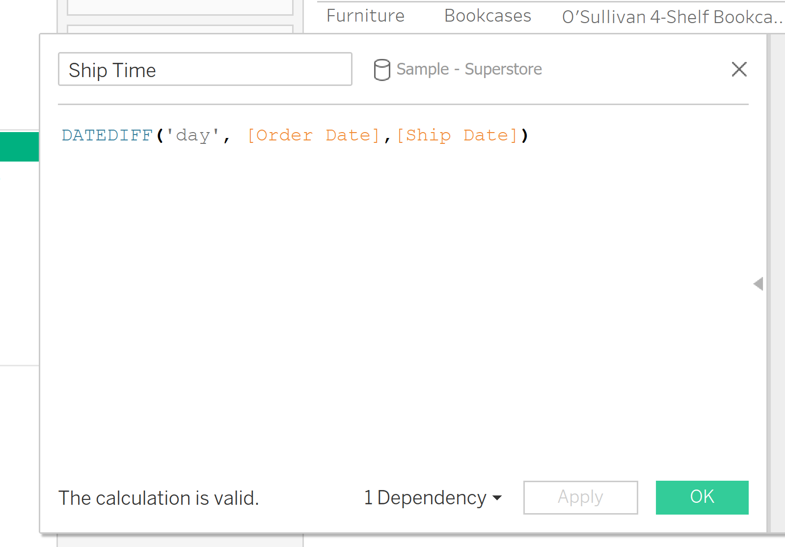
For example for my calculated field, using the Superstore data source, I will name my calculated field ‘Ship Time’. I will then use the DATEDIFF() function. I found this function by searching in the search panel to the right.
This function returns the difference between two dates where start_date is subtracted from end_date.

For this function you also need to specify the date part. This is the unit of date you want the function to read. For example do you want a range of days, months, years etc?
For this calculation, I want to find the number of days it took, so I am going to put ‘day’ as the date_part. Be careful here, it tableau is very specific and will only accept singular words: so day not days, month not months.
Your calculation should look like this:
3. Add the calculated field to the visualization. Once the calculated field is created, you can add it to the visualization by dragging it from the "Data" pane and dropping it onto the appropriate shelf or axis.
4. For my example, I show the number of days each product takes to Ship. To visualise this, I will drag the ‘Ship time’ field to the rows shelf, and order ID to my column. This will produce this bar chart:
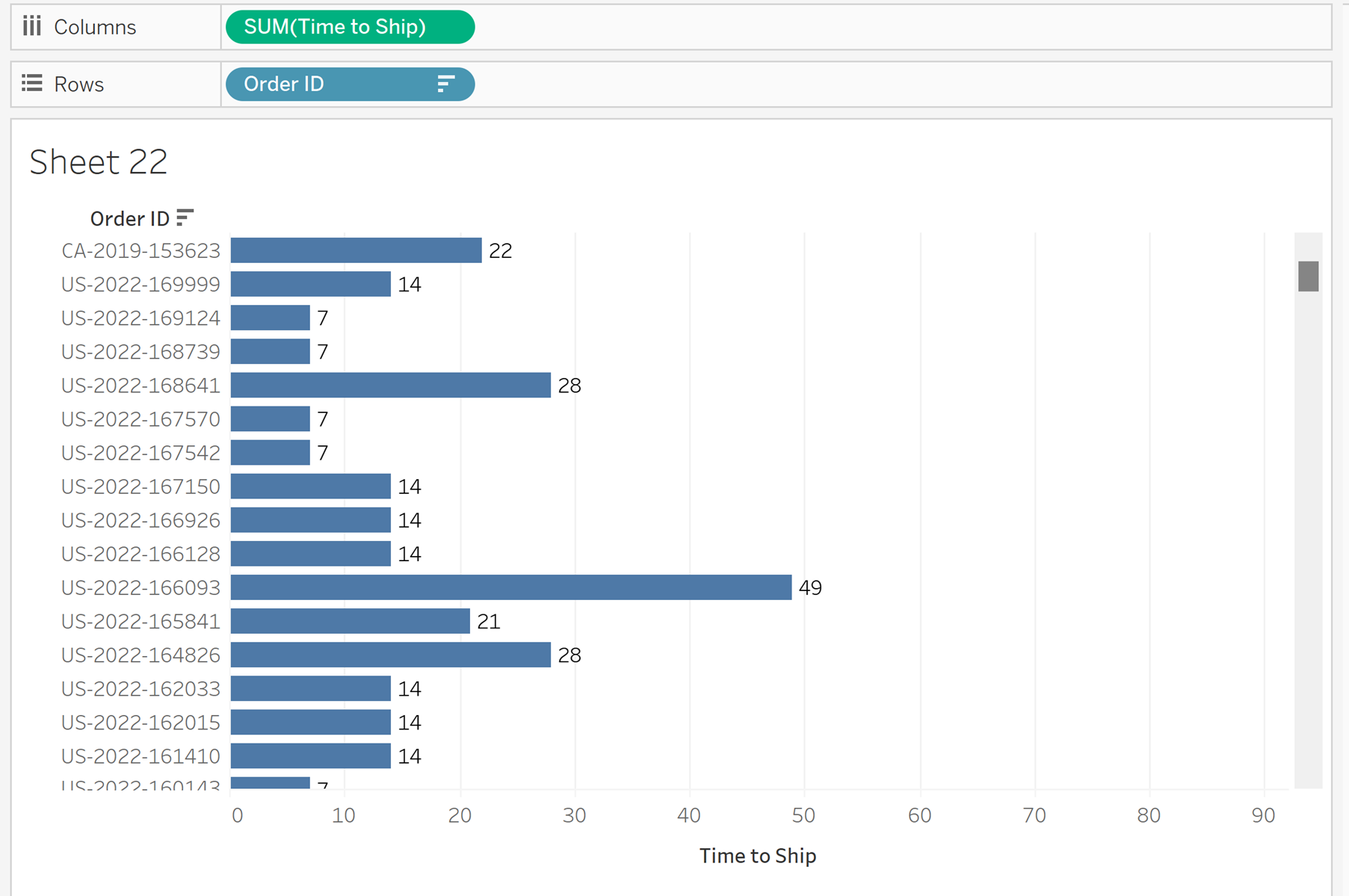
However this is not our final product. One thing to notice with my data set is that there are multiple products in each order. Looking at the ‘time to ship’ calculated field, you can see tableau has automatically summed all the time it has taken to ship for all the products.
For example, if an order has 5 products, each taking 3 days to ship, tableau has calculate the time to ship as 15 days, when actually it has only taken 3 days for all the products in this order to be shipped.
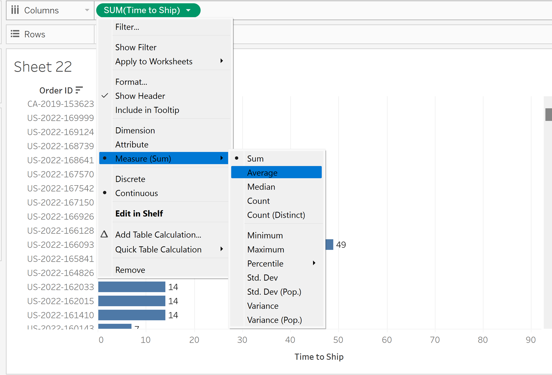
To fix this, right click on the Ship Time calculated field and select ‘measure’. From there it should open another drop down. You want to select average here. This corrects the problem, and allows us to find the average Ship time for each order, accounting for multiple products in each order.
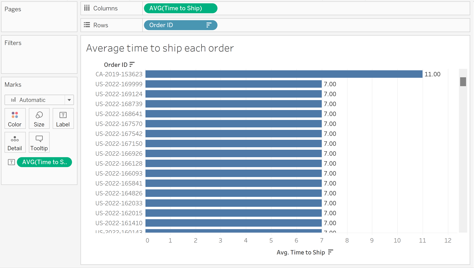
Your final product should look like this, after clicking above the bar chart to sort the results, and adding labels to each bar:
I found this a very useful tool when working with dates in tableau, and I hope you found it useful too!