


I have reached the end of week 2 at the data school and I was set the challenge of improving my initial application.
I chose to remake my first visualisation, in which I looked into presidential candidate’s spending in the 2016 election. I wanted to use what I had learnt this week to improve upon it.
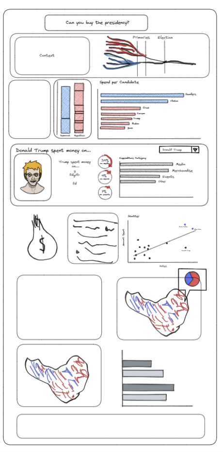
The first thing I wanted to mention was the value of planning. This entails sketching, scribbling and maybe even using excalidraw (which was new to me) to get a good initial idea of what you want your final product to look like.
Of course the original plan is bound to change, but it is worth working through iterations on pen and paper before committing them to tableau. This time round I drew a sketch of what I wanted my updated visualisation to look like. It is worth saying, it didn’t look like this in the end either!
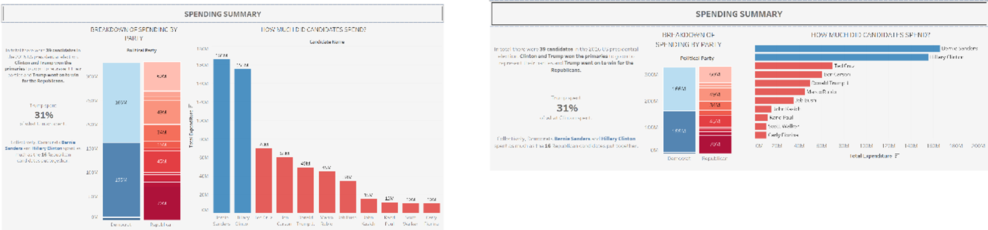
In my first section I received feedback concerning my bar chart. I was told it is better to have bar charts going horizontally and not vertically. I acted upon this, and changed the rotation. I also changed the labels on the bars from the amount spent to the names of the candidates so that I could remove the axis labels and make it look a bit nicer.
Before: After:
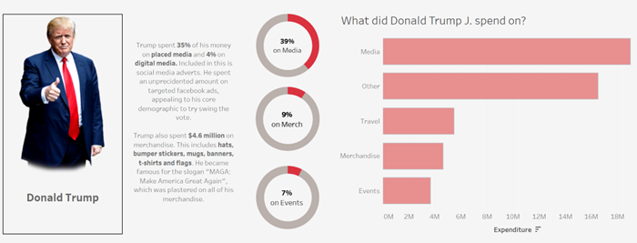
The second thing I looked at was what candidates spent their money on. For this section I had trouble altering what I had. This was because of how I had originally cleaned the data. I have learned a considerable amount since being with the data school that has helped me with this (lengthy) part of the process.
My original visualisation for this section looked like this:
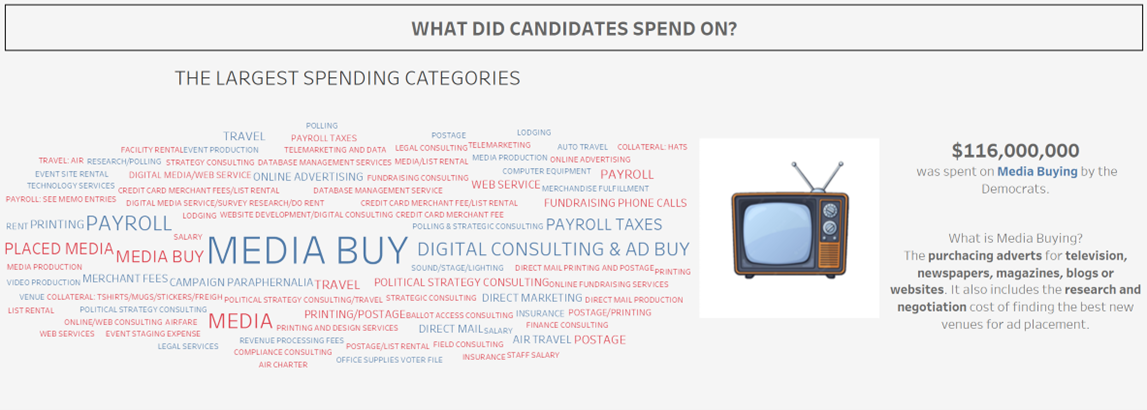
I wanted to explore the different spending categories my data had given me, and before looking at the data, thought this would be relatively simple. How many categories could there really be? In reality, it was a huge issue, as the data was inputted manually from each individual candidate every time they spent something meaning there were huge differences in names of categories, spelling mistakes and a considerable amount of data.
If I had more time to redesign my visualisation I would definitely make use of the cleaning tools now available to me. I would use Alteryx or Tableau prep to sort the categories column. For example, Tableau prep has a filter to correct for spelling errors! From there I would have made use of a graph that fully shows the distribution of the different categories for the candidates. Because my original data was so messy, my calculated fields weren’t dynamic at all. For my redo, I wanted to make the data more dynamic, creating various sets for each category, to then be filtered for each candidate.
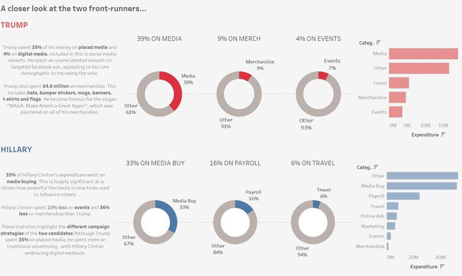
I created a filter that can be changed for each candidate. This is informative per candidate, however I didn’t want to lose the overall insights my original visualisation had. This is why I would have kept the word cloud, and text on the key differences I found between Trump and Clinton.
Lastly I looked at whether there was a correlation between spending and votes. I found Trump spent considerably less but obviously won the election, which was a very interesting insight. I used a scatter plot, but did not maximise the usage, so wanted to change that.
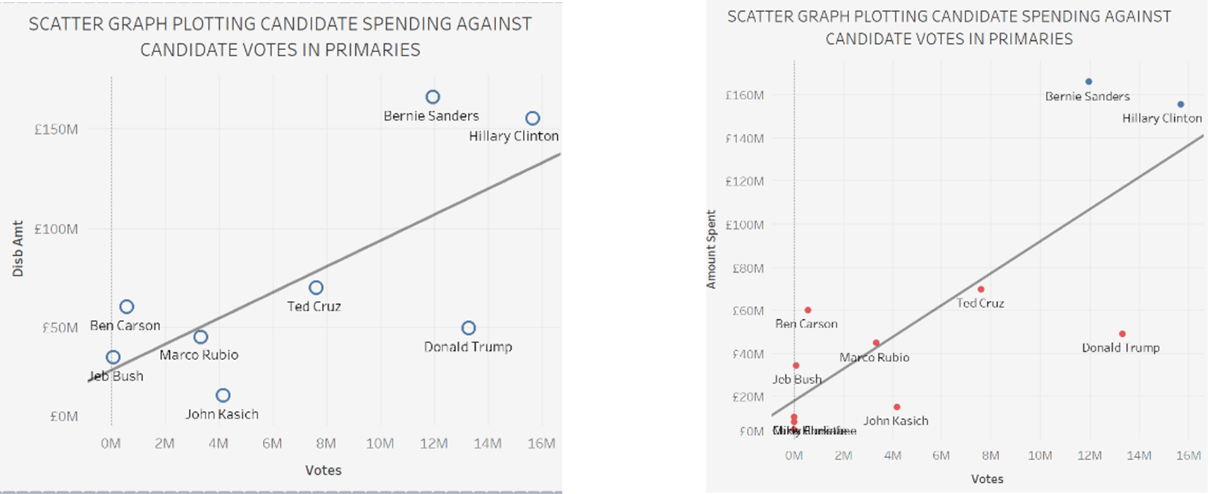
These may seem like minor formatting changes, but I think it made a larder overall impact into the look of my final visualisation. Changing the colour of the points and the names of the axes made it look slightly cleaner.
These are just a few things I would have done to improve on my visualisation. I found this week invaluable for looking at how I would have approached this task differently.