


Being part of the Data School and training for four months allows you to discover your strengths and weaknesses. Our cohort is half-way through our training and I have learnt that I have an affinity for logic problems. I recently found myself using tabcmd and learning to script. I had two hours to cover as much as I could and then present what I had picked up to the rest of the data school. If you had told me I would be able to do that two months ago I don’t know if I would have believed you.
I also discovered that I struggle with creative ways to present data. This didn’t come as a total shock to me. I said in my face-to-face interview that I thought my biggest challenge at the data school would be finding my style. I must admit though, I didn’t expect it to hurt quite as much as it does. The data school is a competitive environment in which you are surrounded by very talented people who excel at different aspects of the training. Our weekly Makeover Monday sessions as a cohort were leaving me feeling like an unimaginative robot going through the motions in a room full of data Picassos. Struggling with the creativity of the job is not an uncommon problem. Talking with some of the more seasoned Data Schoolers made me realise that, not only had other data schoolers been in a similar situation to me, but, it was possible to learn how to be more creative.
I asked Coach Carl for his help on the matter and he passed on some advice that Tom Brown had given him: Find five vizzes that you like and use their methods to inspire your work. To consolidate my learning, I decided to take a leaf out of Andy Kriebel’s book and, much like the early days of Makeover Monday, blog about the learning process. I will write about the thought process behind each Viz I make and critique it. I will also be uploading my vizzes to twitter and would greatly appreciate critical feedback from the data community.
The first viz that inspired me was the radial chart Antti Lipponen produced to visualise temperature anomalies arranged by country between 1900-2018. I thought the overall effect of this was super cool. Antti’s use of colour is really striking, I like the clarity of the date in the middle of the radial chart and I thought the moving sparkline provides context well. Rather than trying to recreate the whole chart I decided to focus simply on one component of the original and aimed to create my first radial chart. Antti made his chart using Python, however, as I am trying to develop my skills in Tableau, Robbin Vernooij pointed me towards a blog post by Ludovic Tavernier on creating radial charts also provided a Tableau Workbook of his that I could reverse engineer.
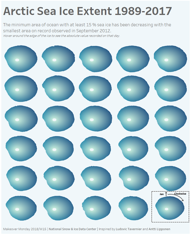
I won’t be going into details about how I made the chart as there are plenty of materials on radial charts online and I learnt how to do this myself from the blog post indicated above. Instead, I want to write about what I did and why. To keep the theme of the original viz that inspired me, I chose to use this radial chart with Arctic Sea ice extent data. I also hoped it would be data that would suit this chart type. I date range chosen from the data was simply the years that contained a data point for every single day of the year. The data set starts with years in which data was recorded every two days and this chart, as it is currently constructed wouldn’t have been suitable to compare these years with those that had data points for every single day of the year. I would have liked to incorporate animation in my chart as Antti did, however, I would have done this using the pages function and this doesn’t work on Tableau Server. As I was focusing only on the radial chart and wouldn’t be providing context with an additional chart, I decided making the viz into a trellis would provide the context. I coloured the chart blue to keep with the ice theme and made a little icon in paint to guide the user of the chart.
The outcome of my first attempt at making a graph that doesn’t look like a bar chart or line graph was pleasantly surprising. The process of learning a new chart type and the trig behind it was really fun. I think the viz itself looks cool, however, I do have to question if the radial chart is better than a traditional visualisation method for this data. I don’t necessarily feel that I improved upon the original viz made by the National Snow and Ice Data Centre and I may have fallen into the trap of style over substance. The size difference between the years isn’t immediately obvious and you have to study it a bit to see it. I tried to accentuate the loss of ice extent through the use of colour but I didn’t really achieve what I had in my mind’s eye.
Ideally, the icon on how to read the chart would be top left of the radial charts to obey the ‘z’ pattern rule. Due to the selection of dates chosen there was a gap in the trellis at the bottom right-hand corner and I couldn’t figure out a way to move this to the top left. Rather than have a gap at the bottom of the trellis, and the icon easy to see but out of line, I opted to slot the icon into the pre-existing gap.
I learnt a lot during this exercise and I’m really looking forward to my next attempt at creating a different kind of viz. I’ll blog about the process on here. If you are struggling to find your creative flair in data visualisation I would highly recommend finding a viz that inspires you and seeing how to can influence your work.
If you read this and have any thoughts on the viz, feel free to leave me a comment here or find me on twitter @kateepeace.
Photo by Nik MacMillan on Unsplash