


When you’re building dashboards in Tableau, sometimes you want to highlight something without hiding everything else on the screen. That’s where proportional brushing comes in. Instead of filtering out the rest of the data, it shows your selection in context so you can immediately see how one segment stacks up against the whole. It’s a simple way to make dashboards feel more dynamic and more informative with just a click.
In Tableau, we can do this by using Set Actions, which lets the dashboard update automatically based on what the user selects. In this walkthrough, we’ll use the Sample–Superstore data to build a clean, interactive proportional brushing effect that lets you compare Segment performance across Sub-categories on the fly.
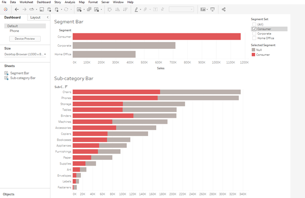
1. Build the Segment Bar Chart
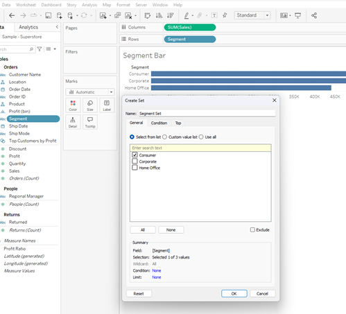
- Open a new sheet and create a simple bar chart using Segment.
- Create a set from the Segment pill. For now, check any item to add to the set.
2. Create a “Selected Segment” Indicator
1. Create a calculated field that returns the name of the segment that is in the set.
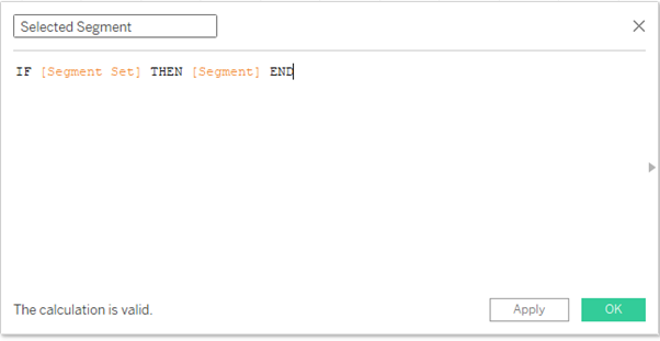
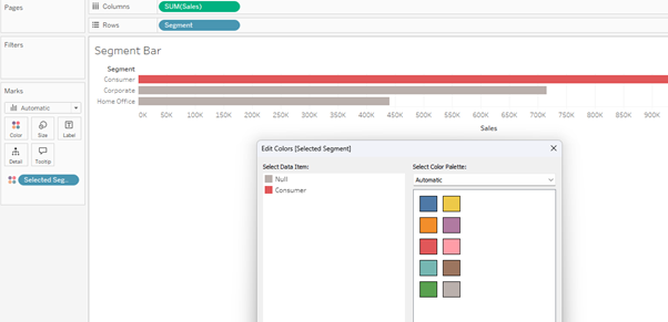
2. Drag this [Selected Segment] pill to the Colour mark and change the colours as desired.
3. Build the Sub-Category Bar Chart
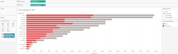
3. Open a new sheet and create a bar chart using Sub-category.
4. Drag the [Selected Segment] pill to the Colour mark.
5. Optional - You can also drag the [Segment Set] pill to the Details mark, and Show Set by right clicking on the pill. You can then see which segment in the set has been proportionally coloured.
4. Add Both Charts to a Dashboard
Create a new dashboard and pull both charts onto the canvas.
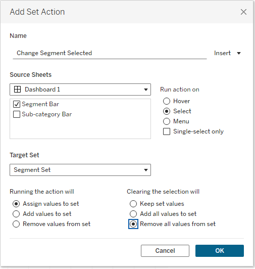
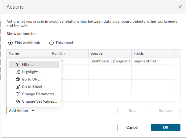
5. Create the Set Action
1. To dynamically change the segment selected in the set and show the proportion in the sub-category bar chart, create a dashboard action from the Dashboard menu and choose Change Set Values.
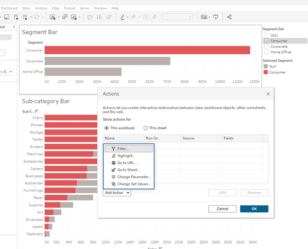
2. Select the Segment Bar chart as the source of the Set action.
3. Run on Select.
4. From the Target Set menu select the Segment set we’re working with from the Sample – Superstore dataset.
5. Choose what the action will do and what clearing the selection will do. In our case we want to Assign values to set when running the action, and Remove all values from set when cleared.
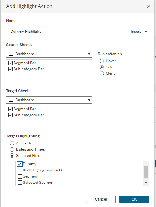
6. Add a Dummy Highlighter (Optional)
One nice addition to these vizzes is to add a dummy highlighter that will keep non-selected items highlighted and not greyed out.
1. Go back into the sheets and create a new field.
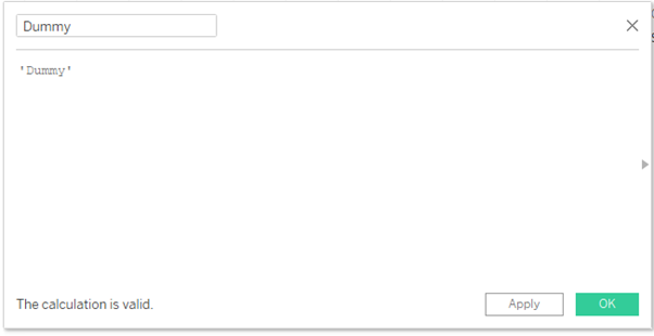
2. Drag this pill to the Detail mark on both Segment and Sub-category charts.
3. Go back to the dashboard and set up a new dashboard highlight action using the Dummy field.
And voila!
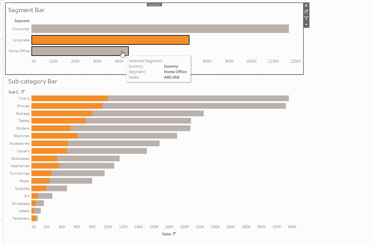
We've built a dynamic dashboard that changes the Segment set value when you select a bar in the Segment Chart, which adjusts the Sub-category Chart to show the proportion of Segment sales in the sub-categories.
It’s a clean, intuitive way to help users explore contribution without ever filtering away the rest of the data.