


This week we were introduced to PowerBI and some of the features it hosts. This experience has shown a few pro's that make the software stand out - mainly the buttons.
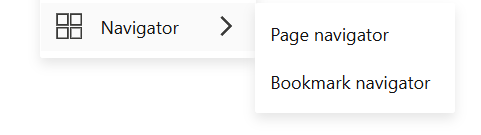
Navigator: This useful button option produces a list of buttons (that can be customised and formatted as you wish) to help the user navigate through the PBI report. This is an easy way to create convenient, presentable ways to alter visualisations and change pages effortlessly.
Bookmarks: Following from the previous example, bookmarks allow you to create a saved format of the page you've made in order to easily allow the user to view different things whether its a different order of sorting or a different visual entirely.
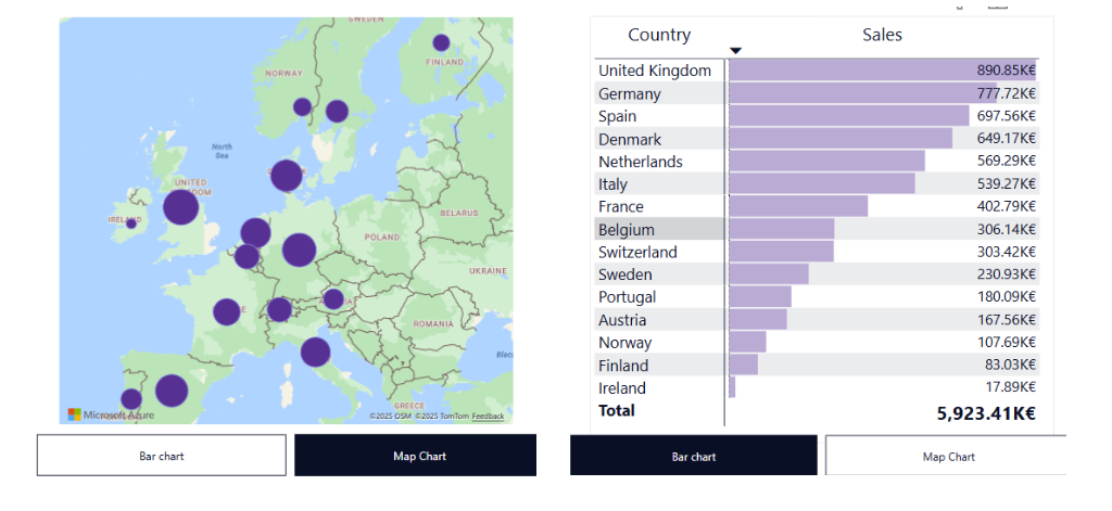
Above are the results from picking different options from the bookmark navigator, where the choice changes the charts being shown.
Slicers: These are essentially filters formatted as buttons that allow easy changing of datasets in the page.
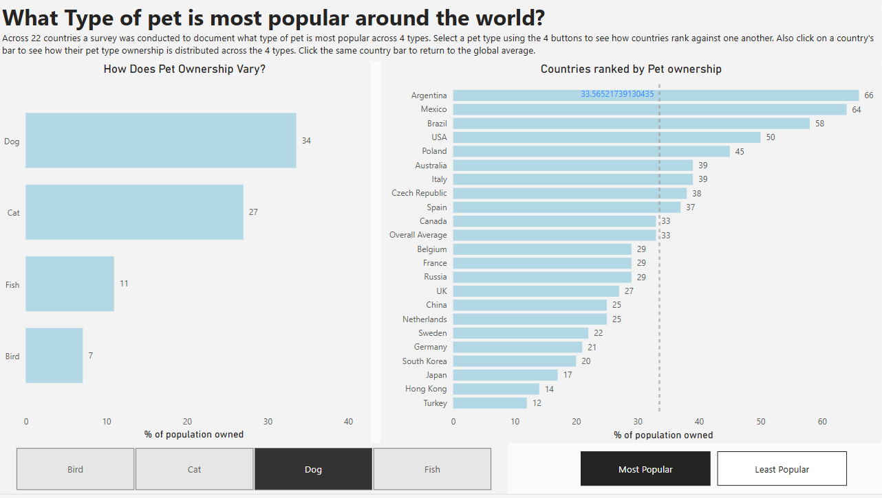
This provides a professional looking way of filtering through the visualisations as opposed to having a filter pane on the side to manually click through.
Various: There are several generic buttons available for formatting actions to in order to achieve professional interactive ways to either navigate through a report or find out more.
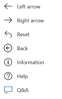
These buttons can be formatted to travel through report pages, returning to a home page/resetting filters or providing additional information for the user.
Overall the buttons available in PowerBI are easy to use, format and follow an intuitive process to set up. Add buttons to your visualisation to elevate your reports/dashboards!