


For this day of Dashboard week, we decided to have more of a refresher/new lesson on how to best communicate with data. We talked about different topics throughout the lesson. Such topics like:
- The differences in exploratory and explanatory questions
- How to identify the Audience as well the difference between said Audience and Stakeholder
- How do we assess the data
- How can we make meaning with data (7 different meanings)
- Few of the most commonly used charts
Going down the list, we will first go through the differences in exploratory and explanatory questions. Some aspects for exploratory questions are; Understanding the underlying data and EDA (Exploratory Data Analysis). The main point in understanding about the underlying data is making sure that the person analyzing the data takes their own interpretation of the data and seeing if they relate to what the stakeholder wants. Say for example, If the stakeholder wants to find the profit ratio for a specific inventory item, we need to make sure that we have both a sales field and a profits field. This relates to the second part of this topic, the explanatory questions. If the data does not contain the required fields, we now need to interpret this through questions, what is the data trying to show now, and how would we need to bring this information to the stakeholder who might not be as familiar with the data. We also want to be able to answer other questions with the data, “what’s going on?”, “why is the data laid like this”, etc.
The next topic we discussed is how to identify the audience as well as differentiate between said audience and the stakeholder. First question, who is the audience? The audience is actually NOT the stakeholder, the audience is actually the people who will be using the data alongside you. Also, any dashboards you create using the data are going to be read by people that understand the data. Rarely will stakeholders be able to understand your dashboards. The audience will be able to properly give feedback to you, as well as use your work. Stakeholders are people that initiated the task and gathered the data from another source. That doesn’t go to say that all stakeholders are like this. Stakeholders can also be just as data literate as you so they can be both stakeholders and the audience. Knowing how to differentiate between stakeholders and audiences can help guide on how you will create your dashboard.
Next topic is, we have the data, now we need to properly assess the data. We broke this down to 6 different questions we need to answer first to properly assess the data.
- What does 1 row of data represent?
- What does each column mean, and how much information does each individual row have.
- Where did the data come from?
- Who gave you the data? If the stakeholder found it somewhere else, who is that person/database and can you communicate/access?
- How much do people trust it?
- If people within the company use different data from the one you were given, why is that? Should you yourself trust the data?
- What's missing in the data?
- Are there any missing fields that are needed to answer some questions given from the stakeholder?
- What are the limits?
- Is the data dirty? (lots of nulls, blanks, errors), Old?
- What questions can you comfortably answer?
- If you were to answer 10 questions using the data, which of those 10 can you confidently answer.
Going forward to the next topic, How can we make meanings with the data? Again we broke this down to 7 different meanings.
- Making Comparisons
- Compare fields with each other
- Seeing Trends
- What trends can we identify with fields (change over time)
- Spot Patterns
- What patterns can we see in the data?
- Spot exceptions and outliers
- Are there any unusual occurrences in the data (Large sudden increases)
- Understand causal relationships
- Are some fields related to each other
- Explain Past
- Can the data show a company’s history and past works
- Anticipate the future
- Does a trend help assume the immediate future?
Having the data broken up to these different meanings can help determine what types of charts we can create with what we have.
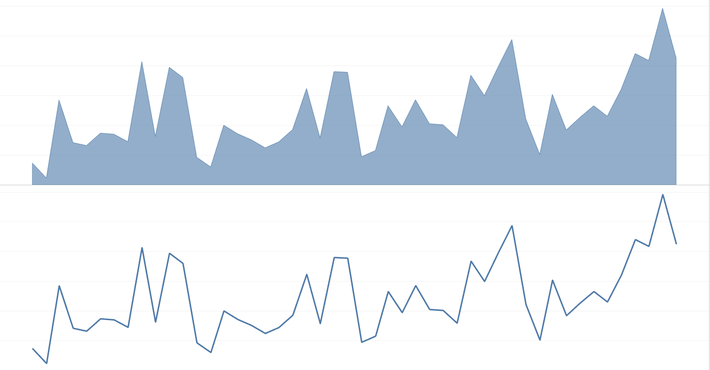
Now that we talked a little about how to read and interpret data, now we can learn about some charts that are most commonly used. There are at least 100 different main chart types, but there are only a few that are commonly used almost always. For example, An area chart, if you look closely, is actually a stacked line chart.
Other examples of bar charts are;
- Dot Plot
- Paired Bars
- Stacked Barcharts
- Histograms
- Vertical Bar
There are also different types of line charts too!
- Stepped Line
- Area Chart
- Slope Chart
- Bump Chart
- Cycle Plots
- Parallel Coordinates
Data communication and chart comparisons are important for us aspiring data consultants. Having a more general understanding with this topic is still useful for all.