Today, for Dashboard Week - Day 2, I had the task to create an accessible dashboard for individuals who have dyslexia and/or dyscalculia.
What Are Dyslexia and Dyscalculia?
- Dyslexia affects how people process written language - they might read more slowly, struggle with decoding unfamiliar words, or find it harder to focus on blocks of text.
- Dyscalculia is like the mathematical sibling of dyslexia - it affects number sense, calculation, and how people interpret numerical relationships, patterns, and even things like left vs. right or sequencing.
These conditions aren’t rare. Around 1 in 10 people have some form of dyslexia. Dyscalculia is estimated to affect about 5-7% of the population. So odds are, your dashboard is being used by someone who has one of these — and you might not even know it.
How Dyslexia and Dyscalculia Show Up in Dashboard Use
Here’s how it might feel for someone navigating a dashboard with one of these conditions:
For someone with dyslexia:
- Text-heavy dashboards become overwhelming - especially when labels are long or bunched together.
- Similar-looking words (like “net” vs. “next”) may be easily confused.
- Fonts and background contrast may make reading tiring or difficult.
- Instructions or filter labels might be skipped because they’re hard to decipher quickly.
For someone with dyscalculia:
- Interpreting raw numbers is mentally draining - especially when charts are overloaded with metrics.
- Relative sizes in bar or pie charts might be misleading or hard to process.
- Anything requiring quick comparisons (e.g. KPIs from this month vs. last month) might not “click.”
- Trendlines might not be obvious; patterns can feel like noise rather than insight.
Tips to Make Dashboards More Friendly for Dyslexia and Dyscalculia
Here’s what you can do:
1. Use Clear, Consistent Language
- Avoid jargon and keep text short.
- Use familiar terms - e.g., instead of “YOY Variance,” try “Change from Last Year.”
- Don’t make users decode abbreviations or guess what you mean.
2. Choose Fonts Wisely
- Avoid overly stylized or tightly packed fonts.
- Good choices: Arial, Calibri, Verdana, OpenDyslexic.
- Use sentence case instead of ALL CAPS - it’s easier to read and process quickly.
3. Get Your Colors and Contrast Right
- High contrast helps - dark text on a light background (or vice versa).
- Avoid red/green combinations. Colorblindness is a separate but often overlapping issue.
- Don’t rely on color alone to convey meaning - use labels, patterns, icons, or text.
4. Simplify the Numbers
- Use formatting to break up large numbers (e.g. 1,200,000 → 1.2M).
- Include visuals to represent quantities: bars, dots, icons.
- For comparisons, use visual metaphors (e.g., “↑5% from last month” with an arrow).
5. Minimize Cognitive Load
- Group related content. Use whitespace like it’s your best friend.
- Avoid having too many charts on one screen - it’s OK to scroll or paginate.
- Highlight key takeaways so users don’t have to work hard to find them.
6. Give the User a Sense of Direction
- Add section headers, hover-over help, or a brief dashboard “tour.”
- Label filters clearly (“Select Region” instead of “Region” alone).
- Provide a clear “start here” element when the dashboard loads.
7. Test With Real Humans
If you can, get feedback from neurodivergent users - even informally. Ask what works for them and what doesn’t. You’ll get insights that no design guideline can fully predict.
The Task
The brief is the following:
"Chloe from the Mayor’s Office is exploring ways to promote inclusive tourism in London. As someone with dyslexia and dyscalculia, she finds most city planning dashboards hard to use - particularly those packed with icons, percentages, and overwhelming layouts.
The task is to create an accessible dashboard using the London Accessibility Dataset. The dashboard should prioritize clarity and ease of use for neurodivergent users like Chloe."
The Outcome

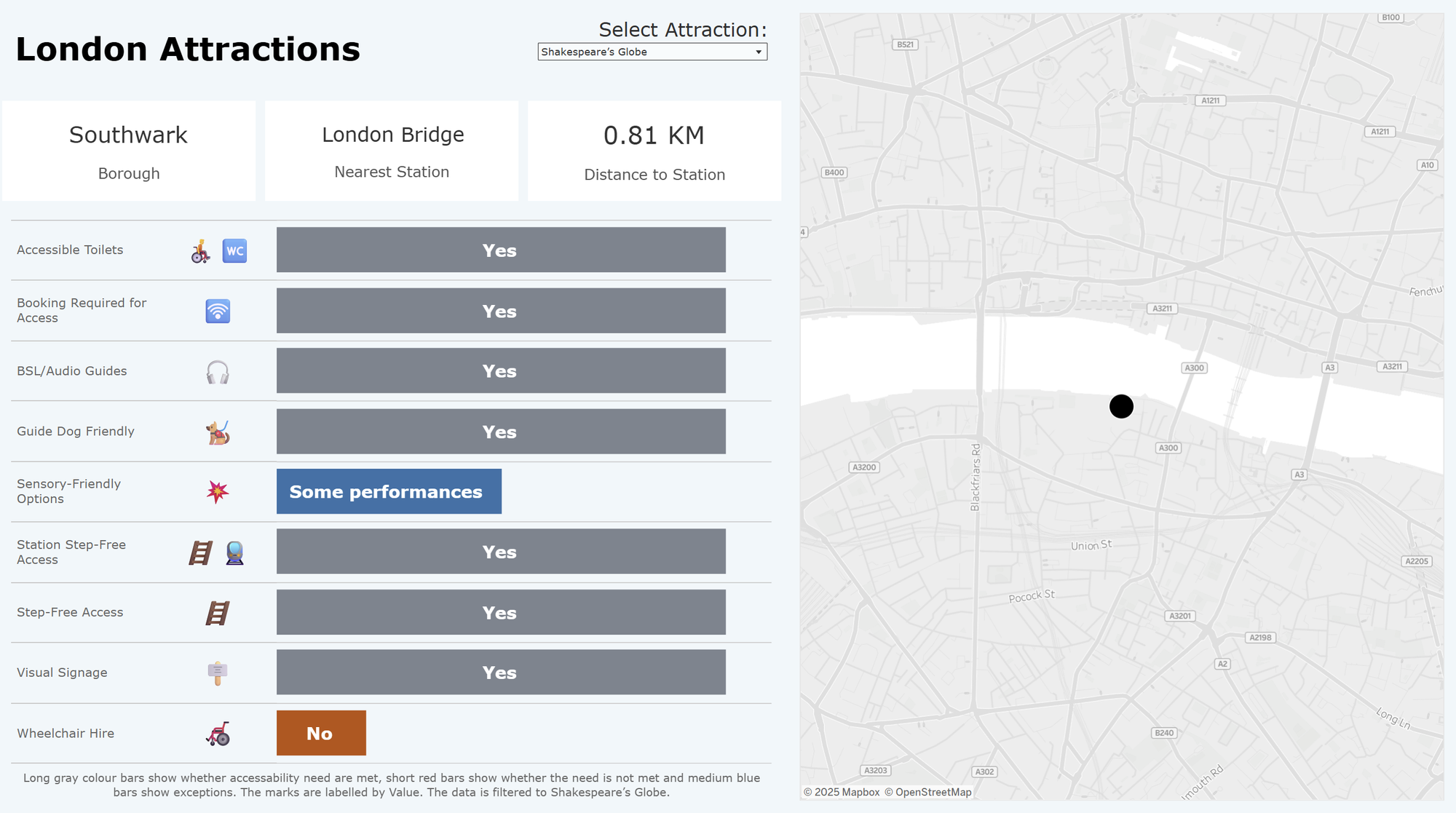
Above is the dashboard that I ended up designing for this project. It is very simple, but that is intentional for the use-case.
The user would select the specific attraction from the top of the dashboard and then the BANs about that attraction would be displayed below, as well as the accessibility information.
I tried to keep the amount of text and numbers as low as possible, which was the main challenge that I faced working on this dashboard. Dyslexia gets in the way of one reading letters / words and dyscalculia affects one's ability to read anything to do with numbers.
What does that leave me with? VISUALS.
I resorted to using bar charts to show whether a specific type of accessibility is available at the London attraction or not. Additionally, I added emojis to represent the types of needs for those who might prefer it.
Future Improvements
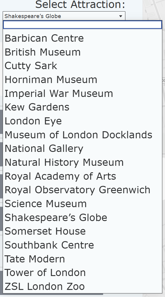
- Unfortunately, at the moment Tableau does not allow for you to adjust the text size of a filter text-box:

- I would like to include the locations of the tube stops on the map as well. I would still keep it very minimalistic - there would only be two marks on the map. The tube stop would be represented with the London Underground logo.
