


Dashboard Week: Days 3 & 4
For Dashboard Week's Days 3 & 4 my cohort was set with the the Data + TV Tableau challenge.
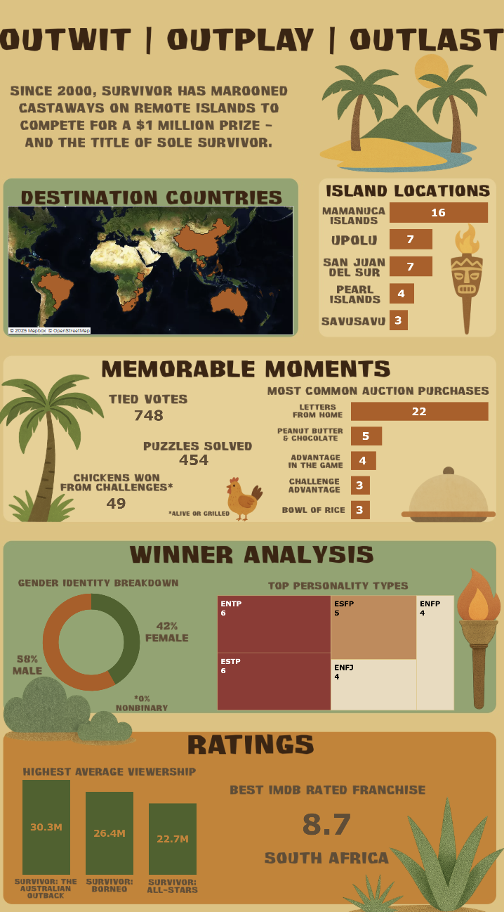
I set out to create something that wasn’t just informative - I wanted it to feel like the show it was inspired by. The brief was to use IMDb & TV-related data to create an infographic-style dashboard using Tableau products only. It had to be static and printable, which meant that there shouldn't be much or any interactivity.
I chose to make my dashboard about the show Survivor. With its tropical settings, competitive spirit, and cult following, it felt like the perfect summer-themed show to bring to life with data.
The Process
I started by sketching a rough layout in Excalidraw to structure the dashboard. I wanted each section to feel like a "mini island." From there, I used:
- Figma to experiment with and create layout aesthetics.
- ChatGPT + DALL·E to generate custom images in a Survivor-style - torches, islands, banners, and headers in the Survivant font. This also helped overcome the hurdle of using copyright free images.
- Tableau Desktop for the final build.
- Github to find my datasource: https://github.com/doehm/survivoR;
- Full credits for the data go to Dan Oehm (doehm)!
Each visual element was carefully styled to match the show’s tribal + tropical island theme - right down to the colors and font textures.

What the Dashboard Shows
The dashboard explores:
- Top-rated Survivor franchises and their average viewership
- Island locations most frequently used
- Breakdown of winners by gender identity and personality
- Common prize winnings (yes, peanut butter & letters from home included)
- Tied votes and puzzle-solving stats
Everything is intentionally designed to feel like a visual journey — not just a dashboard.
Challenges Faced
- Making sure the project meets the Data + TV Tableau challenge's T&Cs;
- And fits into the theme of Summer.
- Using a custom dataset - final result lacked IMDb stats in it, which is a change I plan to implement before submitting my dashboard to the contest.
- Creativity blocks
- Arguing with ChatGPT to generate text and images;
- Font troubles - I used the Survivalist font which does not naturally appear in Tableau Public, so I had to use ChatGPT to generate all of my text images that I then floated onto the dashboard.
- Balancing playful + engaging tone with data accuracy and ensuring design didn’t overpower the analytical narrative.
Final Thoughts
- I am very proud of the result I made. To this day, it is one of my proudest dashboards that I have created, especially design-wise. I hope it is only uphill from here and the creative streak will keep on going.
- I learned a lot about balancing creative design with analytical integrity - and had fun in the process.
- Hopefully I will find time to update the dashboard and include more graphs that show IMDb data. I am thinking that I will most likely have to change the layout to landscape or at least make it a bit wider + longer to fit these additional charts in.