During last week project for the Huntingtonshire council, I learnt how to compare different values across seasons rather than months. It is possible to have an overview in different seasons and it is useful to track sales trends for any commercial activity.
Rather than group the twelve months together, I have created a Calculated field in Tableau and then I used it the field, next to the Year, discrete dimension.
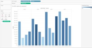
Due to data confidentiality, I am not going to share the Dashboard created for the client. However, I have prepared the same example with the Superstore sample data on Tableau, in order to visualise profit and profit ratio of the main categories across all seasons in different years.
The calculated field was structured with the formula below
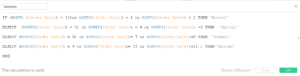
IF (MONTH ([Order Date]) = 12)or MONTH([Order Date]) = 1 or MONTH([Order Date]) = 2 THEN ‘Winter’
ELSEIF (MONTH([Order Date]) = 3) or MONTH([Order Date]) = 4 or MONTH([Order Date]) =5 THEN ‘Spring’
ELSEIF (MONTH([Order Date]) = 6) or MONTH([Order Date])= 7 or MONTH([Order Date])=8 THEN ‘Summer’
ELSEIF (MONTH([Order Date]) = 9 or MONTH([Order Date])= 10 or MONTH([Order Date])=11 ) THEN ‘Autumn’
END
This formula can then be used in several charts types: timeline, bar charts, scatter plot, bullet charts. In this case, I have chosen a simple visualisation with the bar chart.