Workout Wednesday is all about Tableau Challenges made by Zen Masters in the Tableau community, who post it through their website and Twitter in order to make other people try to replicate them. It is a lot of hard work to actually find out how somebody else has approached the challenge.
What makes Workout Wednesday is:
- Requirements regarding Dashboard size and other technical guidelines
- Variety since every week there is a different challenge type
- There is not only one way to reproduce the workbook
Today at the Data School, I went through two of the challenges of Workout Wednesday week 50 and week 34.
First tip: Date functions in Tableau
In Workout Wednesday week 50, Emma Whyte challenged the Tableau community to reproduce a visualisation about the highest grossing film in the UK box office.
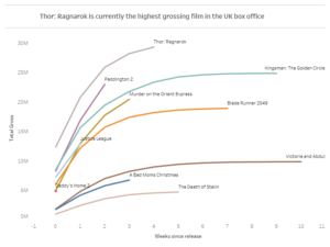
The way I have solved the challenge was very different from the original one but it provided the same result. I looked at how many weeks have passed since the release date of each movie. I first determined the minimum date for each movie with a Level of Detail calculation:
{Fixed [Film]: Min (Datatrunc (‘week’, [Date]))}
and then I looked at the difference in weeks between the release date and the minimum date with a date function calculation:
Datediff (‘week’, [Minstdate], [Date])
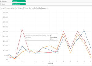
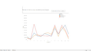
Make the Datediff calculation a Continuous dimension and drag it to columns. It is possible to use this calculations also with other date parts such as Days, Months and Years. In the example below I have used Superstore Sample to see for each category the number of months since the order date. Same calculations are used with the only difference of the Month date.
Second Tip: Title in the tooltip
From the same workout Wednesday of week 50 there is the challenge to have a title with a tooltip. Very simple trick is to actually pretending to use a title, while instead create a new sheet.
Create a calculated field and drag it to columns: ‘ ‘
Create a calculated field with the title and drag it to the labels marks type: ‘Write the title here’
Click on the tooltip and write all the details, explanations that will show up when hovering over the title.
Add the sheet to the Dashboard and it will look like an actual title.
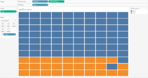
Third tip: Waffle Chart
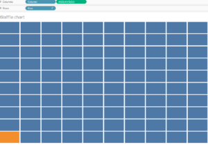
Create a simple Waffle Chart in Tableau with few clicks. The first requirement is having or creating a Data set with Rows and Columns from 1 to 10 to be dragged and dropped respectively to the rows and columns. Click on the Row field, which has to be a Discrete Dimension, and sort it Descending. Create a calculated field called 1, in order to link it with the main data
source, drag it and drop it to columns and make it Avg(1) directly from the Column pill. Drop the measure into details and create a boolean calculated field for the colour.