Day 3 of hell week dashboard week is over and I must say it has been THE most challenging yet. Today’s topic was transportation data in different cities, see Andy’s blog for further details.
Data
I drew San Francisco from the cup which led me straight away to the BART.gov website. It has an API that can call a ton of information. Much of the data, however, is real time – brilliant if you’re looking to create an app but not so great for a single static dashboard. It took a while for me to explore the possible information that could be obtained which was great practice for calling API’s in Alteryx.
Alteryx
I ran a few different APIs, the first of which was for a list of stations with geographic info – lat, long, address and so on. This would form the base of my data moving forward as it would be where I would match further information too.
Next, I looked at access information at each station. The API pulled back huge amounts of information about parking, elevators, lockers, bike racks and so on. However, It proved difficult to use this information and it didn’t seem to me to be the most interesting out of what was available.
After this, I wanted to pull the ticket fare information. For this, a start station and a destination station had to be inputted into the API in order to return price for the journey. I soon realised that I had to generate a dataset for every possible journey that could be made between stations to retrieve the price for every journey. Details on how I did this in Alteryx will come soon in a separate blog.
Next, I started playing with shape files, Bart.gov provides a .kml file containing spatial objects for stations as well as lines for the different routes. What appeared to be a straight forward task proved near impossible to me after a number of attempts especially with diminishing brain capacity and the time constraints stress as it was now the end of the day and I had yet to even open tableau.
At this point, it was clear that a complete map with the stations mapped onto lines was a nice to have feature on a fare calculator dashboard and so had to be discarded. Instead, the geographic data already obtained could still be read by Tableau allowing for the stations to be plotted on a map.

Tableau
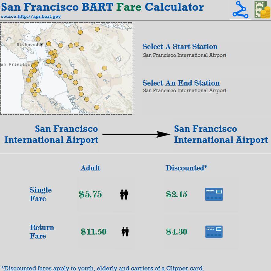
Finally, into Tableau and luckily, I already had a good idea of how I wanted the dashboard to look. A simple and easy to use tool that allowed the user to quickly pull a ticket price by entering the starting station and desired destination. Simple filtering and BANs were used along with a few icons.
See below a picture of the dashboard or interact here

One of the many things that I’ve learnt today is that sometimes having too many options can be an overwhelming. It can be easy to lose a lot of time by falling into rabbit holes due to a lack of decision regarding the end goal. In future, I will formulate a clear strategy before skipping around API land willy nilly.
With more time I’d like to get the shape files to work so that the stations and lines could be plotted onto a map in Tableau as well as incorporating the station info to provide the user with more info. Also, I would like to add a highlight feature that shows the start and end stations on the map.
