


It’s day 2 of dizzying dashboard week and the topic for today was, ironically, the only thing that might get me through this – alcohol. Specifically, beer and wine.
The group was split into either team beer or team wine. I opted to go with team beer, the data for which was to be obtained through an API on breweryDB.com – see Andy’s blog post for more details.
Data
The beer team had a tough time with the API, some calls being only for premium users and others returning very little information to work with. As a result, we chose to go our separate ways and scrape for data instead – lunch time was approaching and we still had no data.
Eventually, I sourced some data to work with from Kaggle.com on craft beers in America. It contained two sheets one on breweries and one on the beers themselves – clean and easy to join.
Alteryx
Over to Alteryx for the relatively simple task of cleaning and joining the data ready for Tableau.
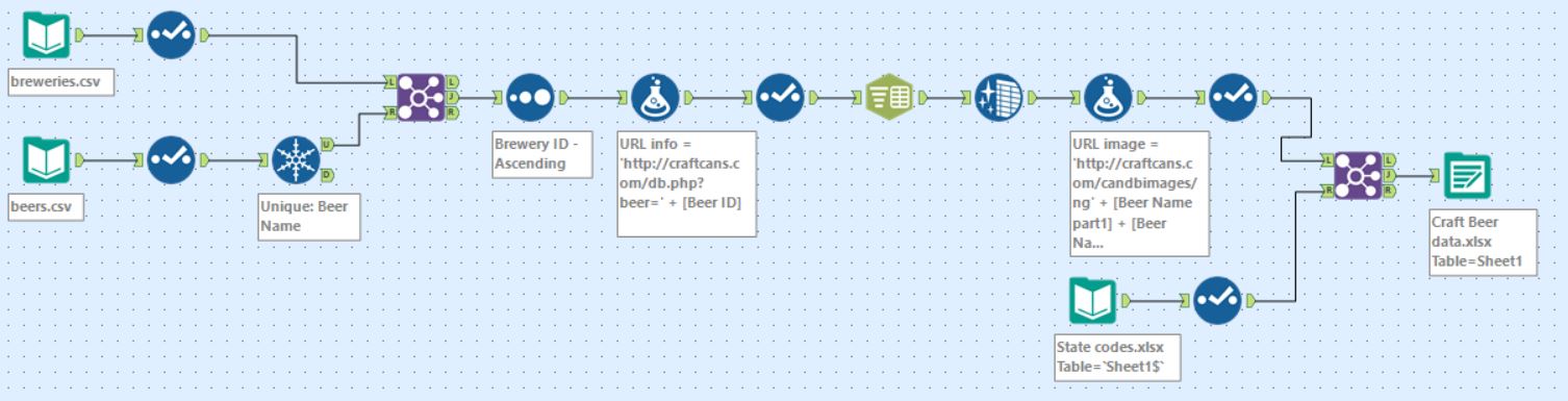
The beer data had some duplicates so first I had to use the unique tool to rid of them. The two sheets could then be joined by brewery ID. Following this I generated URLs that I was considering using for more info; the first proved successful however the second (to bring back a picture of the beer can) proved not possible. Finally, I joined another sheet containing full names for states as the Kaggle data only had state codes.
Tableau
Getting into tableau was a relief as it was already mid-afternoon. I chose to keep the charts simple as time was limited and data wasn’t at its richest. The focus was on design; I used map box for the background layering of the map, followed by meticulous formatting to achieve a classroom kind of theme – this started taking shape without meaning to so I rolled with it.
See the results below, or interact here
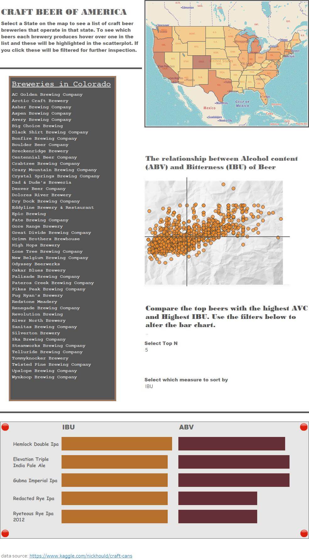
Now I know which beers are the strongest I’ll head out for one or two of those.