


“Everything should be made as simple as possible, but not simpler” – Albert Einstein.
A quote that summarises the take-home message of Visual Analytics in Tableau. Here are some key points to keep in mind when designing visualisations.
Visual Analytics – what does it mean?
Considering these two words individually – when we think “visual” this applies to the charts or dashboards themselves that are produced. On the other hand, when talking about “analytics” this can encompass the trends, outliers and even data quality that becomes apparent when building visualisations. The ease by which Tableau can deliver these features is exactly what makes it so effective.
Memory and Processing
When creating a visualisation, it helps to consider how the human brain processes and memorises information. Using this to your advantage will help present the information in a quick and efficient manner. some key points to consider are:
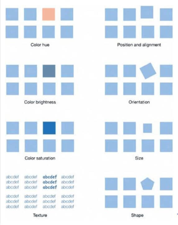
- Sensory memory: short-lived input through your senses. Described as pre-attentive because the information is gained prior to processing it. Shape and Colour are an effective way of employing this
- Cognitive overload: quite simply, if you cram too much onto a page the brain will not want to process the information. Focus on the key points, and keep things simple.
This image summarises preattentive attributes effectively:
Colour
A simple, yet very important component of a truly striking vis, one that can be easily overlooked. Considering the audience is essential in this instance, for example, the use of red and green could alienate a chunk of the population that are unable to differentiate between the two. Keep the pallet simple – a single colour to highlight what you want to show is powerful. Nevertheless, if you do use a selection of colours make sure there is consistency and thought into how they may be interpreted.
Inform! – but don’t mislead
Gestalt principles outline how humans unconsciously build associations and trends through patterns. Consequently, if a connection or pattern is present in your visualisation, but not in the underlying data, this could be misleading. Let’s say you apply a discrete measure to circle size, doing so implies a continuous measure or value. The audience would likely interpret the bigger circles as lager or more important values. Finally be careful when truncating an axis, it will likely lead to overexaggerated, proportional differences in the chart.
Finally – What not to do
…Enough said…