Inspiration (blog by Gwilym Lockwood): https://gwilymlockwood.com/2018/07/03/language-sex-violins-other-how-to-create-violin-plots-in-tableau/
Link to Tableau Workbook: https://public.tableau.com/views/ViolinPlotExample/ViolinvsBox?:language=en-GB&:display_count=y&:origin=viz_share_link
UNDERSTANDING THE VIOLIN PLOT
A violin plots is similar to a box plot, except that they also show the probability density of the data at different values. This probability density is usually smoothed by what is called a “kernel density estimator”.
For example, if we had 15 different chocolate bars and fifteen different prices and plotted them on a straight line they would look like the box and whisker plot below. A violin plot attributes the density of the chocolate prices to a peak in the graph. For example the group of seven chocolate bars ranging from a price of £1.5 to £3 give this peak as seen in the violin plot.
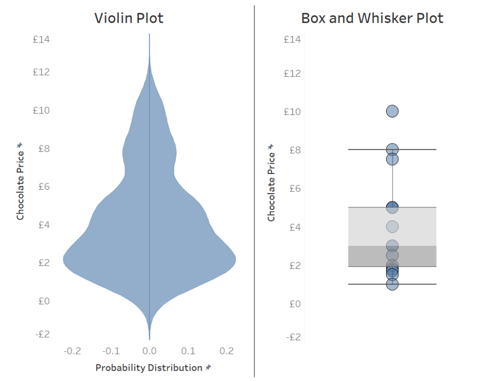
The violin plot is very powerful as it displays the range of a dataset and the probability density of a value in the same view. The big question is how do we make it in Tableau? The major hurdle is creating a smoothed dataset, otherwise we would just get a standard histogram, this is where “kernel density estimators” come in, for the rest of this blog they will just be called kernels.
The effect of the kernel’s can be shown by this comparison between a histogram (left) and kernel density estimate (right) as seen below. The individual kernels are shown in red and the kernel density estimate is shown by the thicker blue line. This thicker blue line is the sum of the density function along the x-axis i.e. sum the value of the red marks together as you go left to right.
The location of the peaks of each kernel on the x-axis represents the value of a sample, for example, £ in a bank account for each person in a bank.
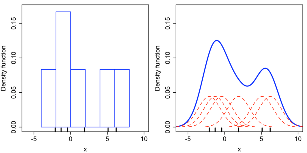
If you are confused, which I was at this stage, then lets see if an animation can explain it better.
First, lets draw 3 kernels based on 3 values: a value of 4, a value of 5 and a value of 8. These values are where the peaks of the kernels appear. We will talk about the equation of a kernel later.

Now let’s add a line which is the sum of those three kernels. This line (thick white) is known as our kernel density estimate.

Finally, lets add a fourth kernel which we can change its sample value i.e. where its peak will appear on the x-axis. For demonstration purposes we will have the kernels sample value be 6 to start. The forth kernel appears as the grey line

Imagine the forth kernel is a value we are adding to the data set. It can be between the values of 1-10 in this case. As the value and thus the peak of the kernel changes so does the kernel density estimator. By adding more values (data) the shape of the kernel density estimator will change to fit the distribution of the data. For an example, if twenty more data points were added with a value of 5, we would start to see a huge peak around the value of 5, since there is a high distribution of data at that point.

BUILDING THE VIOLIN PLOT IN TABLEAU
To build a violin plot in Tableau we will need some sample values, and we will need to scaffold these sample values. For the example we will use 15 Sample ID’s with values ranging from 1 to 10. The scaffold values will range from 1 to 99 in increments of 1. Here we have created two sheets in Excel, one named Sample Data and the other called Scaffold Data. When using this method to create a Violin Plot for your own data, you will need to replace the data is the Sample Data, however, I would recommend of using the same Scaffold Data setup. Note that the Scaffold Values go from 1 to 99 (not 18).
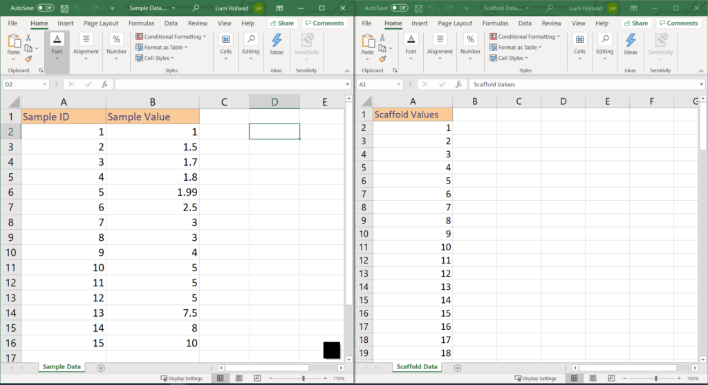
In order to scaffold the data we will need to use a calculated join. This is done by using a calculated field created in Tableau to join the two tables together. For this example the calculated field is just ‘join’ (literally type ‘join’ into each calculation). This will have the effect of exploding the data. For every Sample ID, 99 rows will be created, which is one for each Scaffold Value. This is the reason of recommending that the Scaffold Table is not changed, since 99 points will create a smooth curve (as shown later) but exceeding 99 will quickly create huge number of rows.

There are two complicated calculations used in the Violin Plot. I have called them ‘Evenly distributed scaffold values‘ and ‘Kernel’ but you can call them anything that makes more sense to you.
‘Evenly distributed scaffold values’
IF [Scaffold Values] = 0 THEN {MIN([Sample Value])} - [Scaffold scaling factor]
ELSEIF [Scaffold Values] = 99 THEN {MAX([Sample Value])} + [Scaffold scaling factor]
ELSE
({MIN([Sample Value])} - [Scaffold scaling factor]) +

(

ABS(
    ({MAX([Sample Value])}+[Scaffold scaling factor]) - ({MIN([Sample Value])}-[Scaffold scaling factor])
)

    * ([Scaffold Values]/99)

)
END
The above calculation may look a bit complicated, however, all it is doing is trying to distribute 99 points (our scaffold values) evenly across a range. This range is determined by the [Scaffold scaling factor] parameter and the range of the original data. For this example we have chosen the parameter to be an integer of any value with a starting value of 1. If you are less familiar with parameters it could also be a calculated field with a value of your choice, however, a parameter allows us to quickly switch between Scaffold Scaling Factors to see which one is correct for our data. The scaffold scaling factor adds a chosen amount to either end of our range.
As we can see below the ‘Evenly distributed scaffold values’ field has created 99 points for each Sample ID. If the Scaffold Scaling Factor is set to 0, then the 99 points will be distributed across our original range (1 to 10). However, if we set the Scaffold Scaling Factor to 4, the 99 points will distribute from -3 to +14 (4 either side of our range).
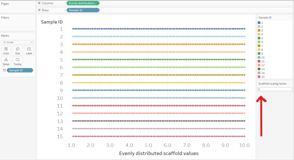
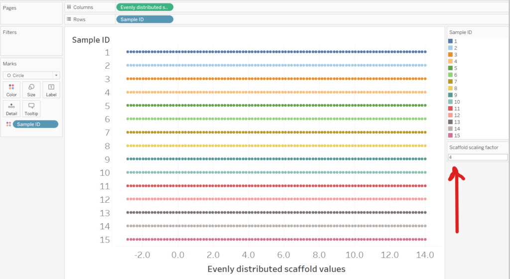
The effect of the Scaffold Scaling Factor on the Violin Plot will be explained as we start building it. First however, we need to explain the kernel calculation.
‘Kernel’
(1/({COUNTD([Sample Value])}*[Bandwidth])

*

(1/(SQRT(2*PI())))

*

EXP(-0.5  * (([Evenly distributed scaffold values] - [Sample Value])^2)/[Bandwidth]))
The important part of this calculation is (other parts are constants to change the kernels shape):
EXP(-0.5 * (([Evenly distributed scaffold values] - [Sample Value])^2)/[Bandwidth]))
This creates the normal distribution type curve. Since e^0 = 1, wherever the ‘Evenly Distributed Scaffold Value’ is closer to the Sample Value we get a peak, since this is the maximum value in a negative exponential (e^0). As the difference between the ‘Evenly Distributed Scaffold Value’ and ‘Sample Value’ increase the value of the ‘Kernel’ starts to approach to zero, since the e^ – (VERY LARGE NUMBER) = 0
The parameter [Bandwidth], like the [Scaffold Scaling Factor] parameter, will change the shape of the final violin plot. The greater the bandwidth, the wider each of the kernels will be. Both parameters should be changed to suit your dataset.

Once all the calculated fields have been made, creating a violin plot is very simple.
One thing to note : You will need to convert the ‘Evenly distributed scaffold values’ field into a continuous dimension (from a discrete measure)
Simply drag the ‘Kernel’ field onto the rows and ‘Evenly distributed scaffold values onto field. For this example a [Bandwidth] of 1 and [Scaffold scaling factor] of 4 has been used.
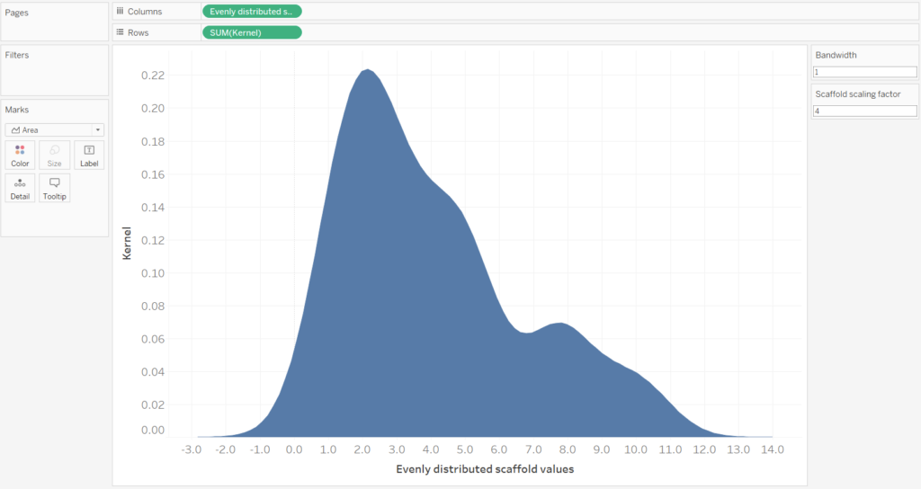
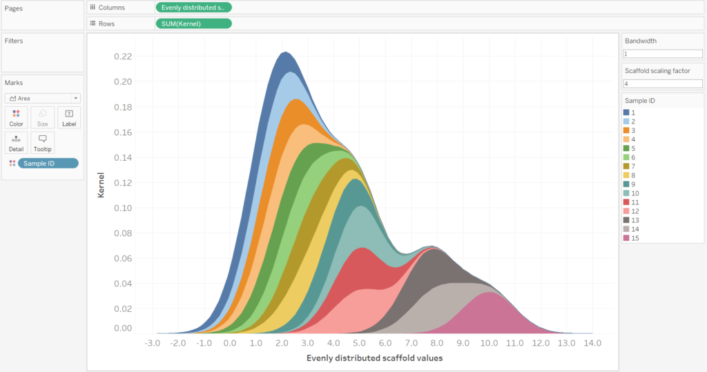
If we include the Sample ID field onto the colour mark, then we can see how the violin plot is the sum of the Sample ID’s. However, for the final Violin Plot we will have nothing on the colour mark.
Next we need to duplicate the Kernel calculation and make the duplicate into a negative. This can be done by double-clicking the green pill and editing the calculation in the shelf i.e. add a – to SUM(Kernel). A duplicate can be made by holding the CTRL key and dragging the pill into the same shelf.
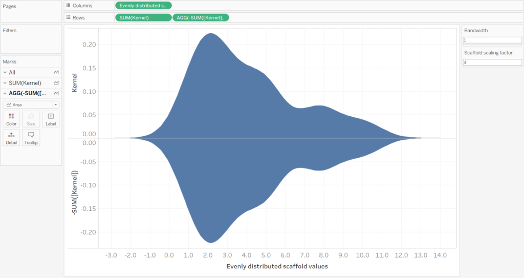
Finally, by switching the axis, creating a dual axis (remember to synchronize the axis) and some formatting you can get a complete violin plot. Remember to convert the mark type to an area.
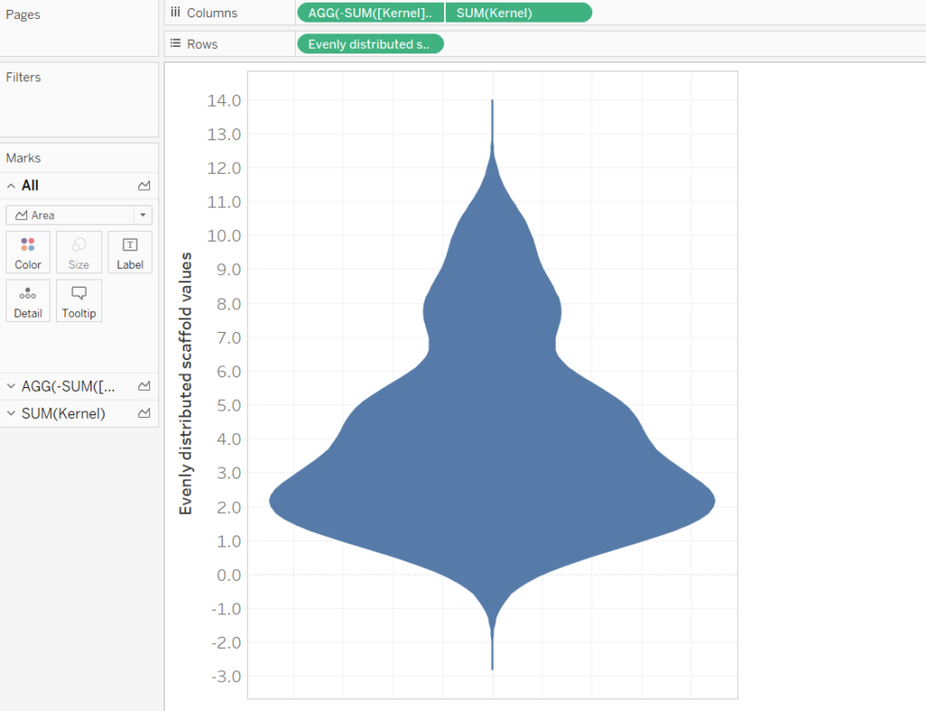
We’ve made it!
Hopefully this blog helps you understand how to breakdown complicated looking graphs into their individual components. If a technique (Sankey, Chord etc.) looks maths-y, maybe try and put parts of the calculation into a graphing calculator and see if you can understand it better. Good luck making this plot and using it for your own creations.
