


This week I met up with a friend to burn the midnight oil if you will, and they were working on a dashboard that used data that had to do with global monthly temperatures through a range of years. The data was structured like this:
Which actually looks pretty nice right? The months are laid out horizontally, the years are stacked in a single column, and the values are laid out in a calendar style table. We even get a yearly average temperature in a column.
The positive thing here is that the table lends itself to being human readable.
The problem, however, was that this format was making it hard to write calculations and set up filter functionality on the dashboard. Its easy enough if you made a bunch of static charts, but if you wanted to get a temperature for a particular month, you would have to create a separate calculation for each month. It gets quite tedious.
Another problem she ran into was that she couldn’t easily compare the minimum and maximum recorded temperature against the yearly average as easily. It could be done, with a really long, tedious calculation for each BAN that looks something like:
But there is a much simpler solution here. With a slightly altered data structure, we can calculate all of these values in one line of a calculation. We could group our temperature by their month, or their country or their year more easily.
Here is how we fixed that.
A Case for Transposing the Data (also known as 'unpivoting' in other programs and languages)
Transposing data is when you take multiple columns of data and turn them into rows. After transposing your data, many columns turn into two, with one column called 'names' that records the name of the column the row was created for, and the other column called 'values', which holds the value that used to be in the old column. It looks like this:
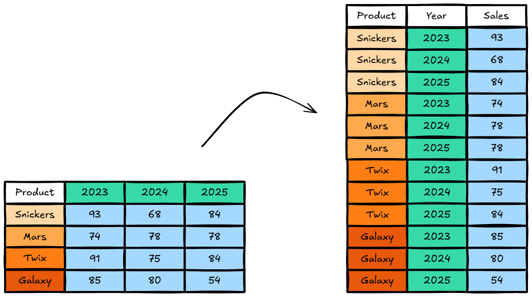
See how all those values on the left side version of the table got placed in a single file in the table on the right? And next to each of those values is the name of the column that it came from.
We did that to the temperature data and went from this:
to this:
With this new, reshaped data structure, where we have one column for each data type (one for year, one for months, one for country) we are able to calculate aggregations in tableau using aggregation functions (avg(), max(), min()) in one line of calculation. Now, we are able to calculate BANs like Average Temperature, Minimum Temperature, and Maximum Temperature by different countries and years across their months with smaller, more efficient calculations.
Want to know what the average temperature in January of 2021 was globally? Filter out the rows by month and year. Your avg(temp) calculation will show you that. Want to compare side by side the minimum and maximum temperature of Canada for all time? Filter out the rows by country, and min(temp) and max(temp) will show you those figures. For 2013? Add a year filter to your sheet.
Its important to know that in Tableau, aggregation functions like average, min, max, sum, and other repetitive math operations are done down a column. Tableau is set up with the idea in mind that a column will only have one, uniform kind of data in it, so it can safely do a uniform, repetitive operation to all of the values in the column.
Calculations are always executed looking at values across a row. This is helpful if you want to operate on multiple values that belong to the same row, but the mathematical operations you need are more complex than a simple aggregation.
In the next article, we will talk about a use case for cross-tab (also known as pivoting in other programs or languages)