


(A very late blog about this since I forgot to post!)
For our last two days of Dashboard Week we're looking at IMDb Data. A large dataset containing all information of TV Series' that are currently listed on IMDb.
The instant I read the brief, I knew what I wanted to do.
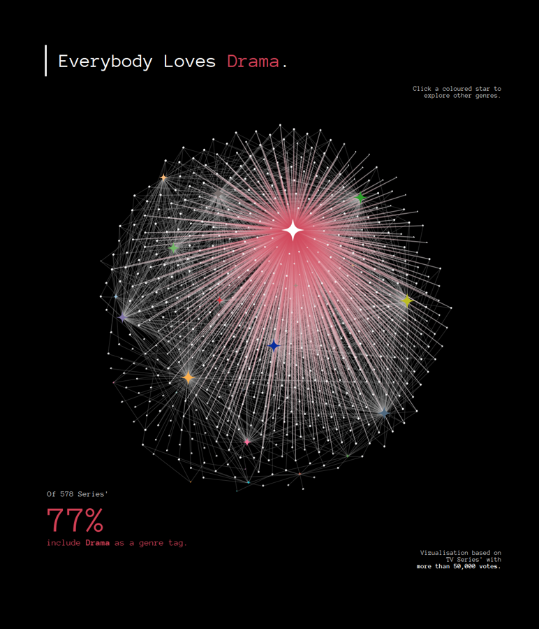
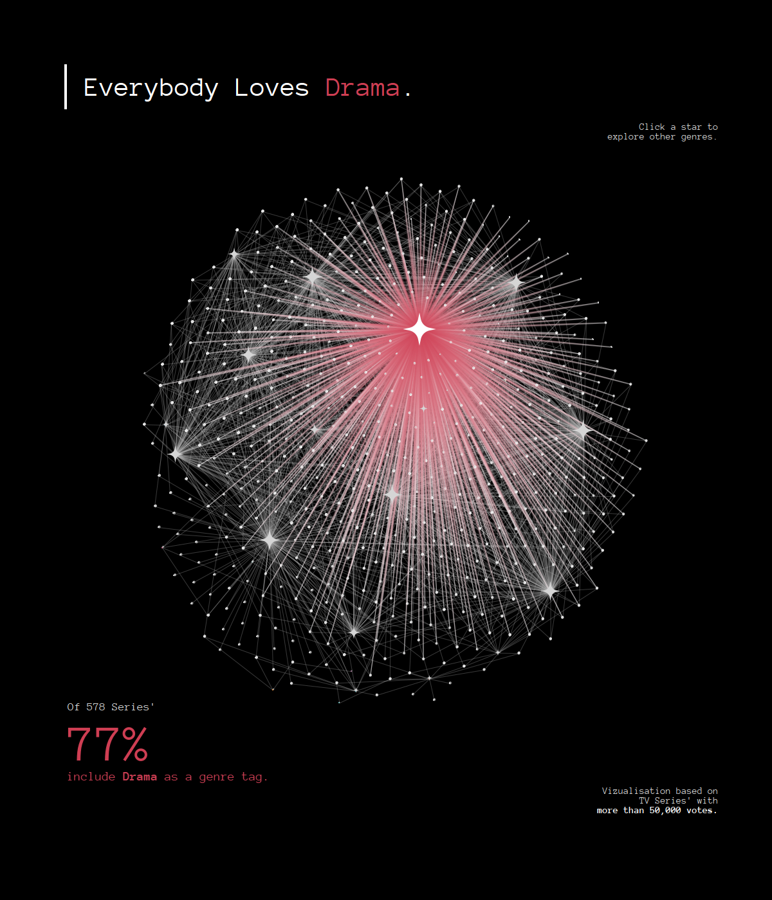
I wanted to visualised TV Series' and their genres. What are the distributions like? What is the most popular genre?
The Plan
I got to sketching straight away.
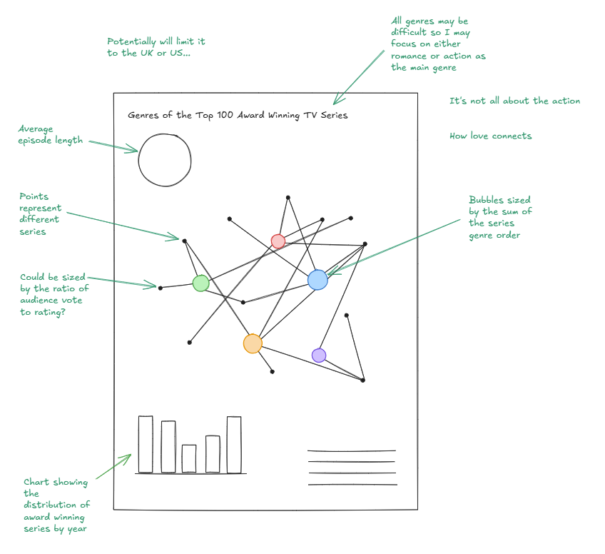
I did some research first on if it was even possible to make this chart type on Tableau and I began researching how to make this sort of chart - a networking chart. I came across this blog which detailed how to use Gephi. So after finding out that it was possible, I went to Ruth to discuss my idea.
After going to Ruth to get her approval, she suggested that I ask my other colleagues about their experiences with making network charts.
Data Prep
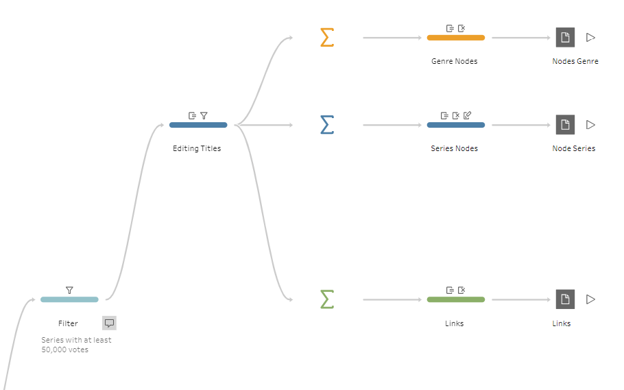
While I was waiting for the responses to roll in, I began looking at the example workbook that was provided, particularly exploring the data that was available. Since there is a lot of data we thought it would be good to reduce the dataset that I would use and bring it into Tableau Prep.
However I came across a problem:
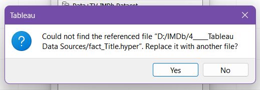
When trying to extract the data, one of the referenced files weren't there. So instead I had to extract the Tableau packaged workbook.

Opening up the extract in Tableau Prep was just as bad.
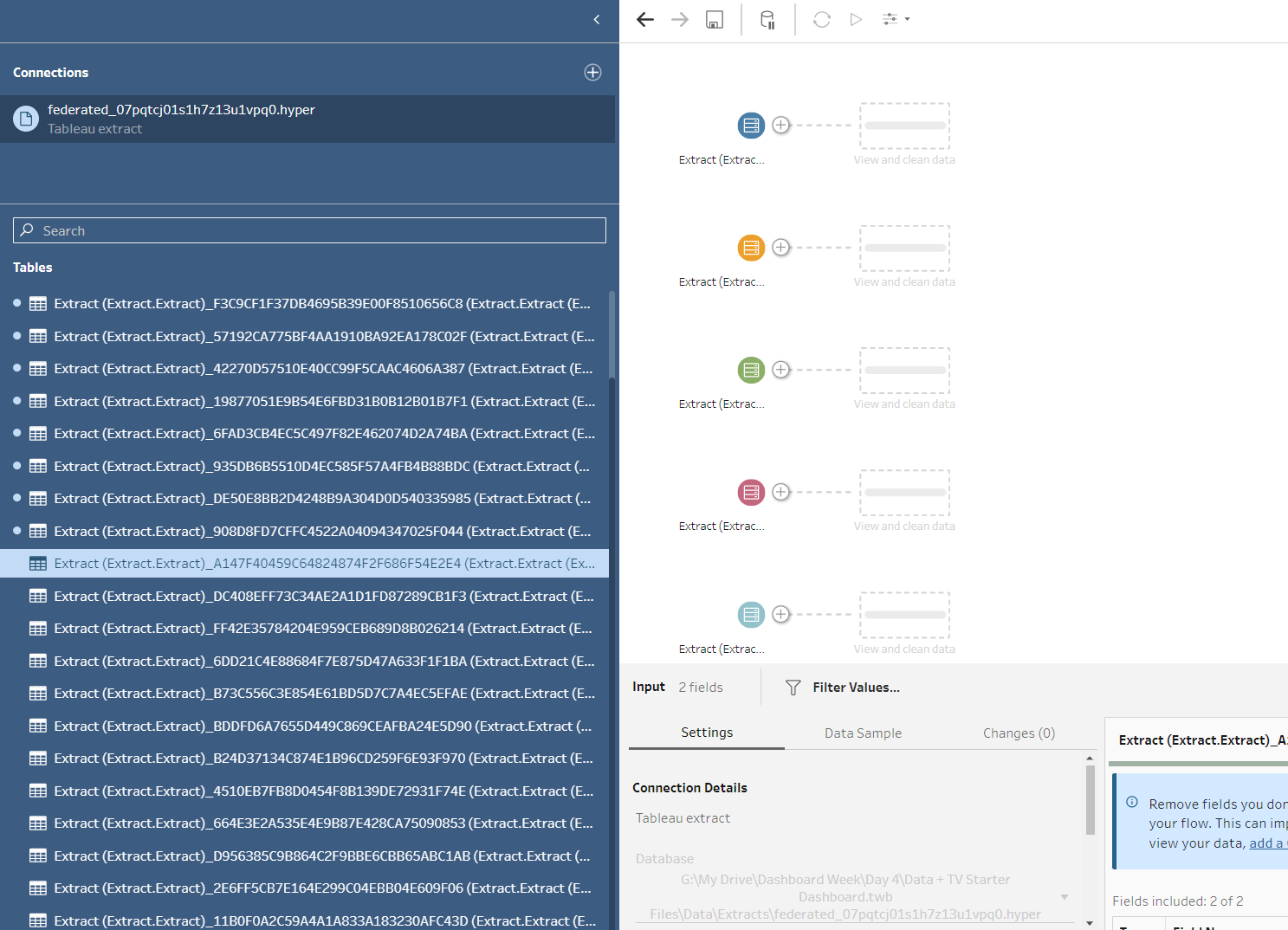
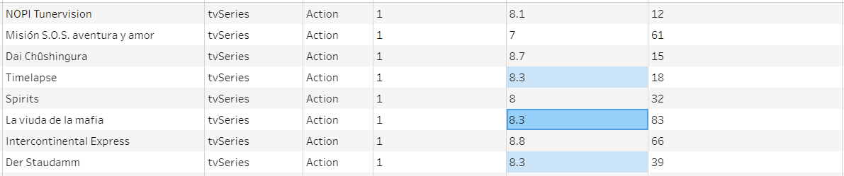
Since I knew I would need the dataset regardless I began going through all of the tables and figuring out what table has what in, and I was able to create a much smaller and cleaner dataset!
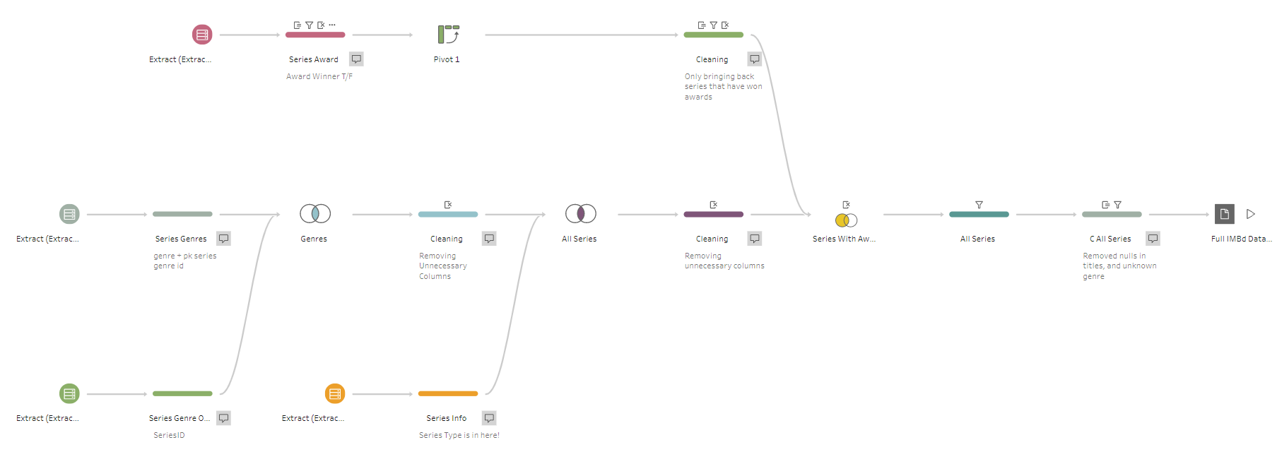
The goal of this dataset was to have a row of data for a series to repeat every genre tag it has. This means that for every series it would be able to connect to multiple genres.
I filtered out any unknown genres and empty titles since that would interfere with the Viz down the line.
I also manipulated the Series Award data so that it would show a tag whether a series has won at least one award.
Back to Network Charts
I checked my post while I was doing the Data Prep and I was recommended the LaDataViz website to create the network chart.
After looking at the website, I saw that I needed to create a JSON file which defines what a node and the connections are - known as links.
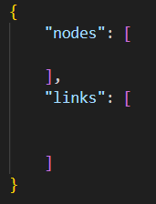
With the string format needing to be quite specific, I also included this in my Tableau Prep.
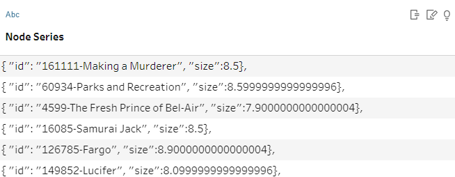
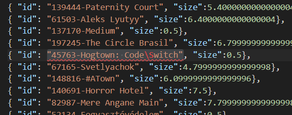
I had to edit the titles and included the ID code just in case there were any series' with similar titles. And I also had to replace some characters in the titles since they interfere with the JSON code.
Pivoting
So my original idea was to include every single series that is in the IMDb dataset but I had to make some decisions to limit how many series' I was looking at.
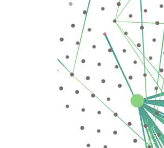
As when I loaded it up onto the website the preview looked like this (and also took a few minutes to load):
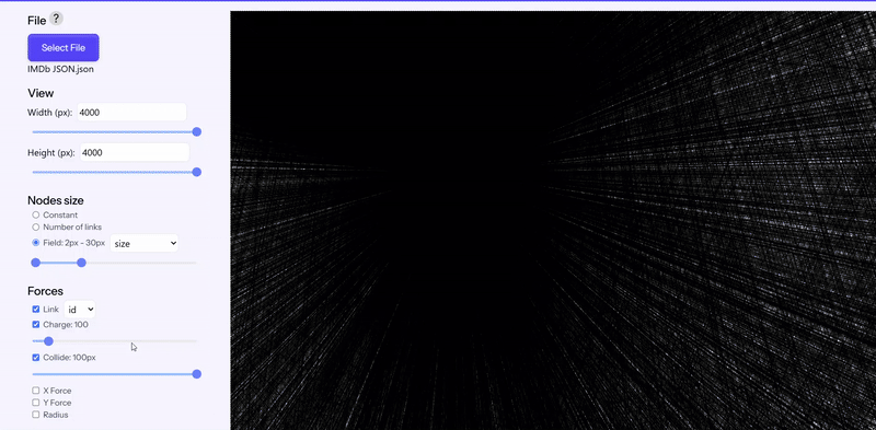
I was unable to even try and fit all of the points on the preview, even with it set to the max so I needed to limit it.
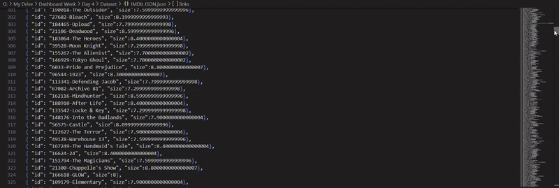
I first filtered down based on ratings, so only including series that had a rating of 7 and above. But this wasn't very representative since there were series' with little to no votes being voted highly on IMDb.
So instead I filtered to only include series' with more than 50,000 votes, this gave a much better representation of popular series' and their genre distributions.
Once again after generating the strings, copying and pasting them all into VSCode I got my final JSON file, which was also a lot faster to use!
After playing about on the website, I got a layout that looked like this:
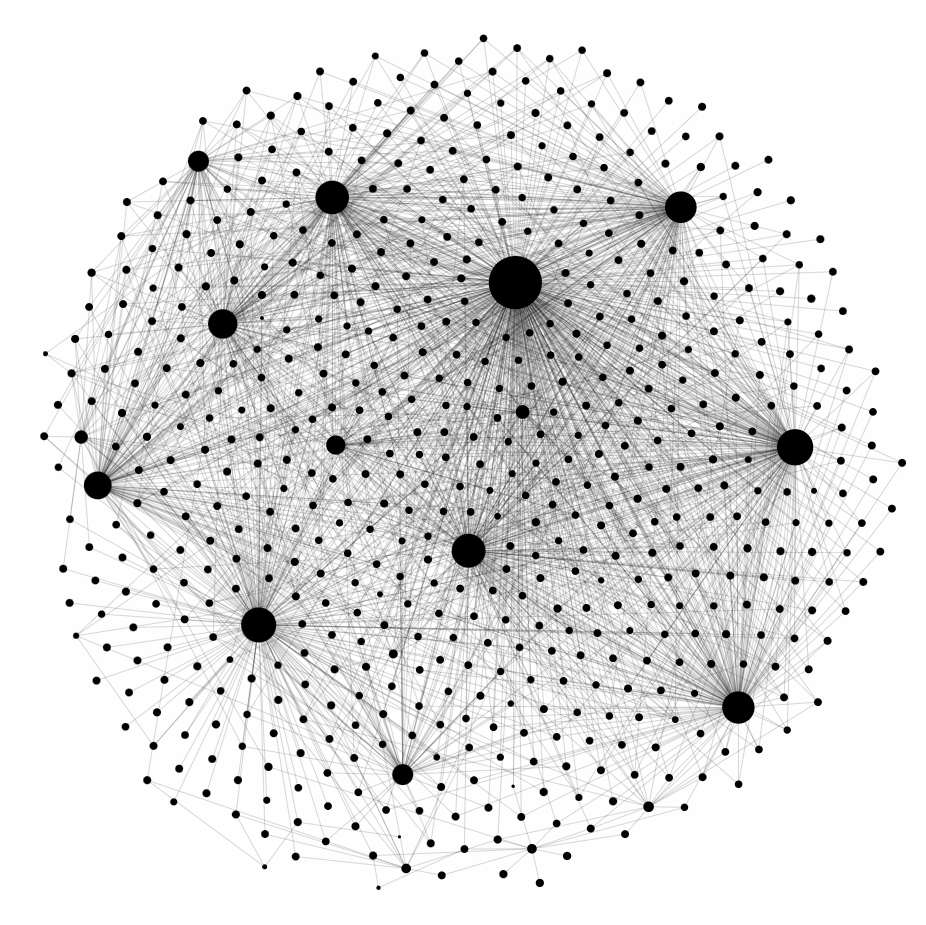
From the website you can download different formats, so I downloaded the Tableau Workbook as everything is set up.
Building the Dash
After opening up the file, I realised that I needed an additional dataset which just has the genres, so I added that to my Tableau Prep.
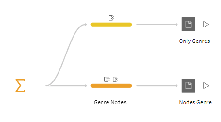
I knew straight away I wanted to get it so that when you clicked a genre, coloured lines would appear and connect to the series' that have that genre tag. So I added in a parameter. But it wasn't highlighting all the lines, instead it was just highlighting the nodes themselves.
I tried a couple of things, but with the help of one of my colleagues realised that my data structure was in the wrong order.
So after rearranging it, we were able to make a few calculations to get it to work!
It took a lot of tinkering and creating new calculations to get the correct labels to display.
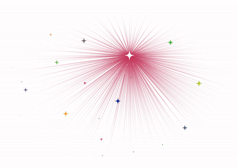
The Final Dashboard
In the end I created two different versions. I got mixed opinions on whether to keep the stars coloured or white, so why not both!
Though I have my dashboard done, I'll likely continue to tinker away before uploading it with the #!