


Clients across industries often ask "How does Tableau add value for our organization?"
In my work as a data consultant focused on Tableau, I've supported clients across several sectors, but with a heavier emphasis on the financial industry. I've partner with two major North American banks, and a hedge fund, where Tableau was used in seven common use cases:
1.) Data Automation
Tableau makes automating data updates and report delivery more efficient.
Imagine an analyst who spends Monday morning updating an Excel report by manually pulling data from several systems. Even if it only takes 5-10 minutes per data source, this workflow delays reporting and burdens the team with repetitive, manual tasks. Some automation is possible in Excel, but access and sharing limitations can still slow things down.
With. Tableau Server or Cloud, clients have scheduled overnight data refreshes, user permissions that control data visibility, and dashboards can be accessed right away, including from mobile devices. For many clients, this change alone is significant
2.) Tracking Performance
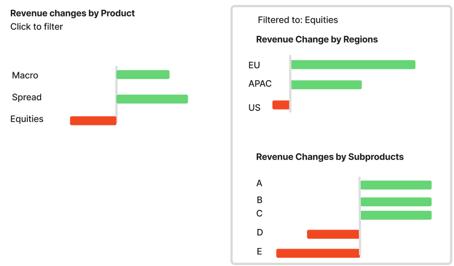
Performance dashboards are among the most common use cases for Tableau. They monitor firm-wide metrics and drill down into specific departments, product lines, or regional trends.
For example: Your revenue may be up year-to-date but trending down month-over-month. A diverging bar chart might point to Equities as the weak spot. A simple click lets the user drill into regional data to investigate further. This interactivity helps teams move from questions to decisions more quickly.
Go-to visualizations: (Diverging) bar charts, line charts, and smart use of colors, filters, and dashboard actions.
3.) Highlighting Anomalies
Dashboards can also support quality reviews or service planning. One client used Tableau to flag customers with non-English preferences, helping assess translation needs. Another tracked Service Level Agreement (SLA) breaches to identify patterns in performance lapses.
Go-to visualizations: Dot Strip Plots, Scatterplots (or 4-Quadrant Charts), and Donut Charts
4.) Competitor Comparisons
Financial firms often rely on third-party data (e.g. Wallet data from McLagan or Coalition) to benchmark performance against competitors. Tableau can make this data easier to digest and explore. One client used a slope chart to compare ranking changes among competitors; another used a parallel coordinates chart to compare the ranking of a selected competitor against their own firm across a series of different metrics.
Go-to visualizations: Parallel Coordinates Chart, Slope Charts
5.) Meeting Preparation
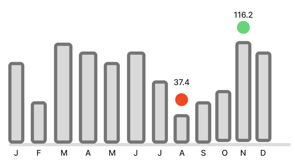
Executives preparing for meetings often need quick access to key metrics. Pulling numbers can be time-consuming either for the executive or for the team members. Tableau dashboards helped streamline this preparation by providing a quick overview of key metrics all on one page, formatted so that it can be downloaded into a powerpoint presentation.
Tip: Use visual cues like color indicators or annotations to make outliers easier to spot. For example, a little colored dot can indicate the best and worst month.
Go-to visualizations: Fast-to-interpret charts with color indicators, KPI cards
6.) Streamlined Analysis
In fast-paced environments like capital markets, tableau's combination of scheduled data refreshes, curated and trusted data sources, and dashboard templates can help deliver timely analyses. Analysts can focus more on insights rather than on formatting.
Additional benefits: Automated alerts when KPIs cross thresholds and scheduled email subscriptions, all of which help reduce the reliance on manual PDF reports.
7.) Access Insights On-The-Go
Executives aren't always at their desks and let's be real: Most work around the clock! Tableau Pulse can generate AI-driven summaries of key metrics direclty va email or mobile. Dashboards can also be optimized for mobile layouts so that executives can easily take screenshots of data points they want to follow-up on once they get to the office.

When NOT to use Tableau
Tableau is great for interactive visualizations and exploring data without deep technical skills. But it's not always the right tool for every use case. If your main goal is to create highly customizable, paginated PDF reports, run complex statistical models, or manage large-scale data transformation pipelines, other tools might serve you better. Luckily, many of those tools integrate nicely into Tableau such as dbt, SQL, Python, R, or Alteryx.
That said, in its sweet spot -interactive analytics, intuitive design, and fast insight deliver- Tableau does deliver a great amount of value.
Final Thoughts
At one client, I replaced five manual reports with Tableau dashboards and saved nearly 90 minutes of analyst time per day. That's more than 378 hours a year, enough to shift the focus to more strategic work.
If you are working in the financial industry and wondering whether Tableau fits your needs, the presented use-cases in this blog might give you a place to start.
Was this useful to you? Follow me on LinkedIn and let me know! https://www.linkedin.com/in/lisa-hitch/