


The Brief
Today's dashboard was focused on accessibility - trying to make the dashboard accessible to people who may be visually impaired, neurodivergent, colour-blind etc.
The brief was given in the context of this scenario:
The London City Council and GDS have opened a new bid for accessible data visualisation services. You’re submitting a pitch using real-world public data to showcase how you meet WCAG 2.2 and GDS accessibility standards.
Using data on London attractions and tube stations, we were tasked on making a dashboard that could be viewed as an example of what accessibility in data visualisation should look like.
This includes:
- Colour contrast rules (for colour-blind safety)
- Keyboard and screen reader navigation
- Descriptive headers and ALT text
- Clear language and no abbreviations without explanations
After planning on what the dashboard should actually show, I decided on an accessibility dashboard for people with impairments to plan their day out in London.
The idea of the dashboard was that they can select a London attraction and view all tube stations within a specified radius, also seeing the tube station's accessibility information (e.g. step-free access).
The Dashboard
I chose PowerBI for this project as I hadn't used it in a while. PowerBI is also known to have (maybe slightly) better functionality for accessibility. This includes built in features such as:
- Keyboard navigation
- Screen reader compatibility
- Contrast colour view
- Focus mode
This means the user doesn't actually have to implement much in order to get these features working for your dashboard.
The dashboard I ended up creating was this:
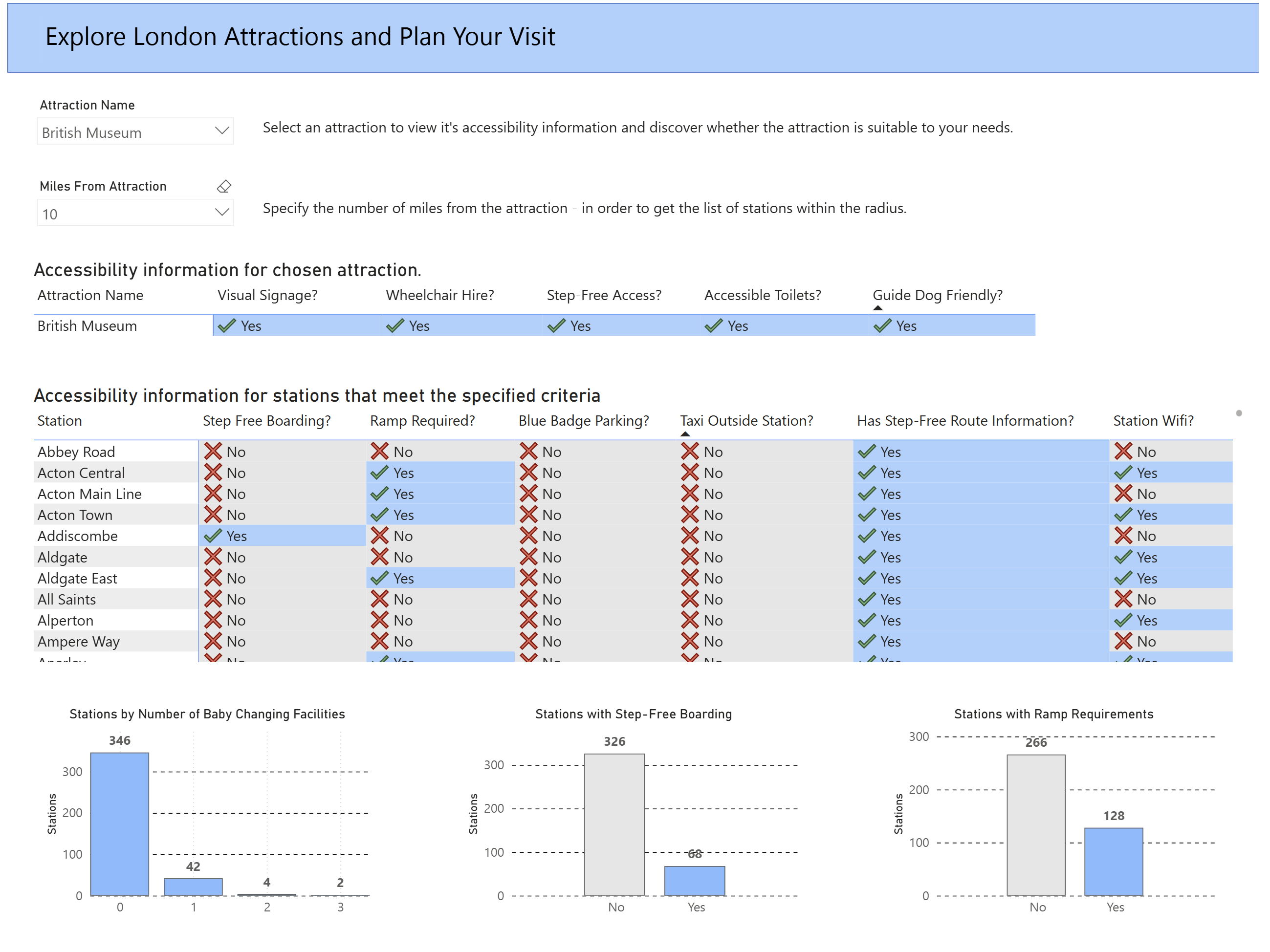
The biggest challenge was by far getting the DAX calculations for spatial analysis right. It was difficult to get the table filtered depending on the mile radius from the attraction, but in the end I got it working. The bar charts are also filtered depending on what is in the table view at the time.
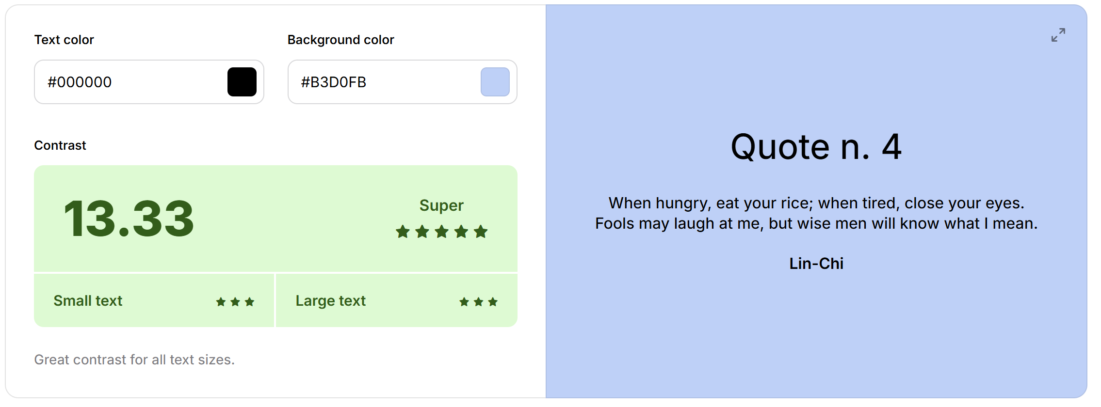
Although I'm not a huge fan of the colour scheme myself, it passes the "colour contrast test" (as shown below). I suppose whether I like the colours or not isn't important, but whether someone with colour-contrast blindness is able read it. So I was happy to stick with it.
The table is coloured depending on whether it's "Yes" or "No", whilst also having a tick or cross. This is just to try and make it as accessible / readable as possible.
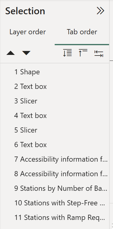
The dashboard also incorporates a tab order. A tab order is for people who only use keyboards and need the tab button to navigate. A tab order specifies what order your selection will go in if you press tab. I configured my tab order so that the user journey is logical - selecting the filters/parameters first and then moving onto the tables / charts.
Overall I think I was able to hit all accessibility requirements in the brief whilst also providing some functionality to the dashboard.
With a bit more brushing up, maybe it could actually be useful!