The Brief
For our third project this week we were given two days, which meant the expectations were high.
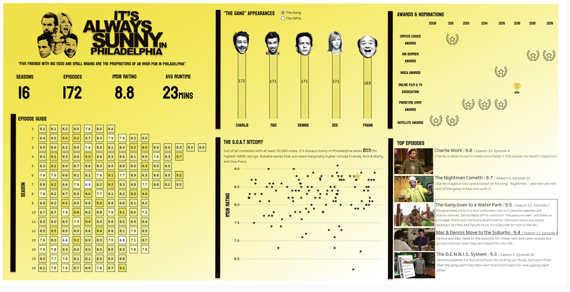
Following the reoccurring Summer theme - were given the task on making a "Summer" infographic based on TV. The data we were provided with was IMDb data from the #Data-TV Tableau challenge.
A big challenge for me was actually deciding what TV series to use for my infographic. I'm not a big reality TV fan so a lot of the common ideas such as Love Island etc. didn't appeal to me. It took me a couple hours of delving through the data and finding something I was really interested in.
After careful deliberation I decided to go for one of my favourite TV shows of all time - It's Always Sunny in Philadelphia. To be honest, the only Summer theme within this show is the fact it has "Sunny" in the title. I was willing to take a sacrifice on the brief in order to use a TV show I loved (I only did this because it was kind of a personal project - I promise!)
The Process
Because the goal of this project was to make a creative, infographic style dashboard, I decided to use Figma. I used Figma to create the background, titles, and any images.
One of the biggest challenges with Figma was making sure everything lines up with what you're creating in Tableau. Altering the width and height of the Figma sheet so that it lines up with my Tableau dashboard proved to be slightly frustrating.
After lots of fiddling around my Figma background looked like the following:
One thing to notice when using Figma, most of the time you'll end up floating your worksheets (which is not best practice).
One graph which I really wanted to recreate was the classic IMDb episode guide that you often see on social media. This graph is essentially a breakdown of episodes and seasons, coloured by how highly rated each episode is. My recreation ended up looking like this:
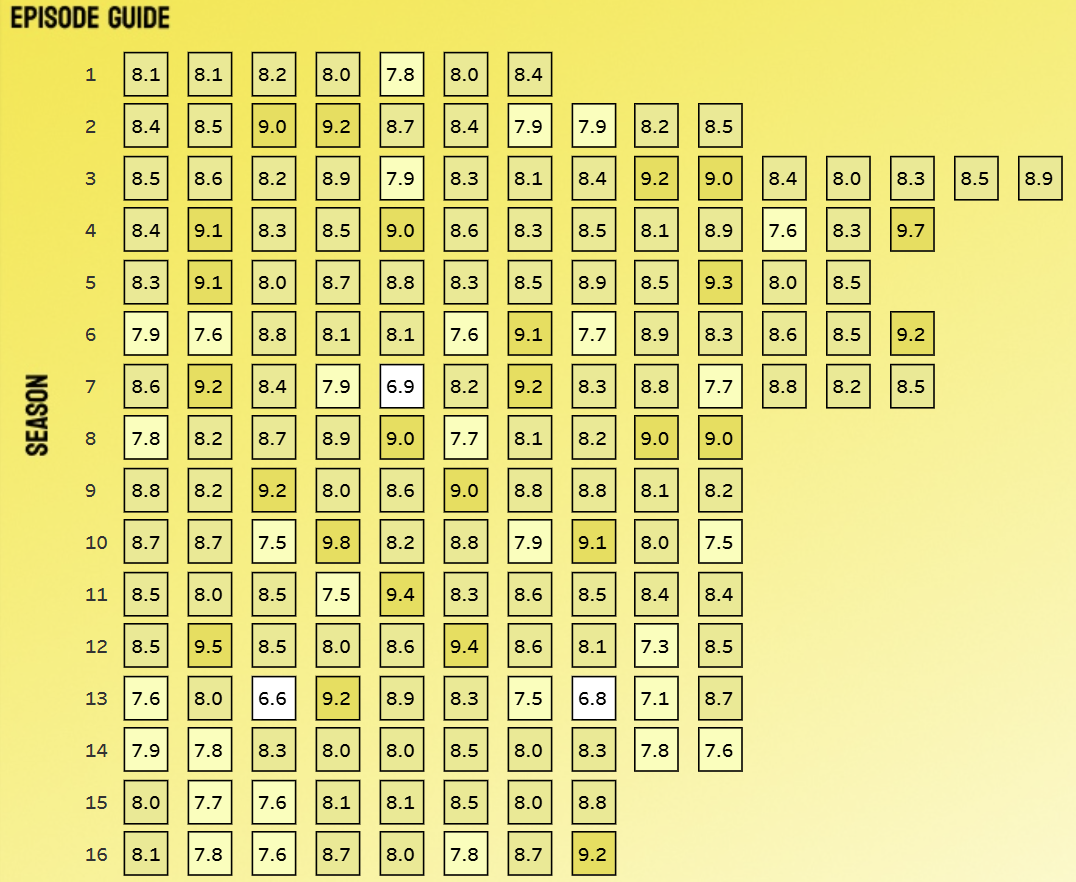
I kept the classic yellow and black "It's Always Sunny" theme throughout and tried to make the colours consistent.
In the end I think the dashboard came out quite well.