When do we use zones?
I recently had client work with a professional football club who wanted to see how player metrics differed between specific zones on a football pitch. I quickly discovered that in order to create these mapped zones in Tableau, you must utilise the polygons mark with specific X and Y co-ordinates.
Creating these mapped zones are not only useful in football analysis, but in sports analysis as a whole. Professional cricket teams, basketball teams etc. may want to split their pitch/court into zones and identify which areas their players are most/least effective in.
Similarly these polygon zones can be used for other forms of spatial analysis, such as mapping out specific geographical zones in London for example.
What do we need to create zones?
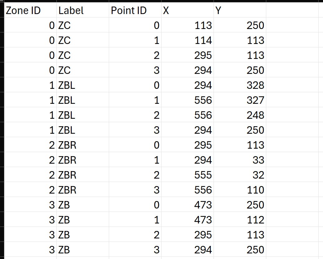
1) Shape/Zone ID
An ID serves as a unique identifier for each zone, this will allow Tableau to identify how many zones are being mapped out once you drag it onto detail.
2) Shape/Zone Label
This allows you to label each zone and identify which zone is which.
3) Point/Path ID
A point ID will allow Tableau to identify each corner of the zone, and where to draw lines (the path) between each one.
4) X & Y Co-ordinates
These are the co-ordinates for each of the points (identified by your point ID) so Tableau knows where to map all of the points for your zones.
Getting the data
In professional settings you should be provided the pitch data where the specific zones are laid out or the precise co-ordinates of the pitch.
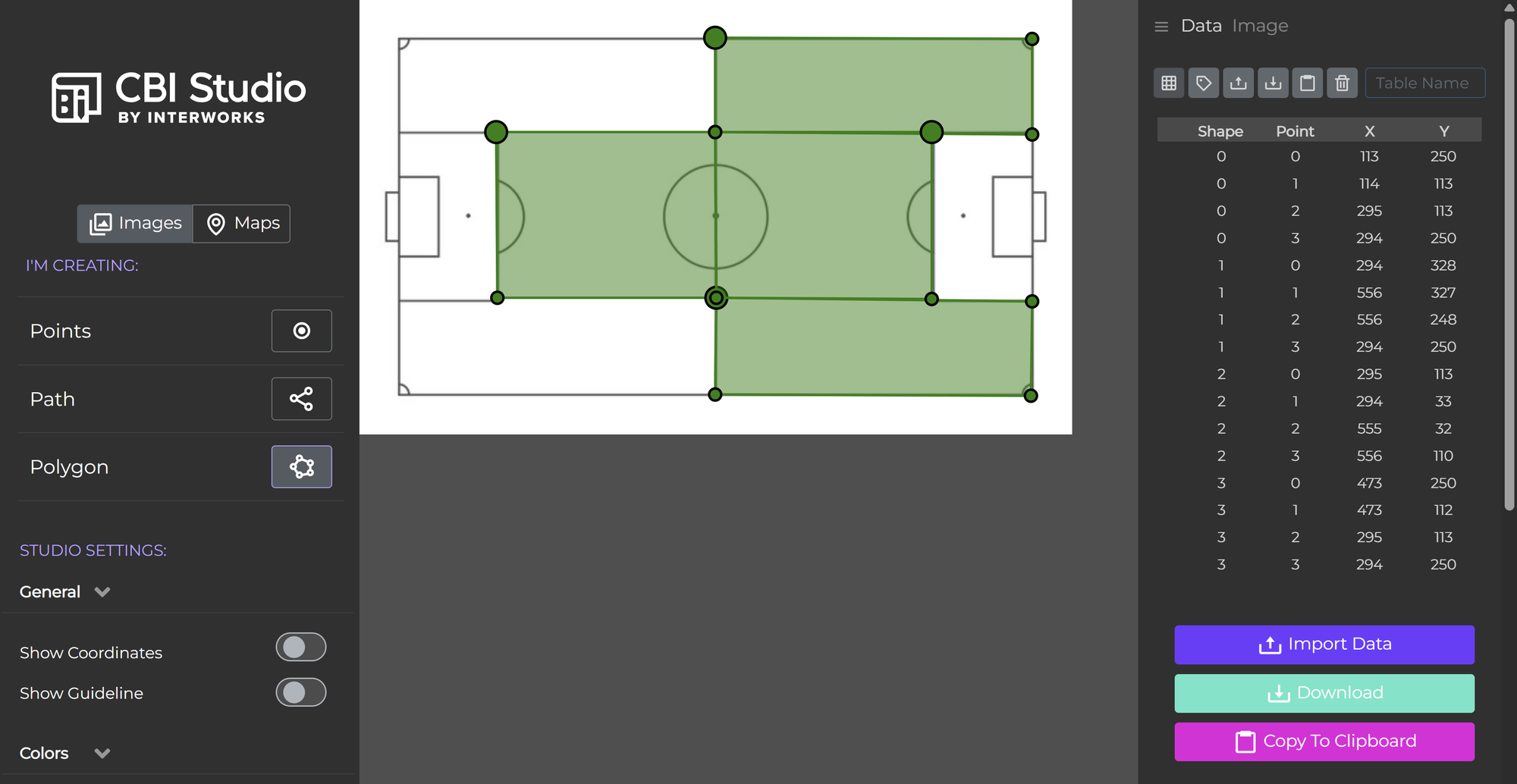
If you do not have the co-ordinate data you can use online tools to help you map out any images you may have.
This website below allows you to import images or maps and provide you with co-ordinates for where your polygons lie.
cbistudio.interworks.com
This is one I made using this tool for this demo:
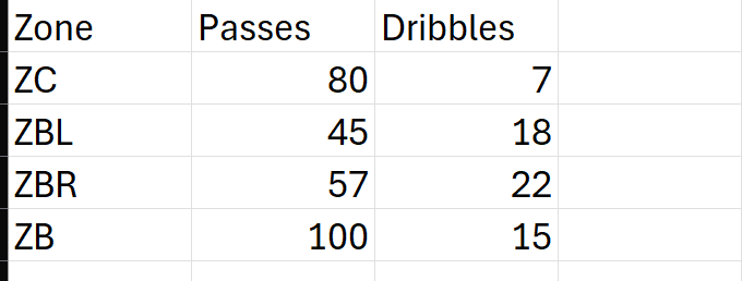
Your data should look something like below - perhaps you have another data table outlining how many shots, passes, dribbles etc. happened in each zone.
Mapping in Tableau
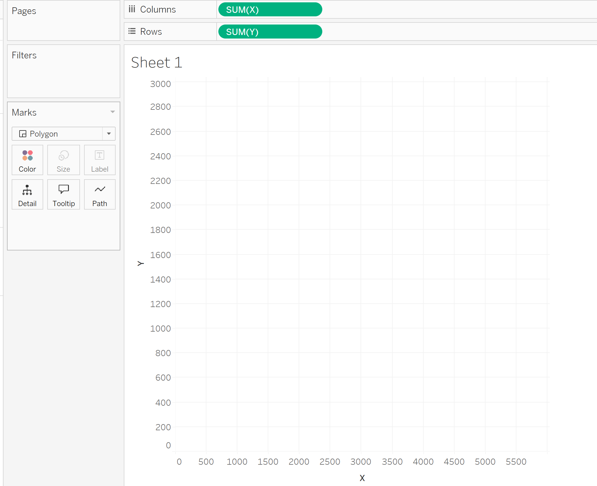
Step 1 - X & Y Co-ordinates
Drag your x and y co-ordinates onto your rows and columns. Which way you do it will change the pitch view to either horizontal or vertical. I have my X on columns and Y on rows - therefore my pitch is in a horizontal view.
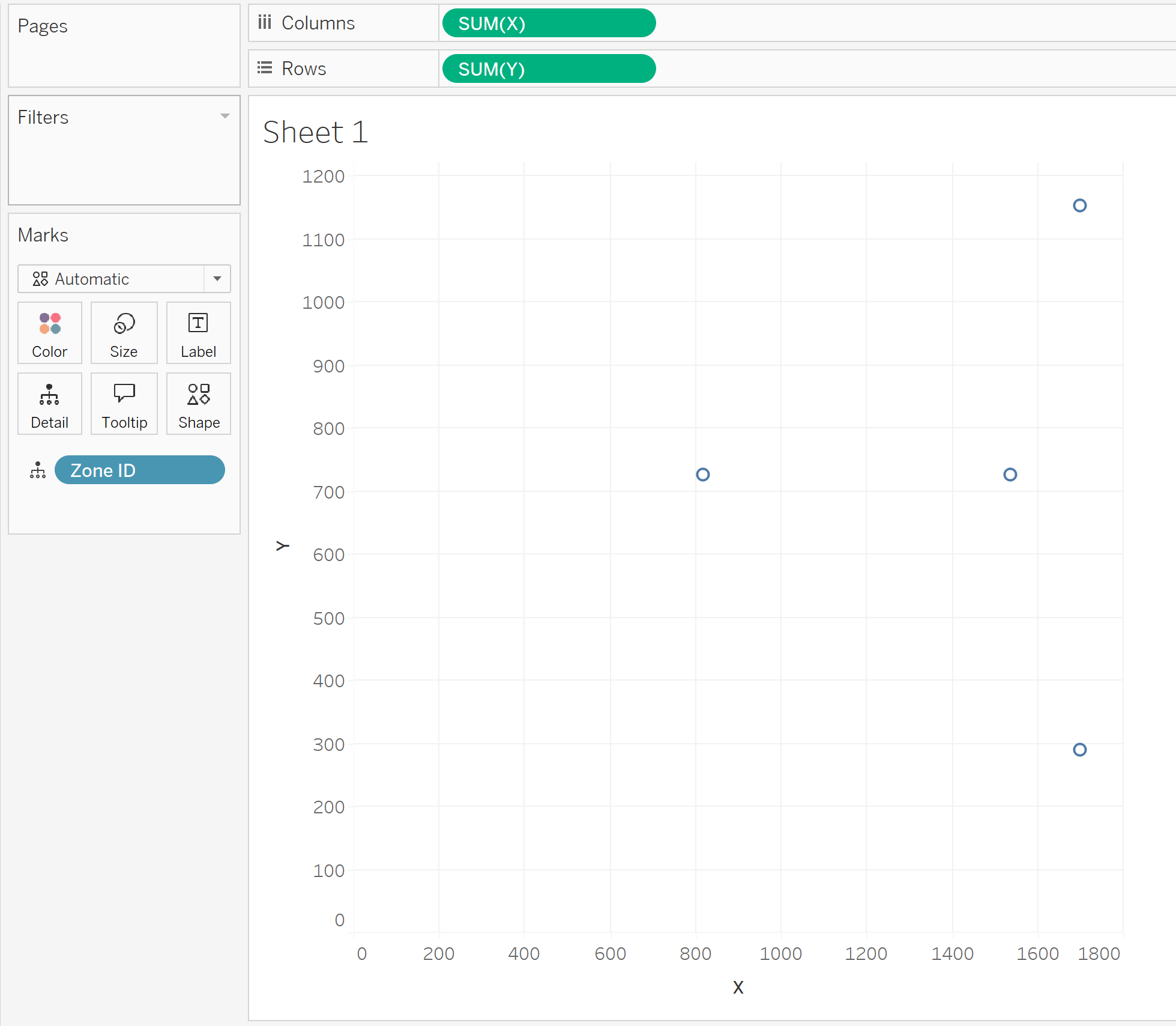
Step 2 - Zone ID
Drag your zone ID onto detail - you should now have a different point on your graph for each zone.
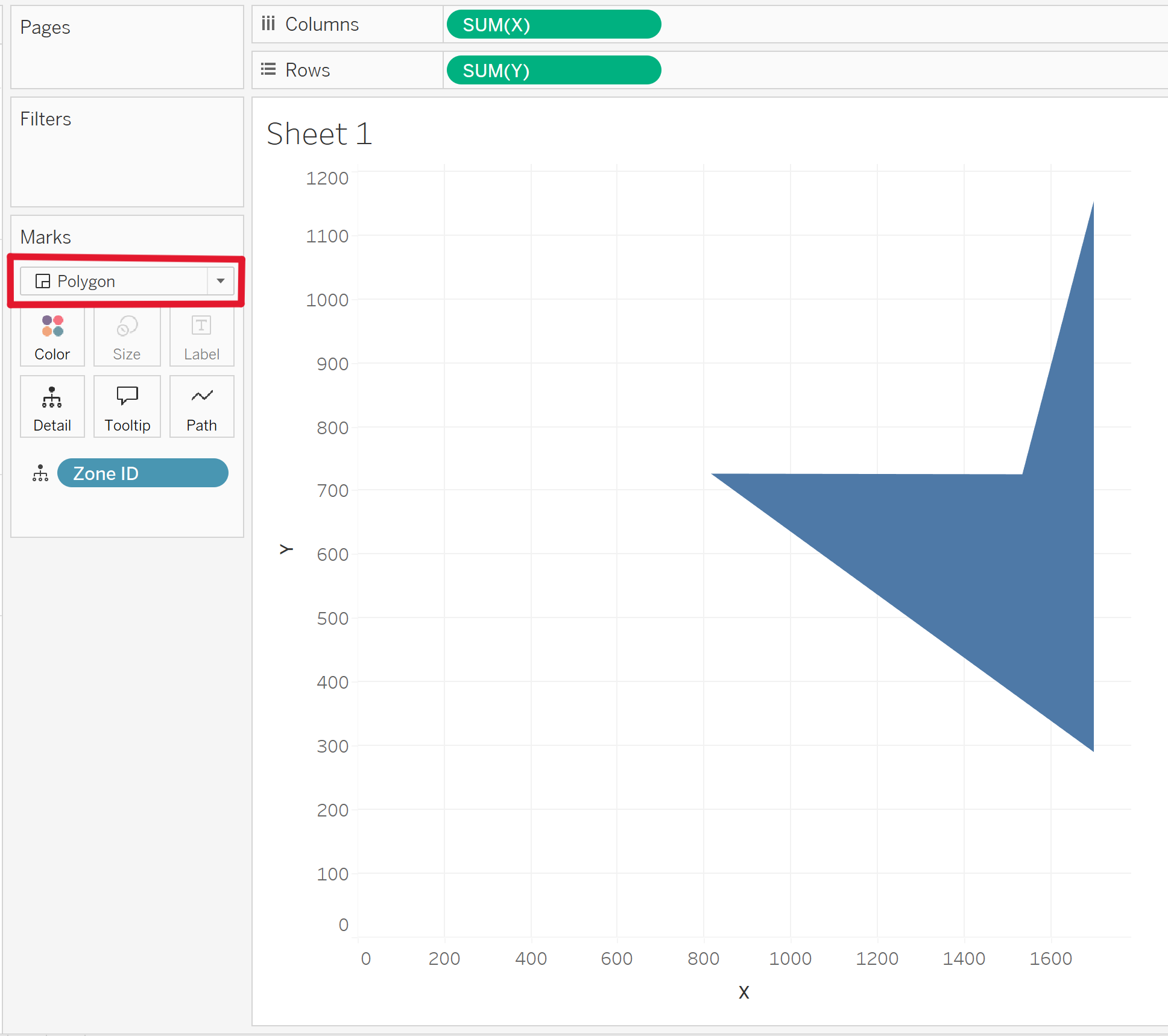
Step 3 - Polygons
Change the marks type to polygon on your marks card.
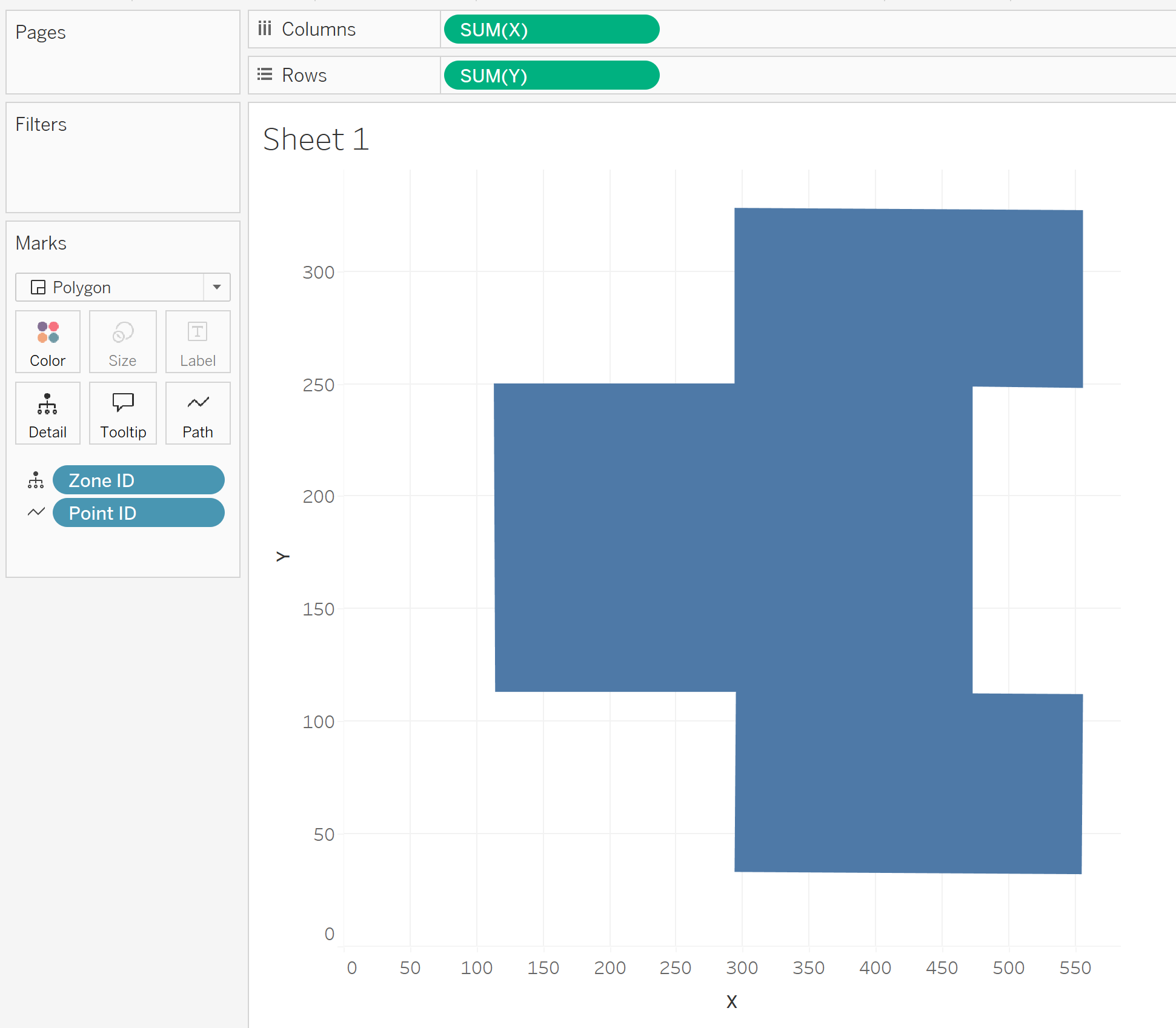
Step 4 - Point ID
Now that you've specified the mark as polygon, you'll have the option to drag something onto "Path". This is where your point ID will go.
Mapping The Football Pitch On
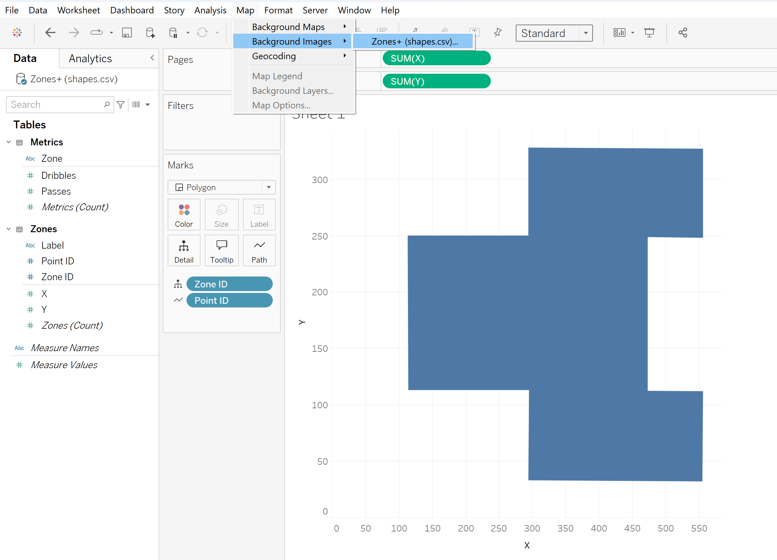
To map an image in the background of your chart, navigate to the "Map" pane at the top, navigate to "Background Images", and select your data source.
A background image pane will then pop up, select "Add Image".
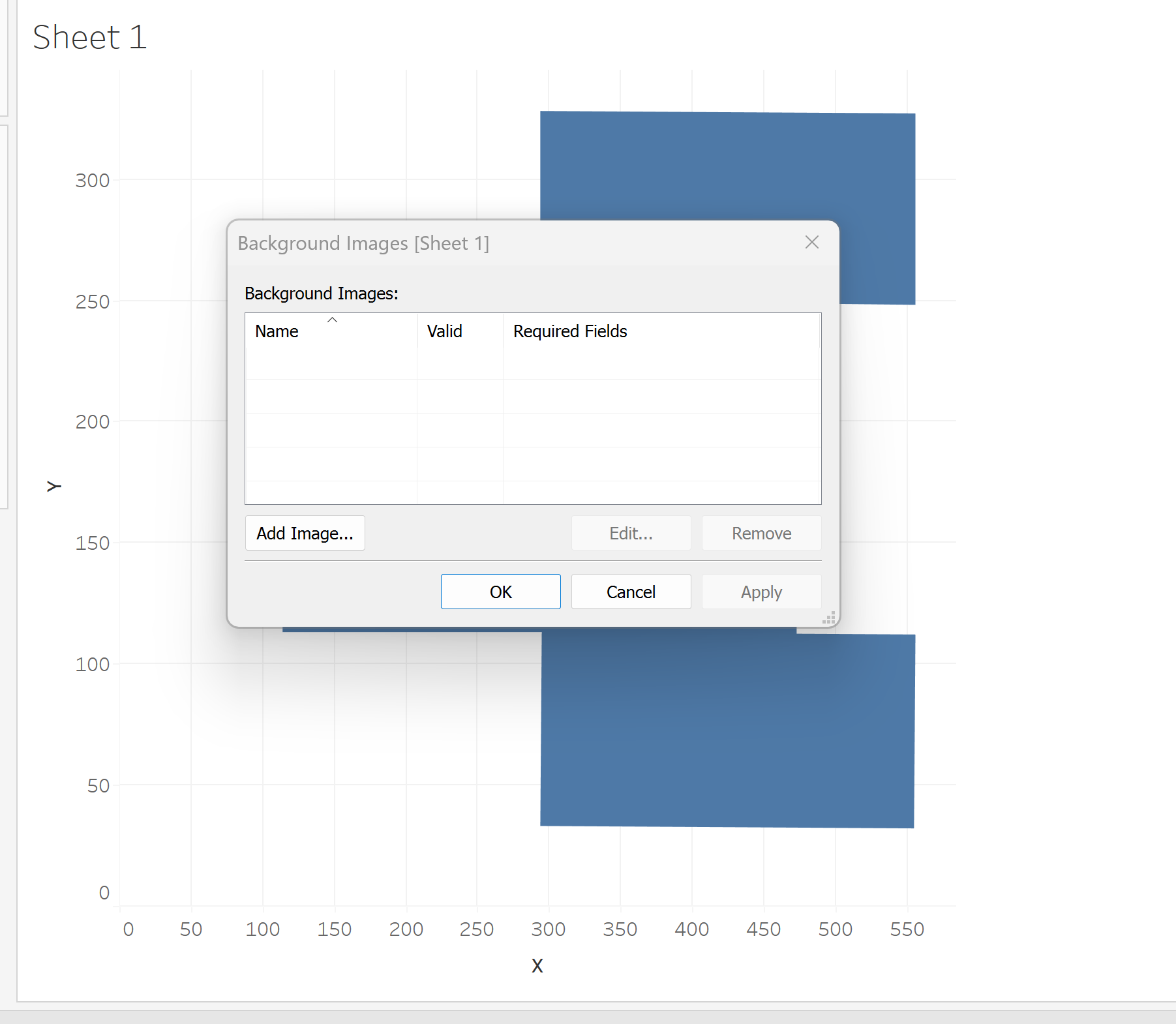
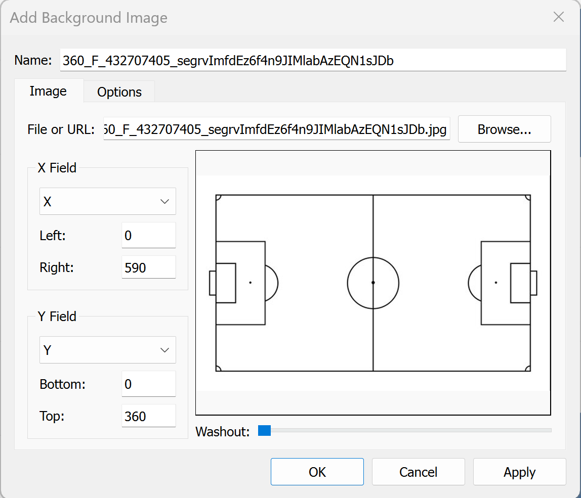
Here you can add the file or URL of your football pitch image.
You must then map the image in correspondence with the X and Y axis of your chart. Sometimes it may take a bit of trial and error to get the co-ordinates to link up with your chart - but ideally the values should be the min/max of each axis.
In this pane you can also edit the washout of your image.
Click OK!
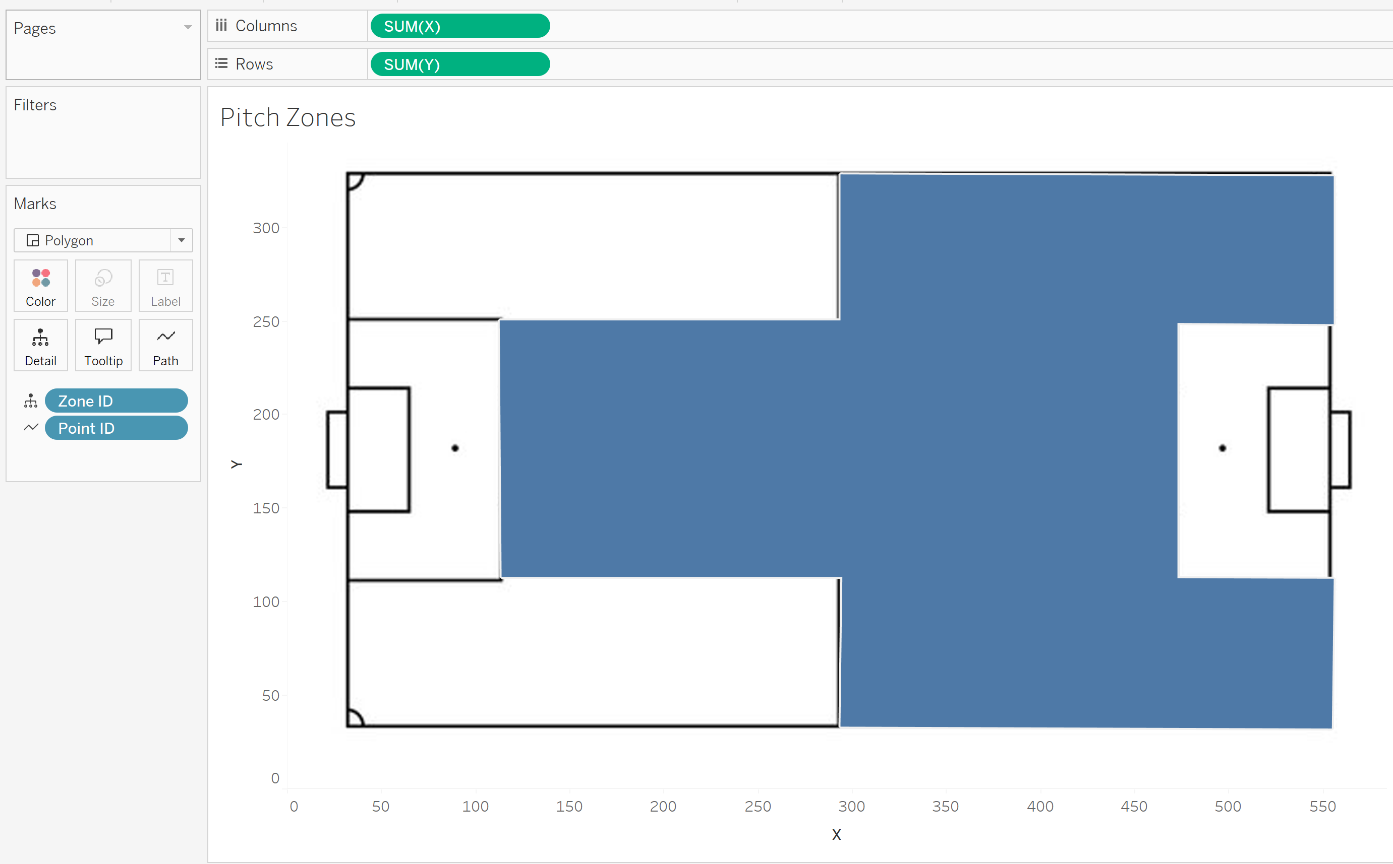
Our pitch now looks like this:
Adding Labels
If you want to add labels you have to make sure your X and Y co-ordinates are set to AVG and not SUM.
If you are working with a single axis then SUM is ok, but when working with a dual axis (which is needed for labels) it must be AVG otherwise Tableau won't like it, so make sure your aggregation type is changed.
Duplicate your X axis (hold down ctrl and drag it next to itself).
You will now see a second marks card appear - on mine it is called AVG(X) (2).
Change this mark type from Polygon to Circle.
Remove the Point ID from this new marks card and add your zone label to "Label". If you don't remove the Point ID then you will get a label for each corner of each zone.
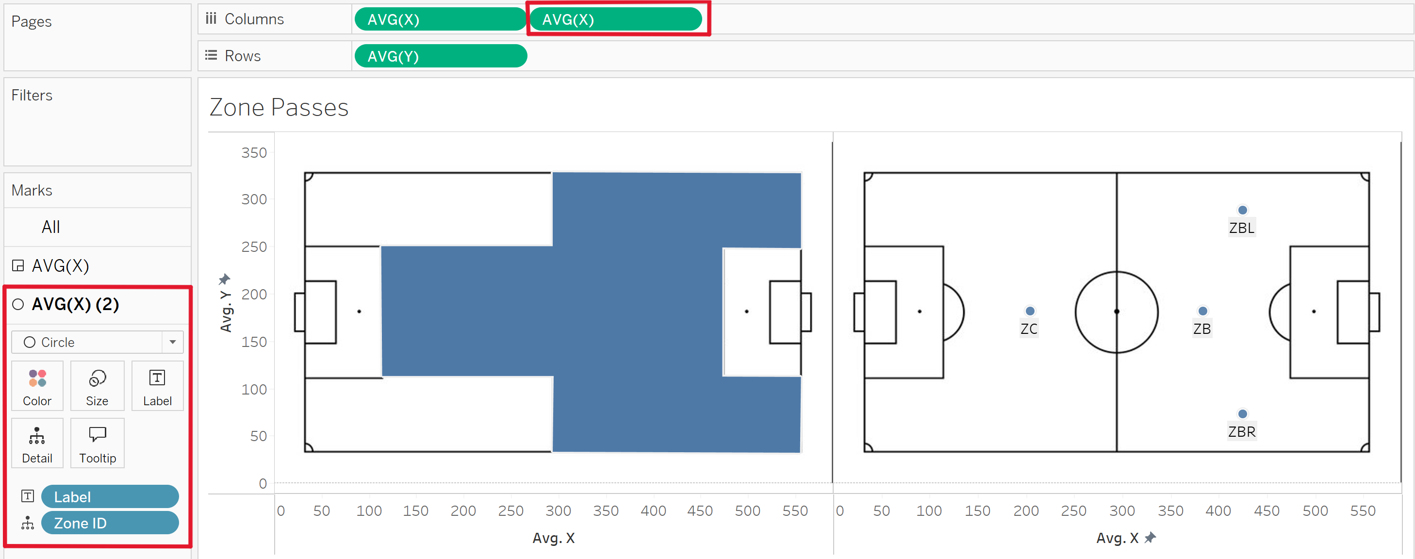
Dual-axis the charts.
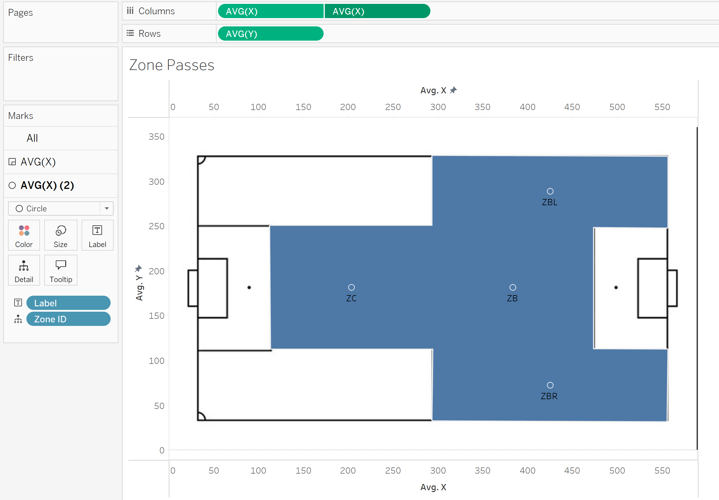
Format and change to your desire!
You now have a mapped out and labelled pitch with your specific zones, congratulations!
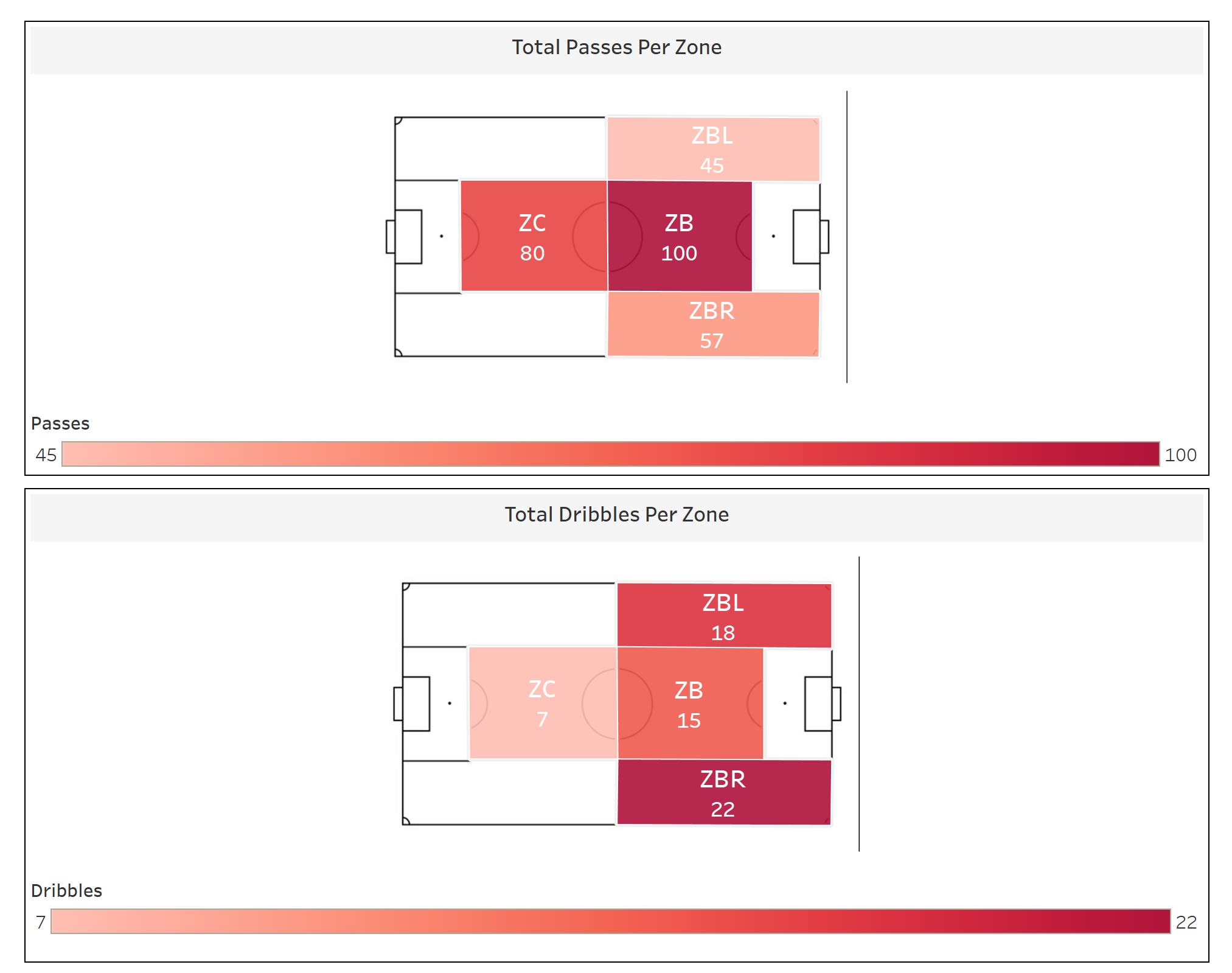
Now you can format the chart in any way you like and add any metrics onto the "Colour" mark to visualise the frequency of your metric in each zone.
Here are two examples I made for passes and dribbles: