


When would you use a control chart?
A control chart is used to monitor a process over time. It is a powerful tool for monitoring non-random variation, and always has a central average line, upper control limit, and lower control limit.
This blog will take you through the process of building one in Tableau - in this example we'll analyse how road traffic casualty age has changed over time.
Step 1 - Make the skeleton
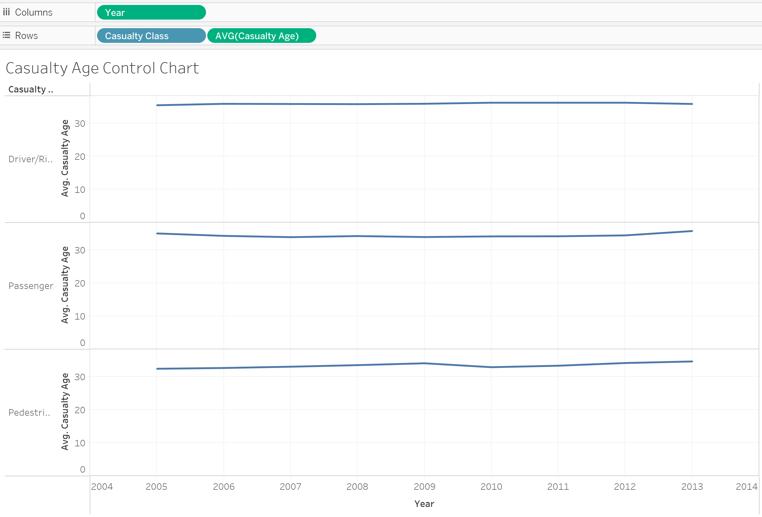
- Place your time field in the columns and the field you want to measure in rows.
- In this case I've also placed "Casualty Class" in rows because I want to see a different control chart for drivers, passengers and pedestrians.
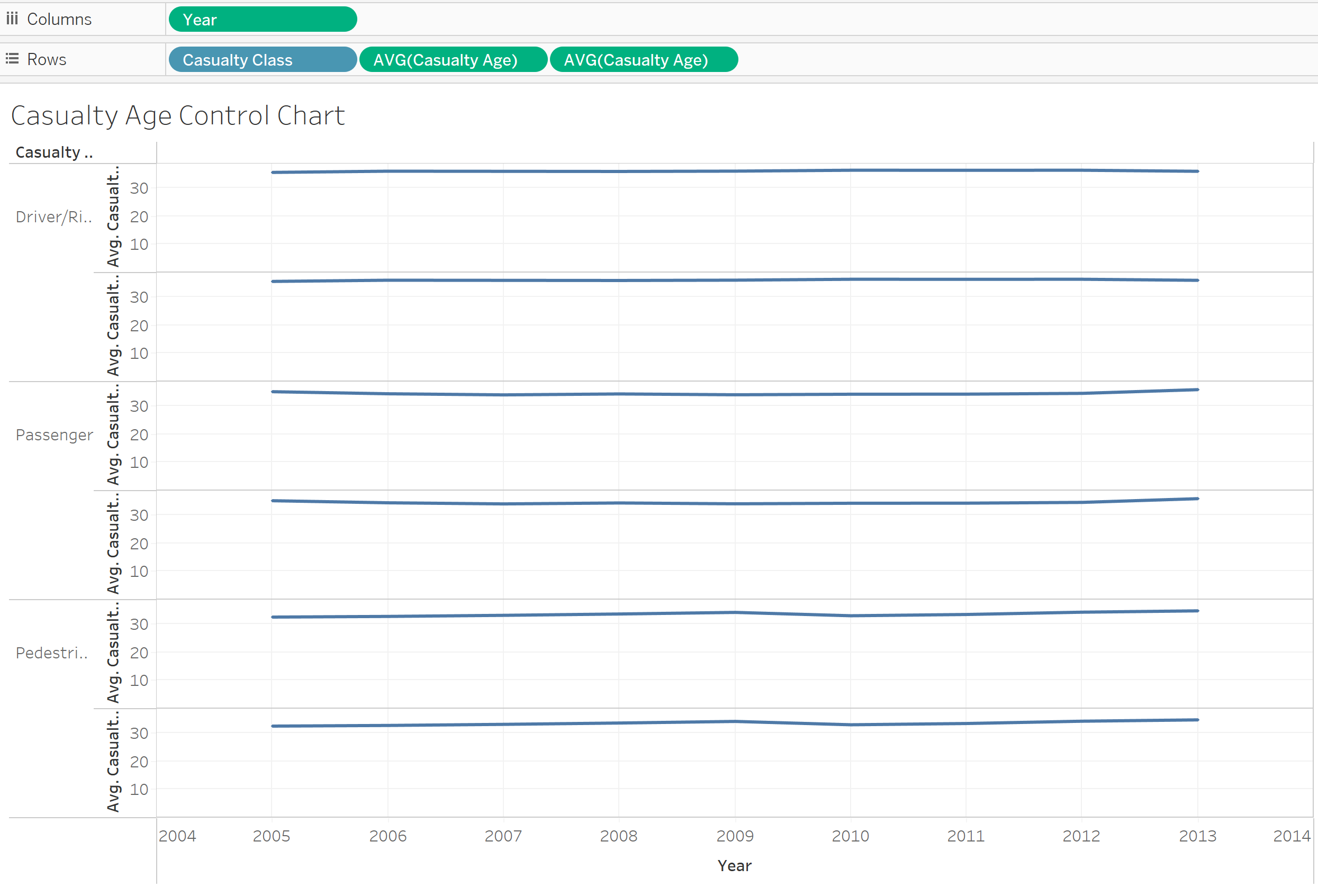
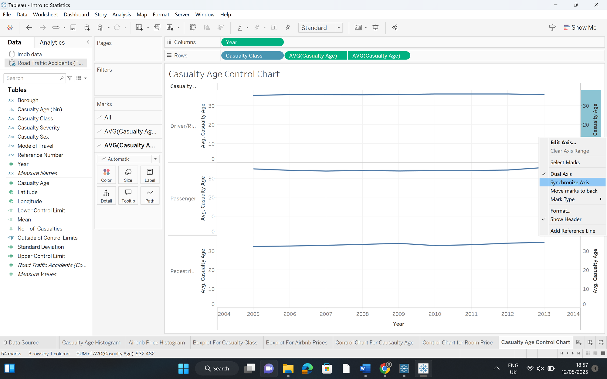
Step 2 - Create and edit your dual-axis
- Duplicate your row level measure (you can do this by pressing ctrl + dragging it to the side)
- Click on your duplicated measure and select dual-axis
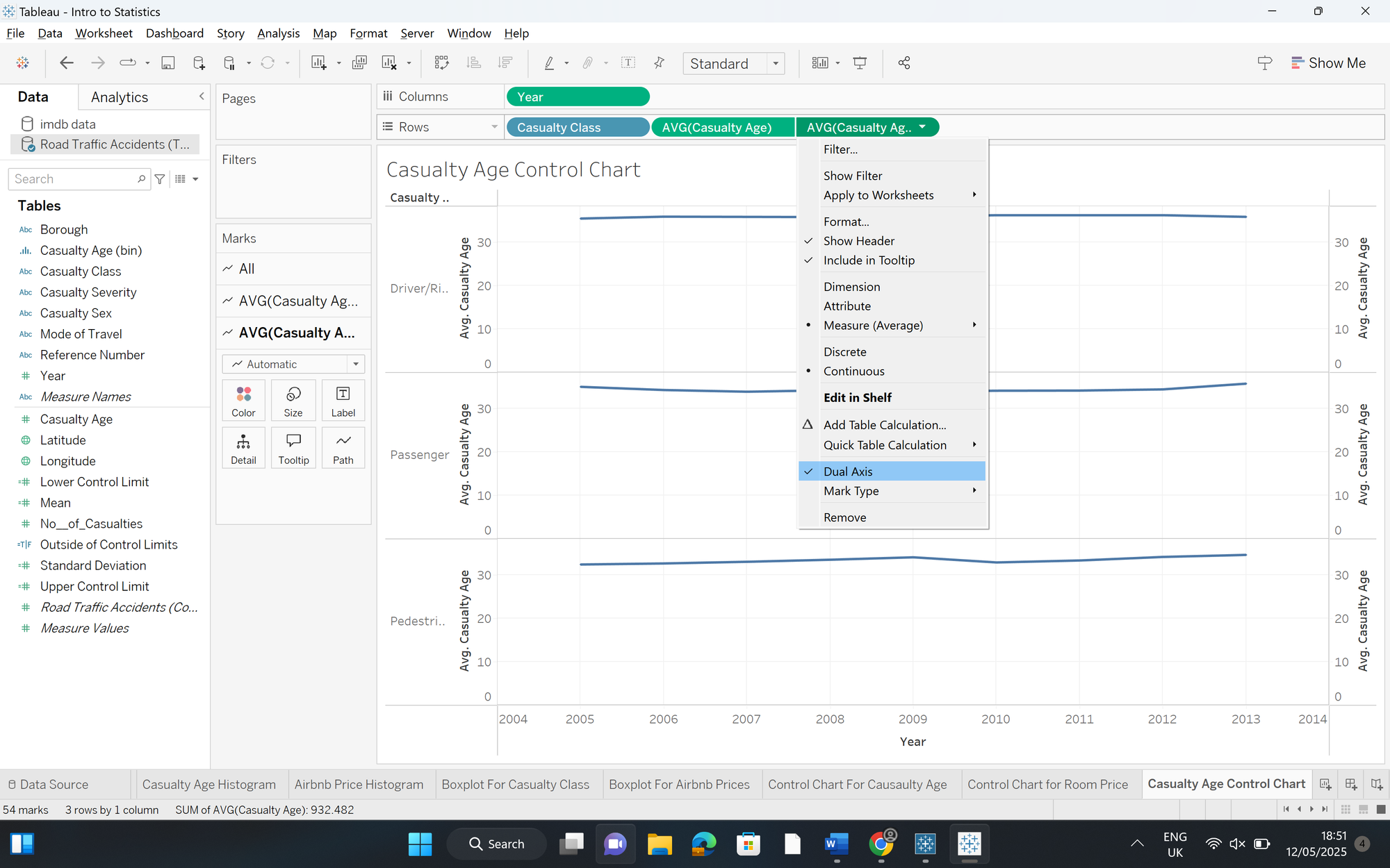
- Synchronise your axis and untick "Show Header" on your right axis.
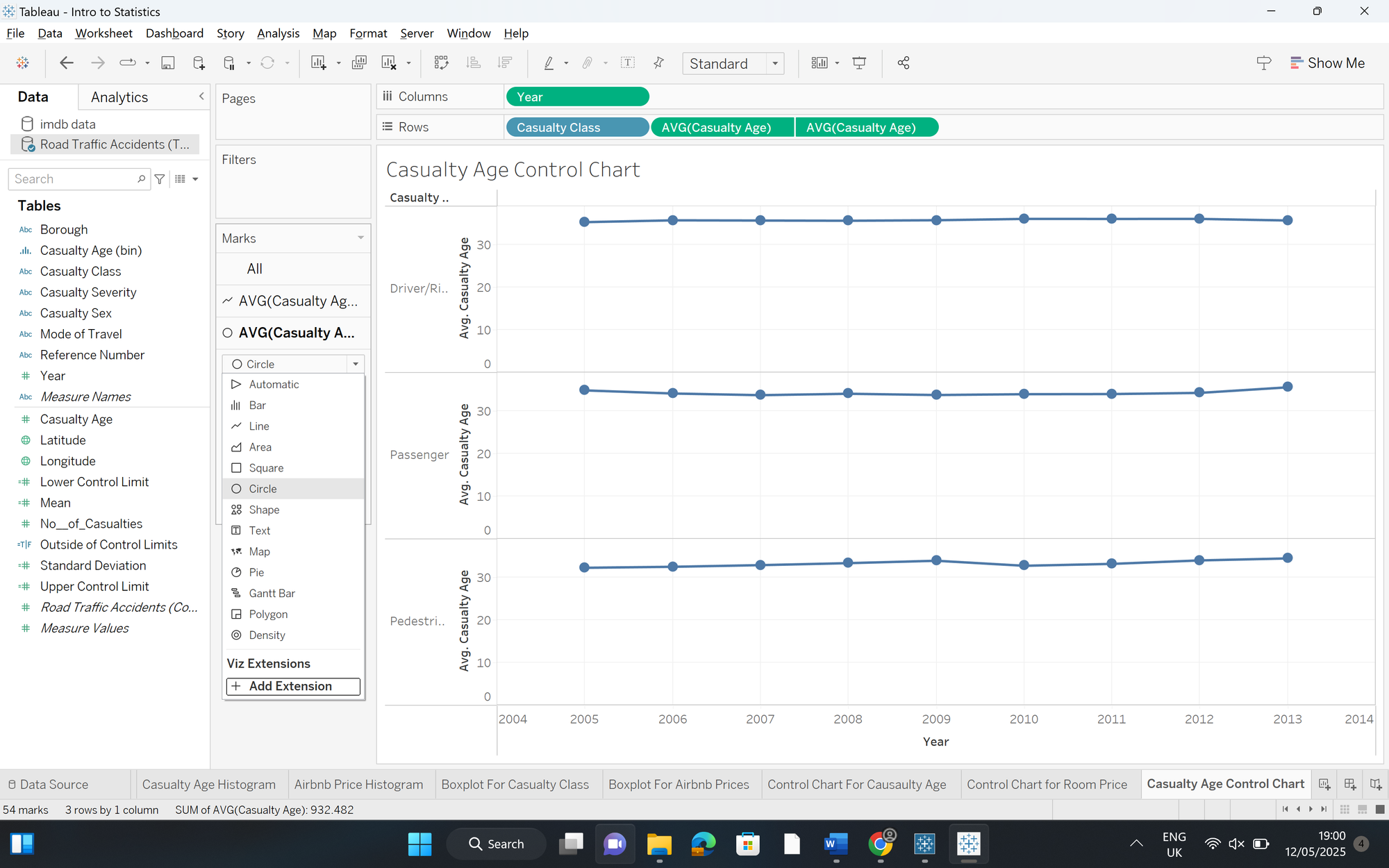
- On your Marks card, change the mark from a line to a circle - edit the size of the circles as you wish.
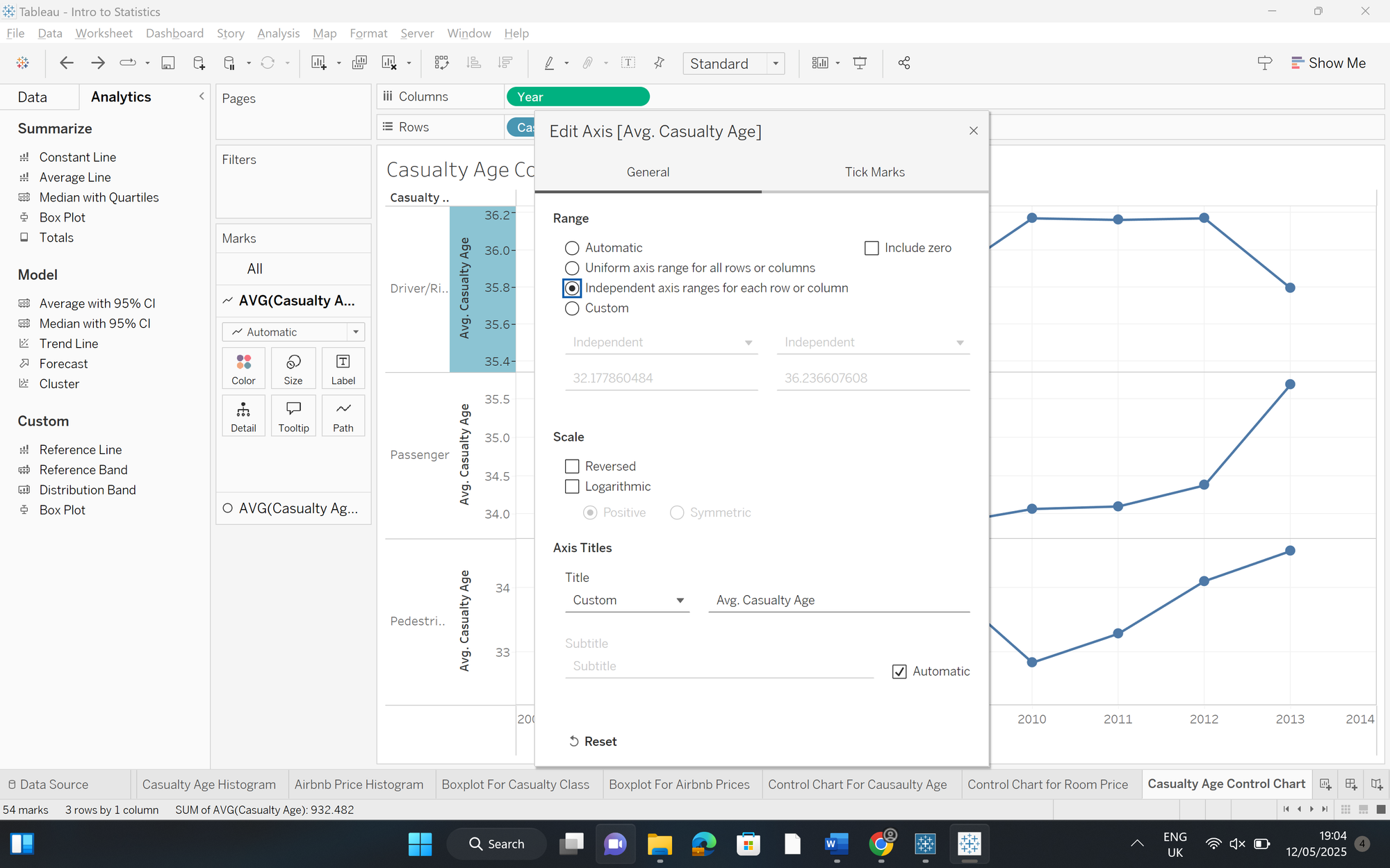
- Right click on your Y-axis and select "Edit Axis".
- Untick "Include Zero" - this will make your data points a lot clearer.
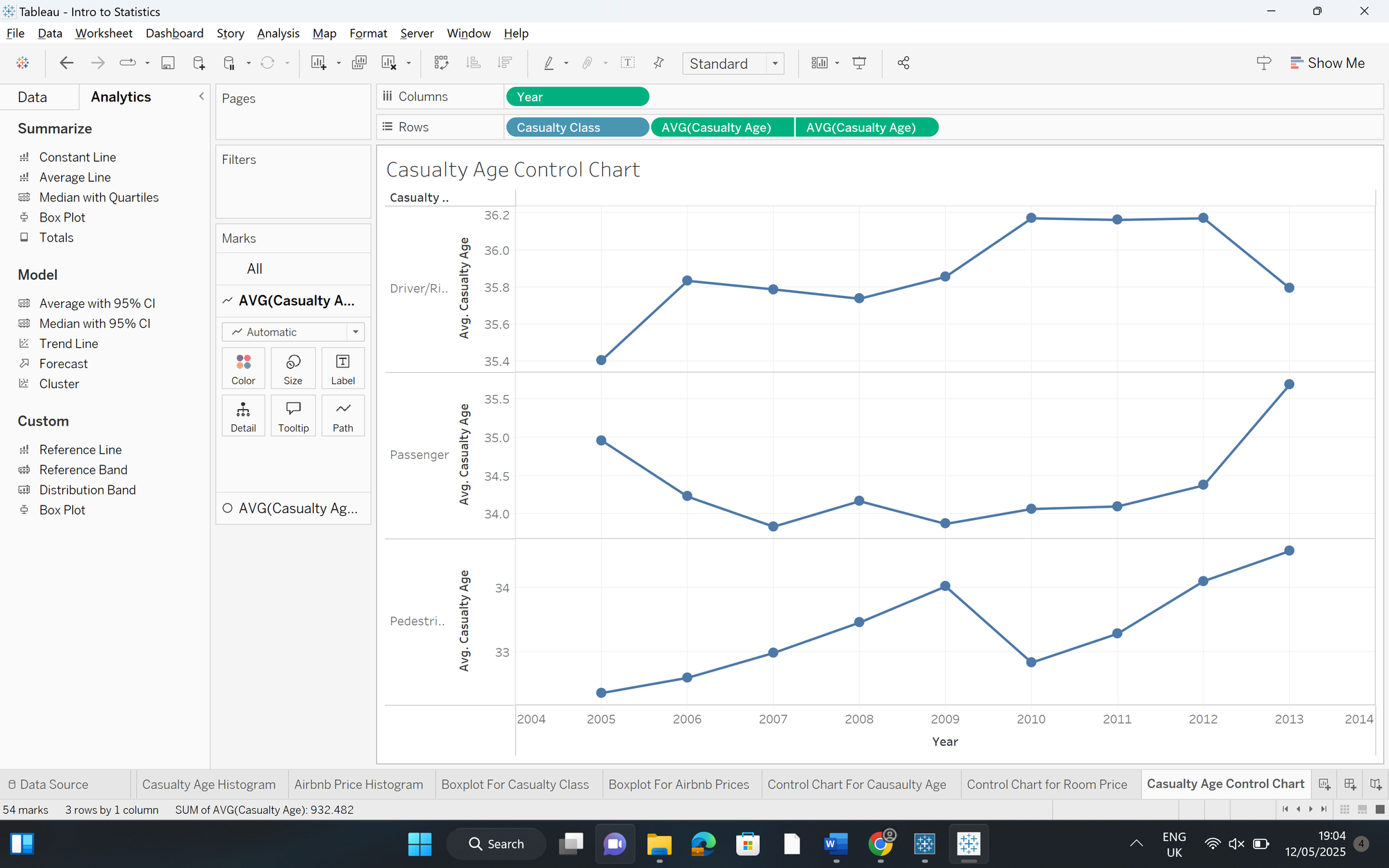
- Change the axis range from "Automatic" to "Independent axis ranges for each row or column" - this will make your data points even more clearer.
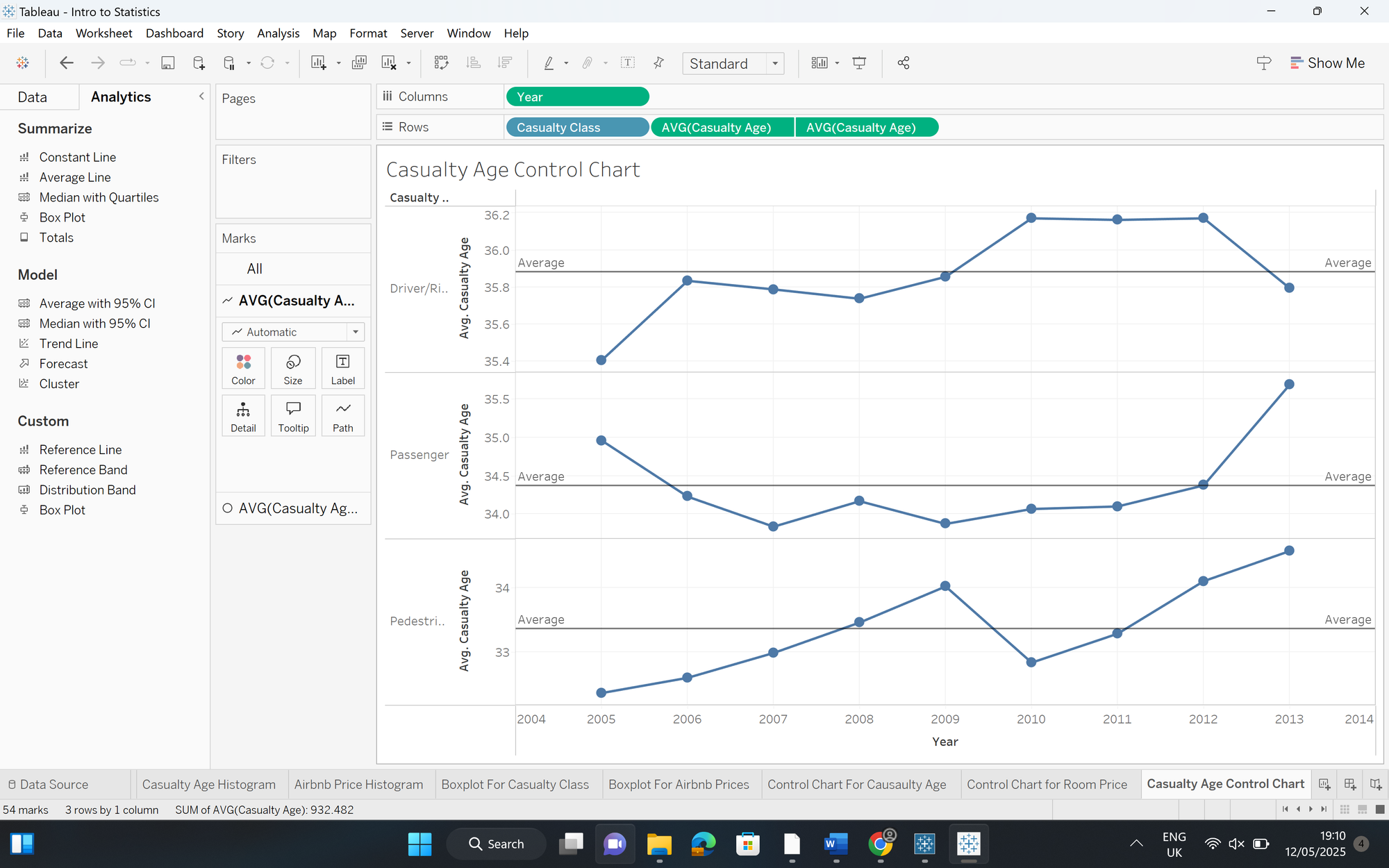
Step 3 - Add your average lines
- In your Analytics pane, drag "Average Line" onto the crossover between pane and your measure - this is because we want to see a unique average line for each casualty age across each pane.
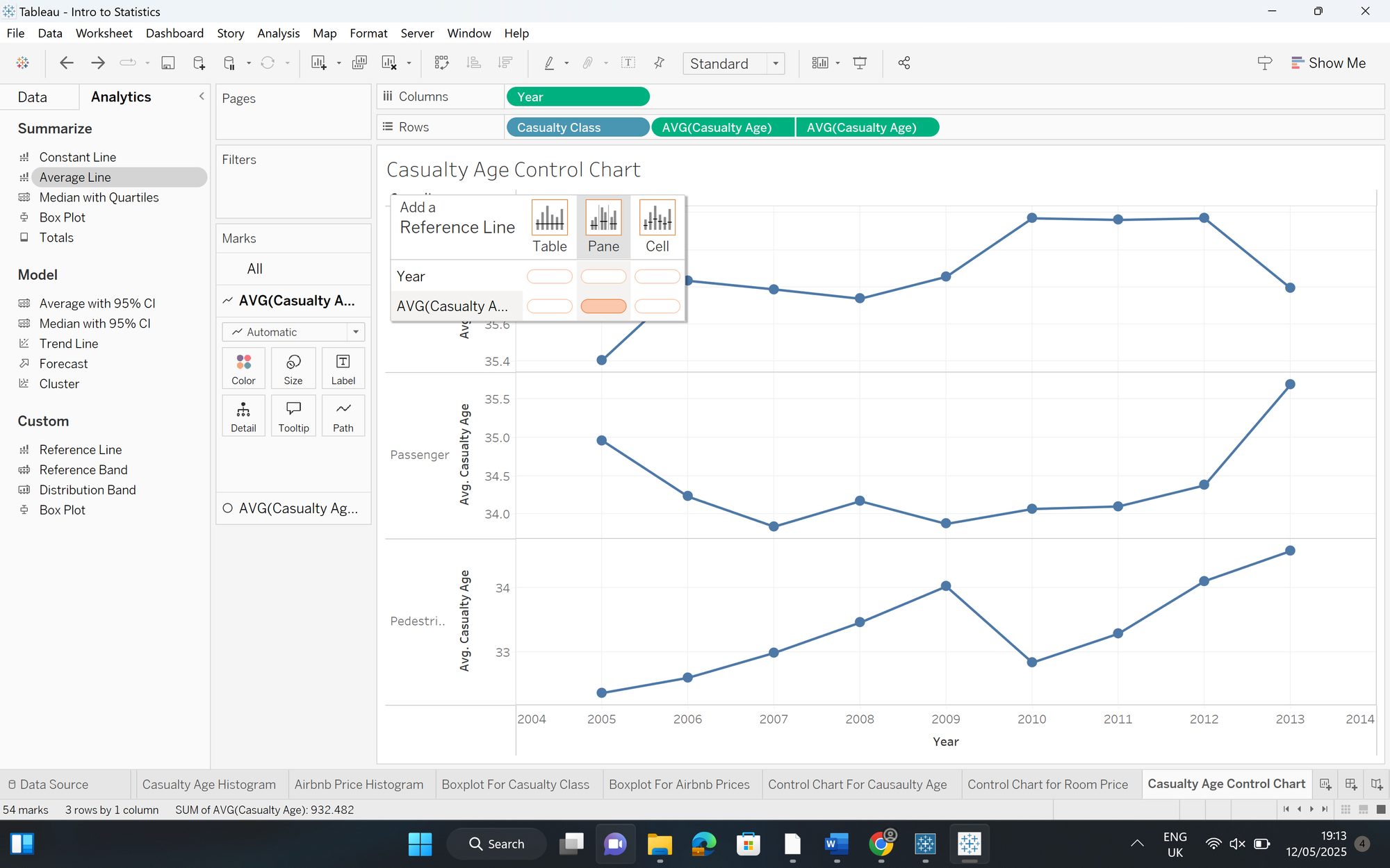
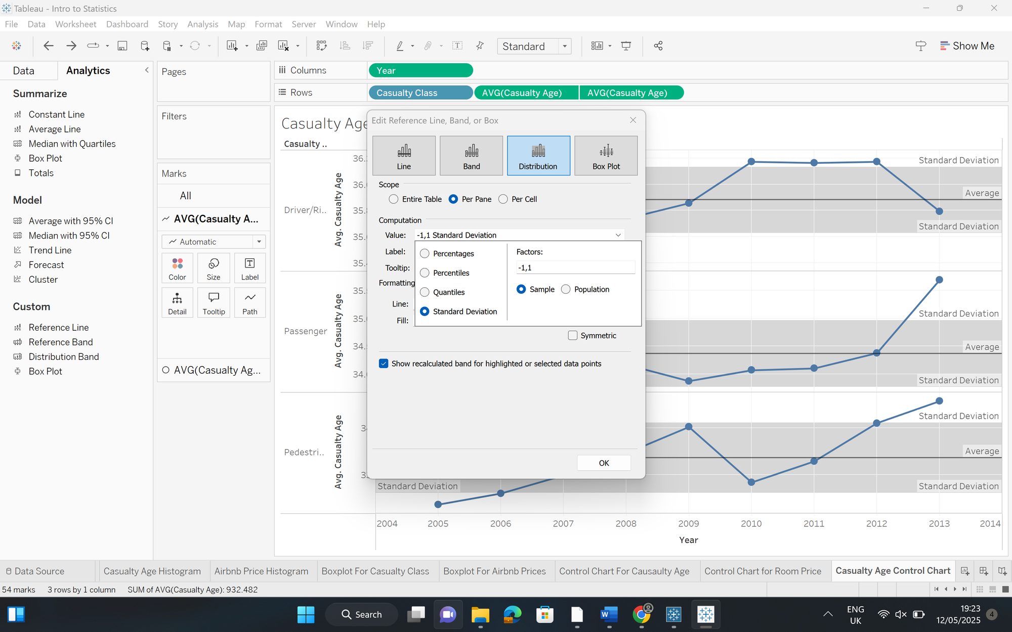
Step 4 - Add your standard deviation reference bands
- In your analytics pane, drag "Reference Band" onto the crossover between pane and your measure - just like we did with the average line.
- Select "Distribution"
- Change the "Value" to "Standard Deviation"
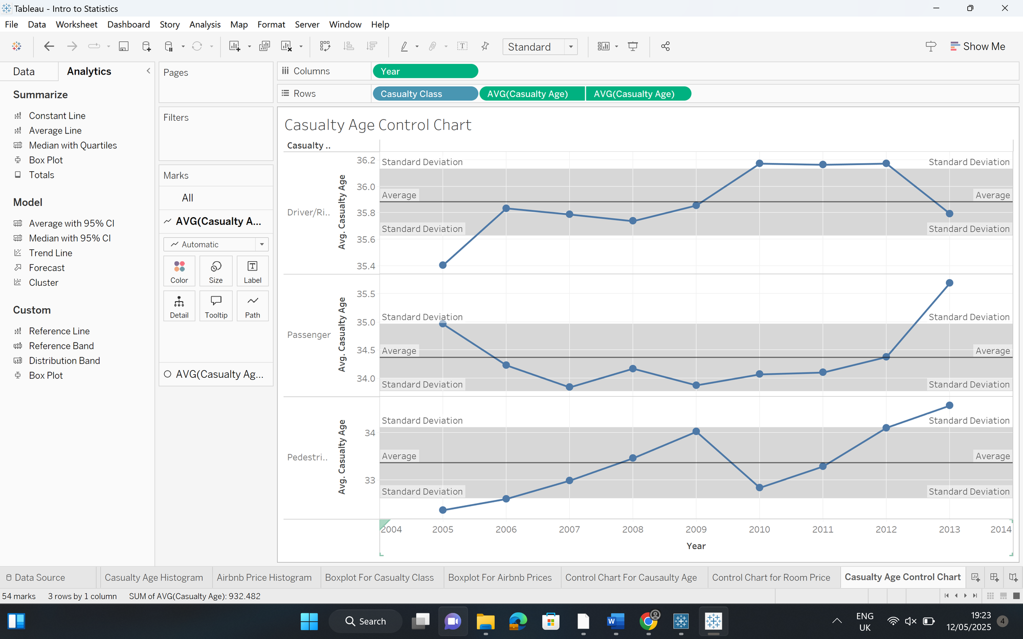
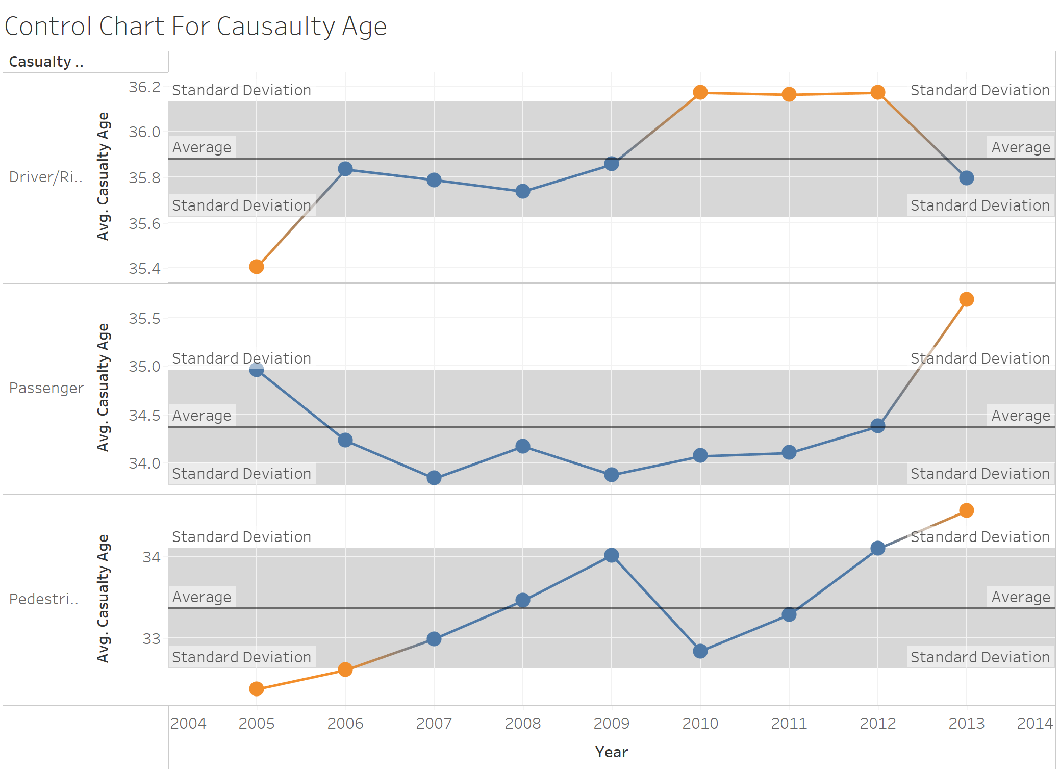
Now our chart clearly shows which data points are outside our upper and lower standard deviation bounds - leading us onto the final step.
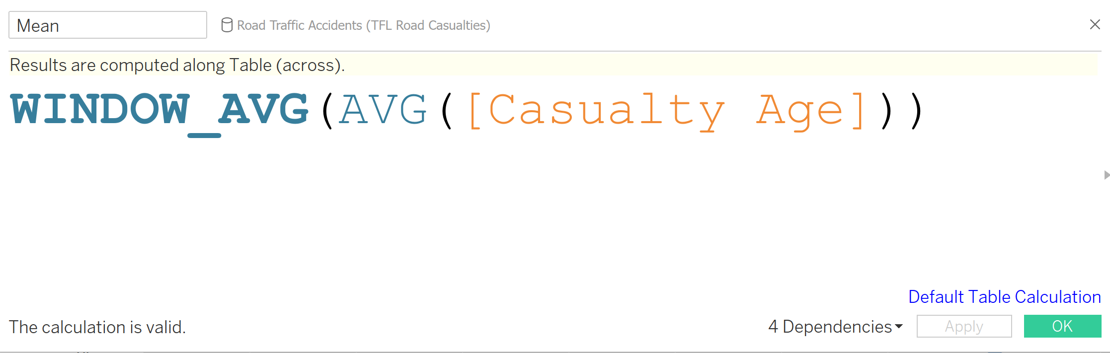
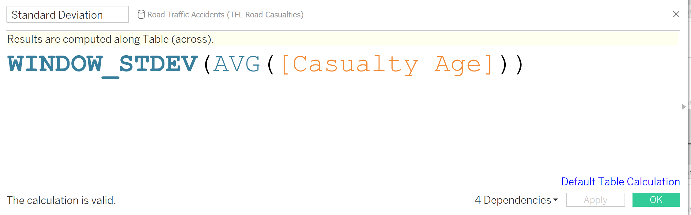
Step 5 - Colour the data points outside your control limits
- Create a calculated field for your mean and your standard deviation using WINDOW_AVG & WINDOW_STDEV
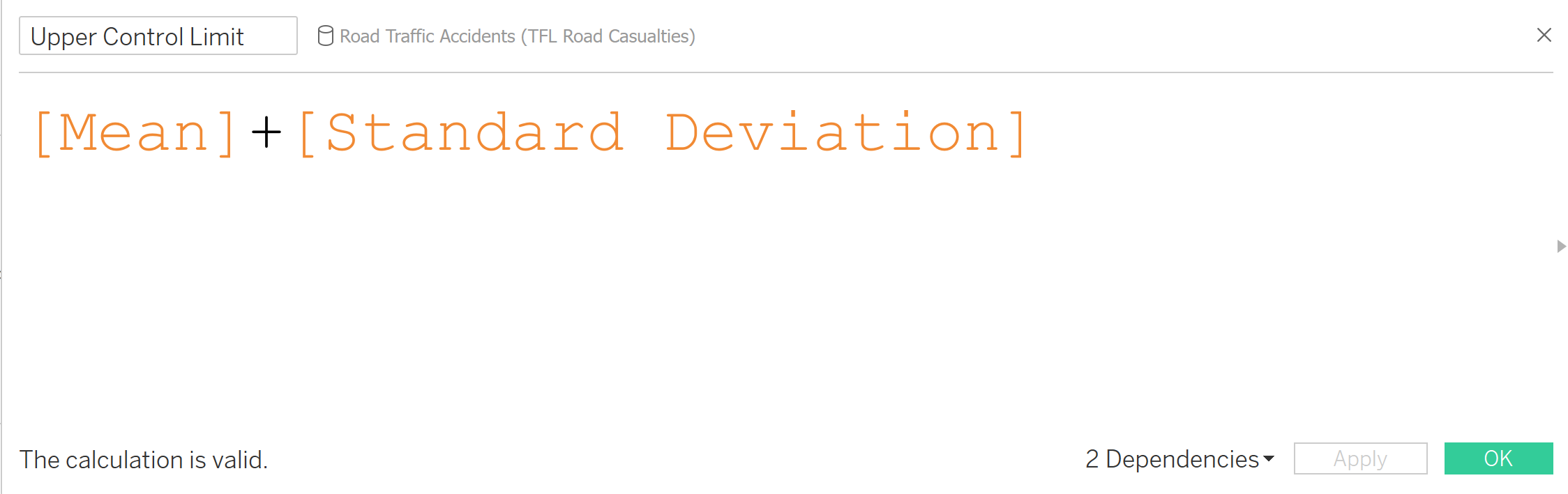
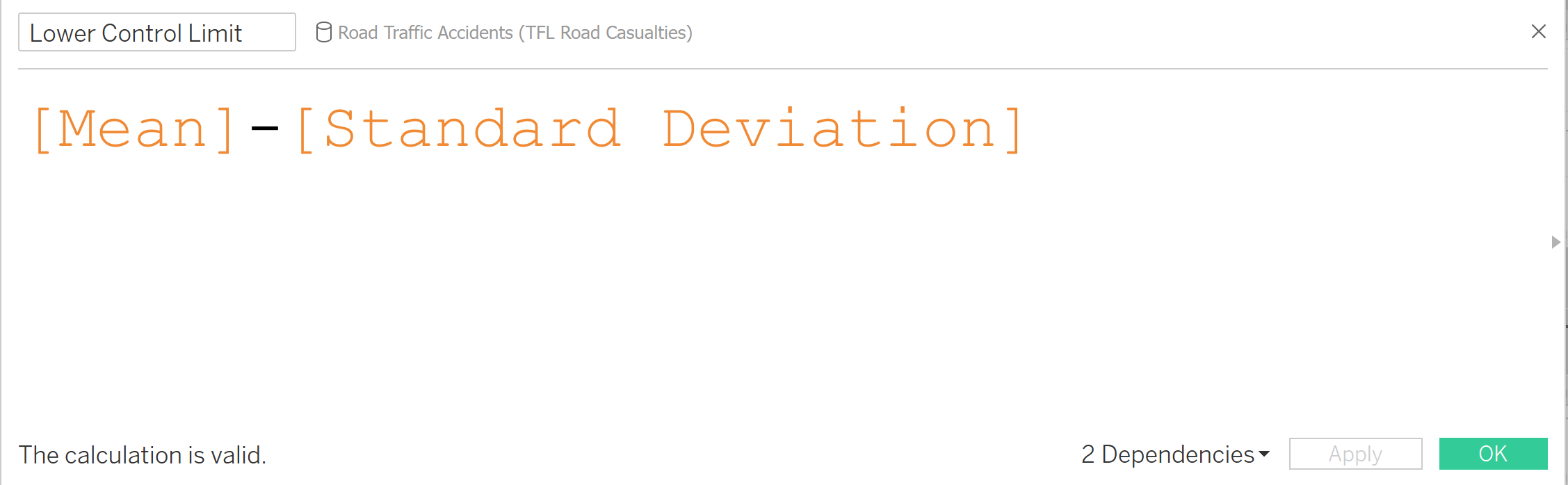
- Create a calculated field for your upper and lower control limits
- Upper = Mean + Standard Deviation
- Lower = Mean - Standard Deviation
- Create a calculated field to determine which points are outside your upper and lower control limits.
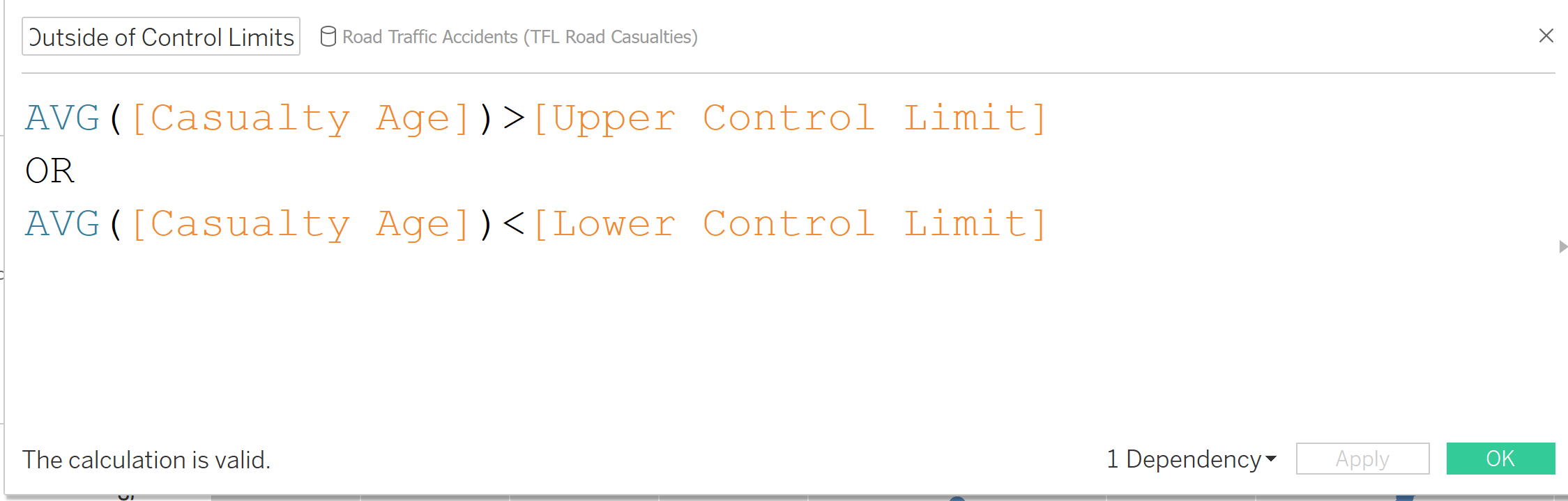
- Drag this calculated field onto colour in your marks card.
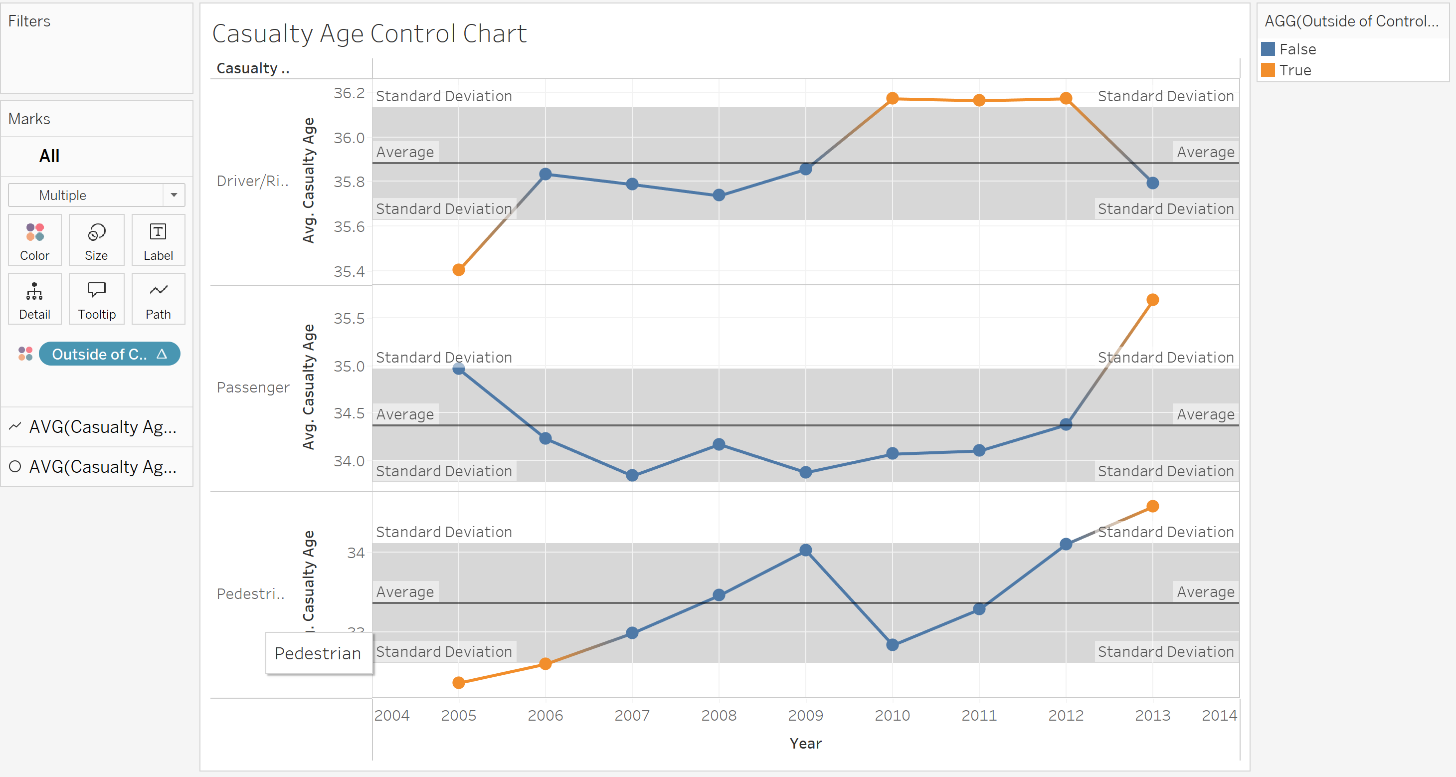
We can now understand the data a bit better. For example, passenger and pedestrian casualty age both reached a peak in 2013, surpassing our standard deviation and breaching the upper control limit.
And just like that you're done! Congratulations on building your very own control (shewhart) chart.