My day started at 7.30am when I took the Tableau Qualified Associate exam. This meant missing out on everyone’s day 1 presentations and diving straight into the new dataset.
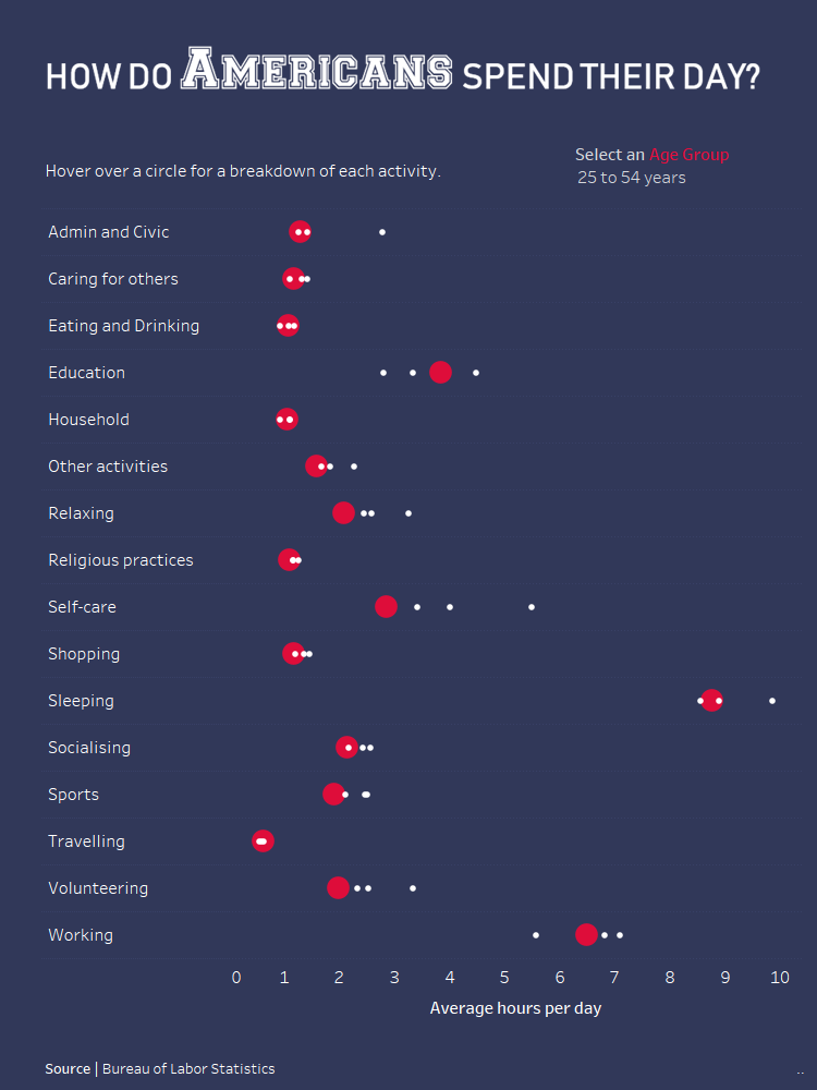
Today’s task was to scrape survey data from the Bureau of Labor Statistic’s website. The American Time Use Survey (ATUS) measures the amount of time people spend doing various activities and provides additional information on demographics. Obtaining the data wasn’t as straightforward as yesterday as Laine describes in her blog. But we got there eventually using only 12 join tools…
The Viz
The dataset was quite overwhelming as it listed over 100 different activities. I usually struggle to come up with a story that focuses on just one aspect in the data so I decided to visualise various (read: all) activities. I grouped the activities into broader categories and created one of my favourite charts – a DNA chart. Using a parameter you can compare how much time different age groups spend on certain activities every day.