What is a Pareto Chart?
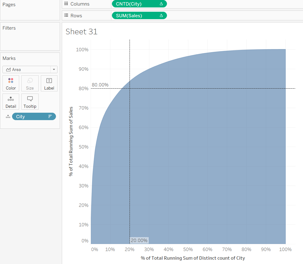
According to the Pareto Principle ‘for many events roughly 80% of the effects come from 20% of the causes’. Or, in more practical terms, 20% of your customers/cities/regions are responsible for 80% of your sales.
How do you build one in Tableau?
The most important part are table calculations. And not just simple ones, you’ll also need secondary calculations. So let’s find out if 20% of cities are responsbile for 80% of sales of the Tableau Superstore.
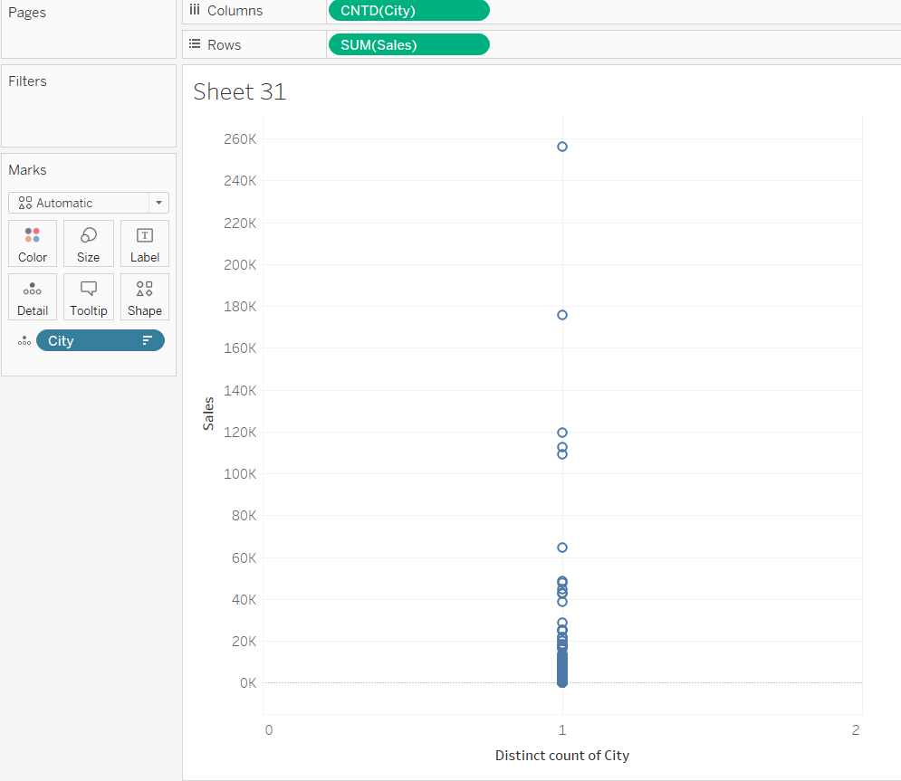
1) Drag ‘Sales’ onto rows and ‘City’ onto columns. Right-click on ‘City’ and change the measure to ‘Count (Distinct)’ since we ultimately want to calculate a percentage.
2) Drag City onto the detail marks card and sort it descending by SUM of Sales.
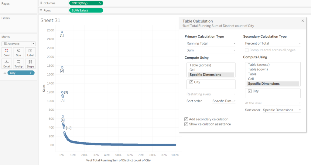
3) Right-click on CNTD(City) and click ‘Add table calculation’. Select ‘Running Total’ and SUM as ‘Primary Calculation Type’ which will be computed across ‘Specific Dimensions’. That’s where you select ‘City’.
Check the box for ‘Add secondary calculation’ and compute this one using ‘Percent of Total’ along ‘City’.
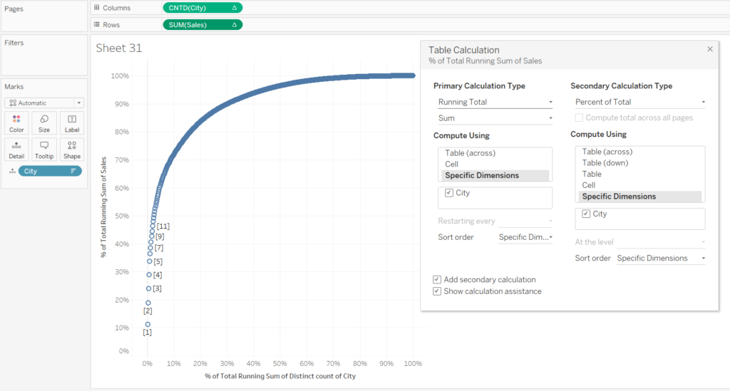
4) The table calculations for SUM(Sales) are identical. Select SUM of ‘Running Total’ computed across ‘City’ and add ‘Percent of Total’ as secondary calculation. That will give you a nice looking Pareto chart!
5) Change the mark type to bar or area.
6) Drag reference lines from the analytics pane into your view and set them to constant with 0.2 on the x-axis and 0.8 on the y-axis.
There you go! As you can see, less than 20% of cities contribute to 80% of sales.