


Hello everyone! I’m super excited to share an innovative chart type that Carl and my cohort (48) stumbled upon while exploring data visualization techniques. This unique chart not only give a quick snapshot of metrics over time, but it brings a fresh, vibrant perspective to a visualization.
What does the chart do, and what does it look like?
In short, this chart is able to look at the trend of a metric over time, relative to a category. In our case, we were looking at the Tableau Superstore dataset, and we included the following discrete variables in the columns card: Year[Order Date], Quarter[Order Date], and the rows card: [Sub-Category]. See the output below:
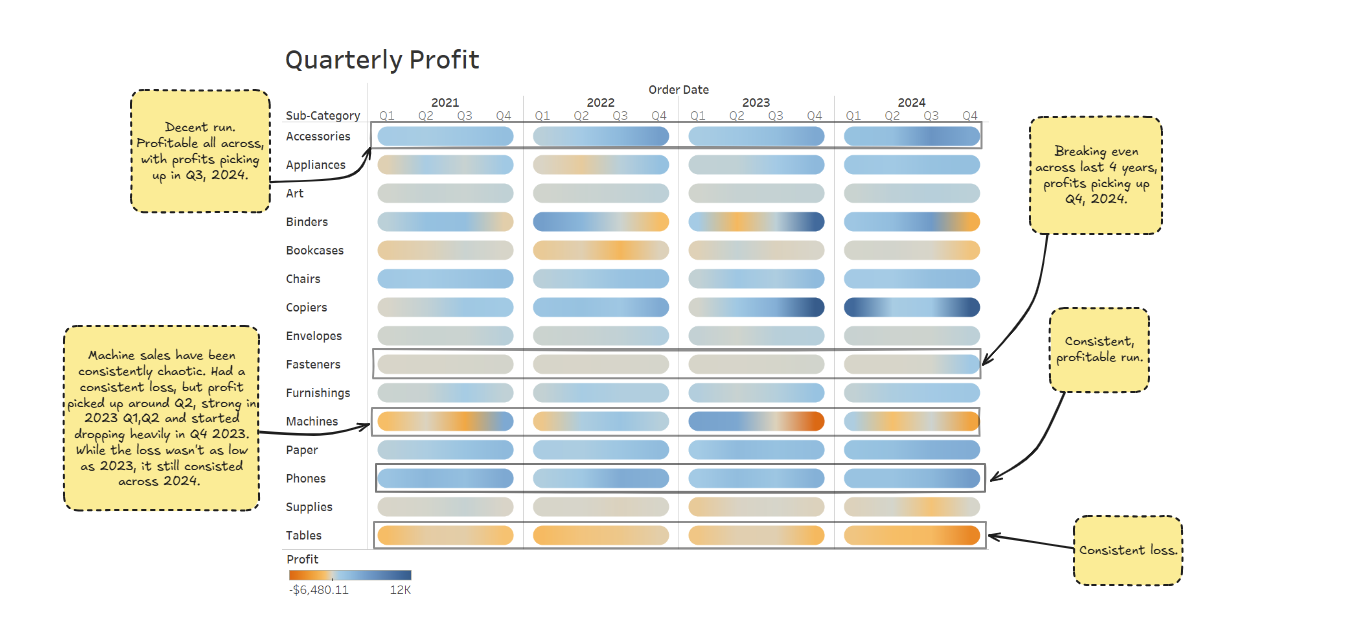
As you can see, this type of table can give you a quick snapshot to understand of what is happening with each category across time. The colours make it really easy to digest and take in (see annotations and legend).
Why name it 'Chromaflow Chart'?
According to Luminus, the word 'Chroma' refers to the intensity of a colour, meaning how pure its hue is. This makes total sense in this chart, as the whole interpretation and visualisation relies on the intensity of the colour and which side of the spectrum (either orange - loss, or blue - profit) it is on.
However, other members of my cohort interpret the chart's depiction as 'describing vibes' - check out Sandy's post here!