


In this blog, I’ll be working through the Preppin’ Data challenge called “Is it the teacher or the student? Part 2”. You can find it here. This was a fantastic challenge!
For this challenge, I got the chance to use the NTILE function to find out the distribution of test scores based on their quartiles. Most importantly, I got more practice using the UNPIVOT function.
This blog will consist of screenshots of my queries, outputs and descriptions of what the queries are doing.
I completed the challenge using three CTEs. Originally, I had more than five! At the end of the article, I’ll talk more about how I was able to optimize my SQL code. Huge thanks to Patrick Lucas, a core consultant here at DSNY, for reviewing my code and offering suggestions for how I could optimize it. This kind of personalized support and feedback is what makes The Information Lab (and Data School New York) such wonderful organizations to work at and with!
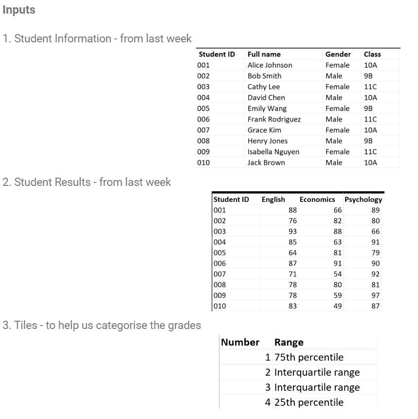
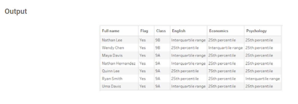
To start, let’s take a look at the input tables for this challenge which are pictured below. The first two input tables are familiar because they are used in the first part of this challenge. They give us information about each student and their respective test scores. The third input table, Tiles, is a reference table which we will use to map the quartile values for the test scores for each subject with their respective “label” values. More on this later!
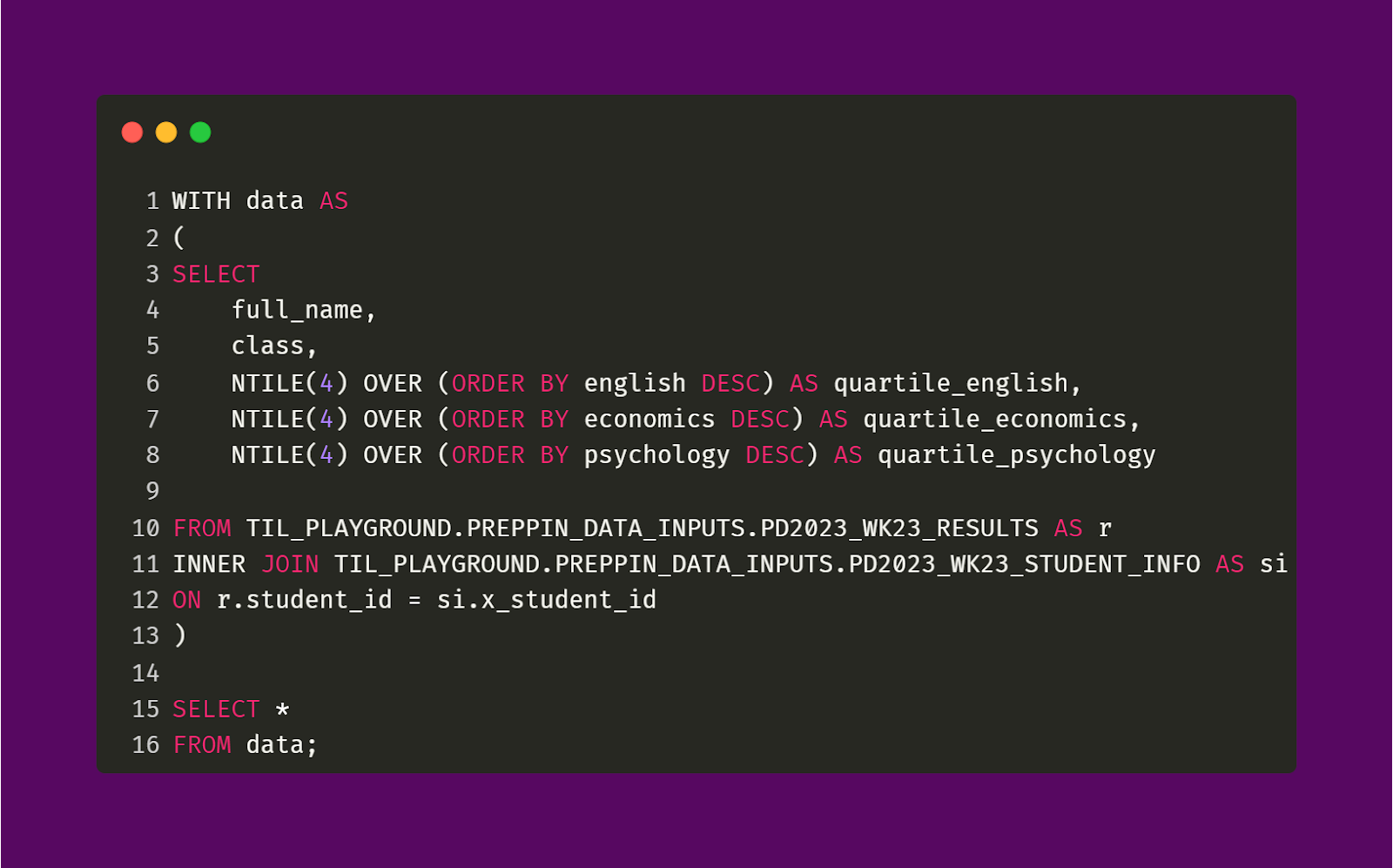
With these input tables, we’re going to be making this output table pictured below.
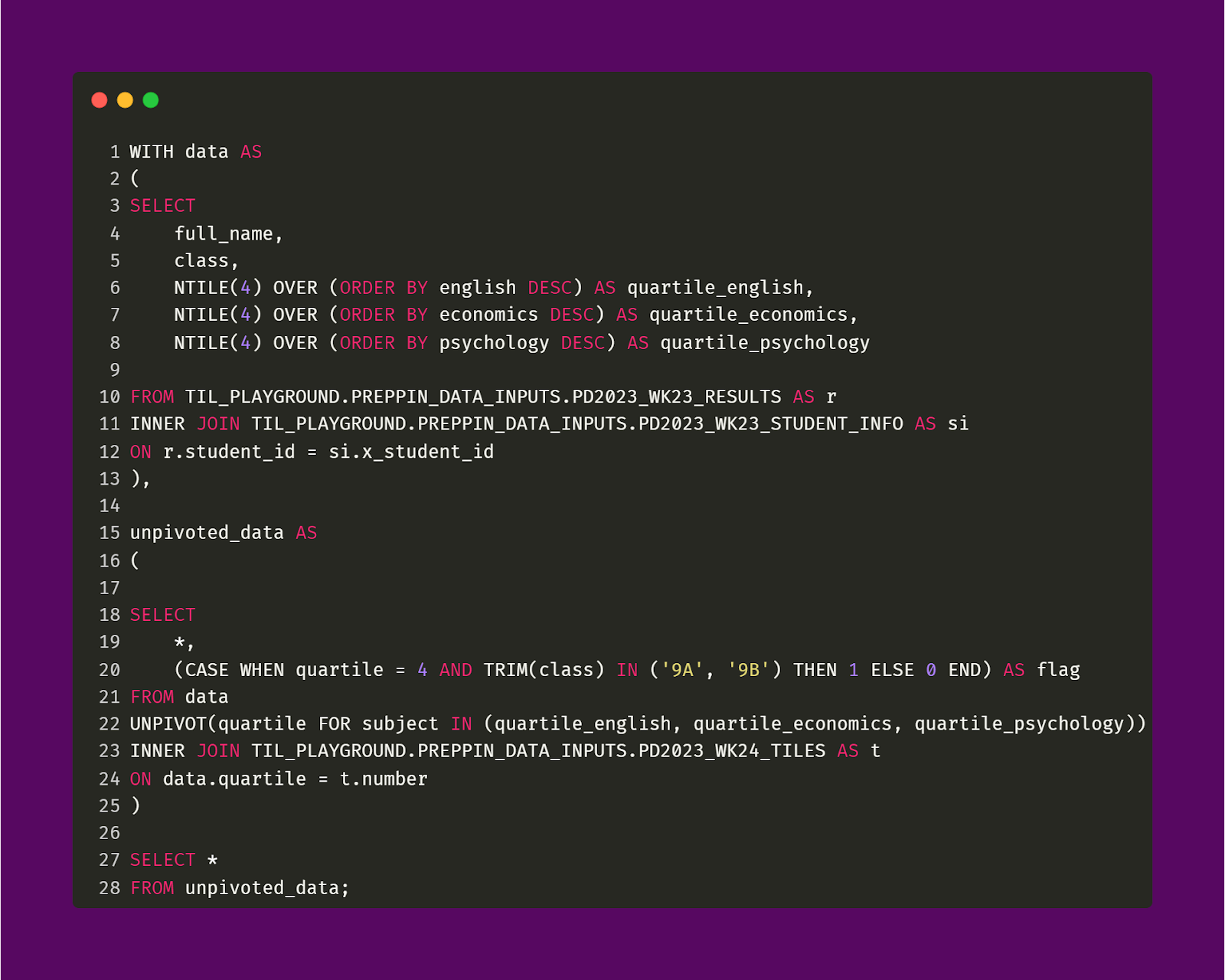
The first CTE I made, data, does two things. First, it joins the Student Information and Student Results tables based on their shared Student ID field. Second, it creates three new fields (for each subject) that indicate the quartile value for each test score. These fields have the prefix quartile so that they are distinguishable from the original subject fields of English, Economics, Psychology. There will be one more join between the data in this CTE and the Tiles table which will take place in the next CTE.
The query code and output is pictured below.
Data CTE
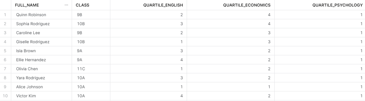
As you can see in the output above, every student has a quartile value for all of their test scores. We’re pretty much halfway done with this challenge! The data CTE represents lines 1 to 16 from the query above.
As I mentioned earlier, we now need to prepare the data so that it can be properly mapped. While the mapping will occur in a CTE after this one — this CTE, unpivoted_data CTE, is necessary because it will do three things. First, it will transform the shape of the data CTE so that it can be joined with the Tiles table. This is done through the UNPIVOT function. Second, it will create the skeleton for the Flag field. This field is necessary because it identifies what students need remediation. Lastly, it will join the data CTE with the Tiles table which is necessary for the mapping.
The query code and output is pictured below.
Unpivoted_Data CTE
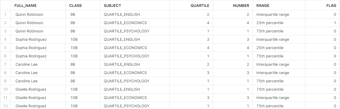
As you can see in the output above (and when you compare this output with the output from the data CTE), the created quartile fields (Quartile_English, etc.) are no longer separate fields. Instead, they are now shown in the Subject field. The Subject field is created through the UNPIVOT function, as you can see in the query above. The Quartile field is also made through the UNPIVOT function. With the shape of the data changed, the join between the data CTE and Tiles table can happen. The unpivoted_data CTE represents lines 15 to 28 from the query above.
You will also notice a new field, Flag, which is just a column of 0s and 1s. The query outlines the logic for the Flag field. When a test score has a quartile value of 4 (25th percentile) AND when a student is in the class of either 9A or 9B, then a student has a flag value of 1. If these two conditions are not met, then the flag value is 0. As I mentioned earlier, this version of the Flag field is just a skeleton. It needs additional logic applied to it which will be carried out in the following CTE.
With that, we are finally ready to bring out the last CTE, mapped_data. As the name suggests, this CTE is responsible for replacing relevant values to match up with the expected values as shown in the desired output table shown at the start of the article. Specifically, we are replacing the quartile values (1-4) with their respective “labels” (text from the Range field of the Tiles table) and we are replacing the 0s and 1s of the Flag field to instead show “Yes”. As I mentioned earlier, a lot of optimization was incorporated into this CTE. In my original solution, as you will soon see, I used four CTEs to be able to do what the mapped_data CTE does.
The query code and output is pictured below.
Mapped_Data CTE
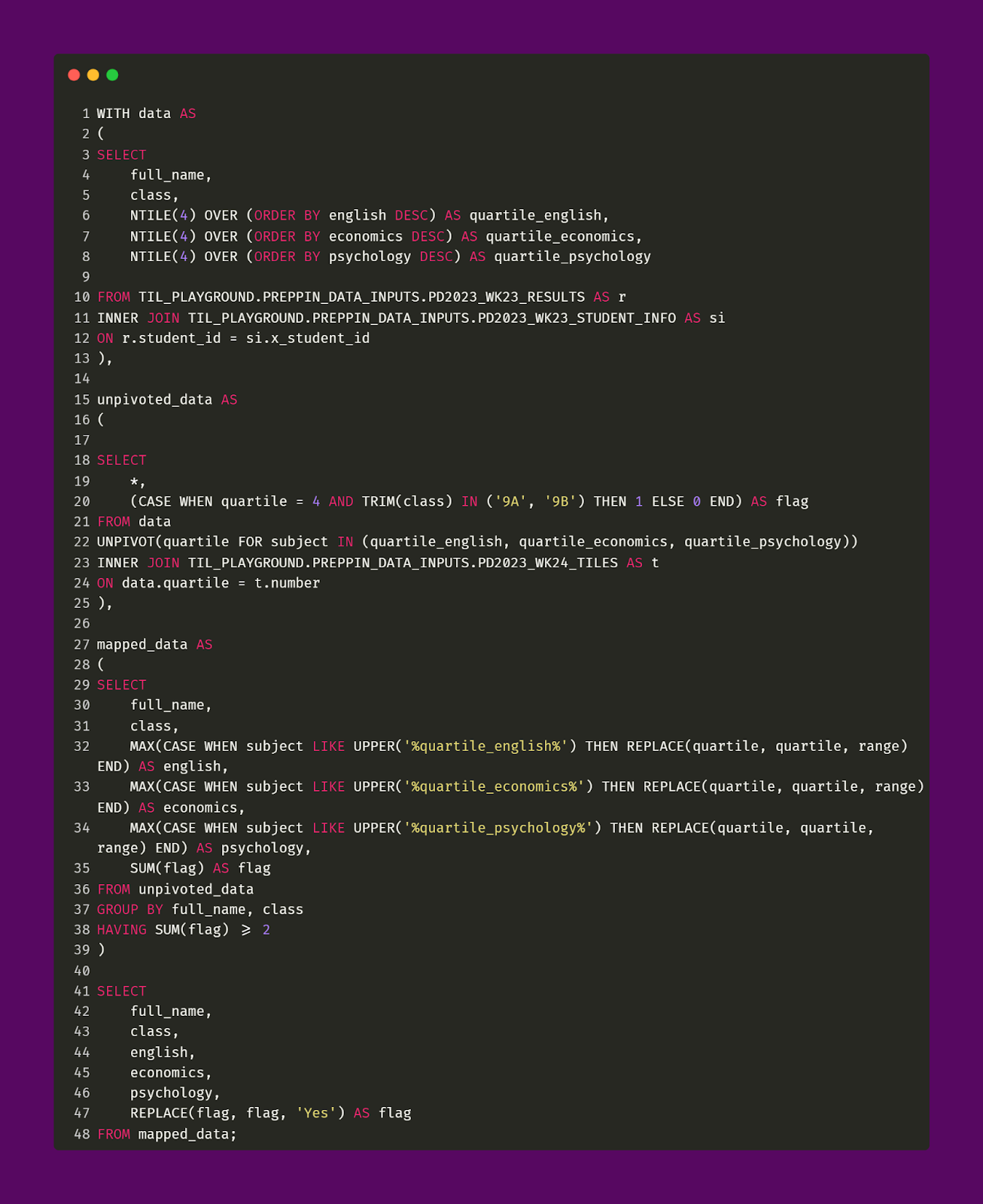
And with that, we are all done! Through our nearly 50 lines of code, we were able to consolidate three different tables to make the table output shown above. The mapped_data CTE represents lines 27 to 48 from the query above.
This CTE creates three new fields which represent each of the test subjects. These fields represent the mapping between the quartile values and the “labels”. An important aspect of this CTE is the filtering effect that takes place on line 38 of the query above. We are only interested in students who had two or more test scores that fell within the 25th percentile which is what the HAVING SUM(flag) >= 2 code is evaluating. Without line 38, the final output would have 50 rows (every student) which is not what we want. We want to identify only those students who need remediation. Line 47 remaps the Flag field from showing 2 (based on line 38) to instead showing “Yes”.
Original solution
Part of the fun with this challenge was thinking about ways to optimize the code. In my original attempt at this challenge, which is pictured below, I had nearly 100 lines of code. However, with help from Pat, I was able to go from nearly 100 lines of code to just about 50!
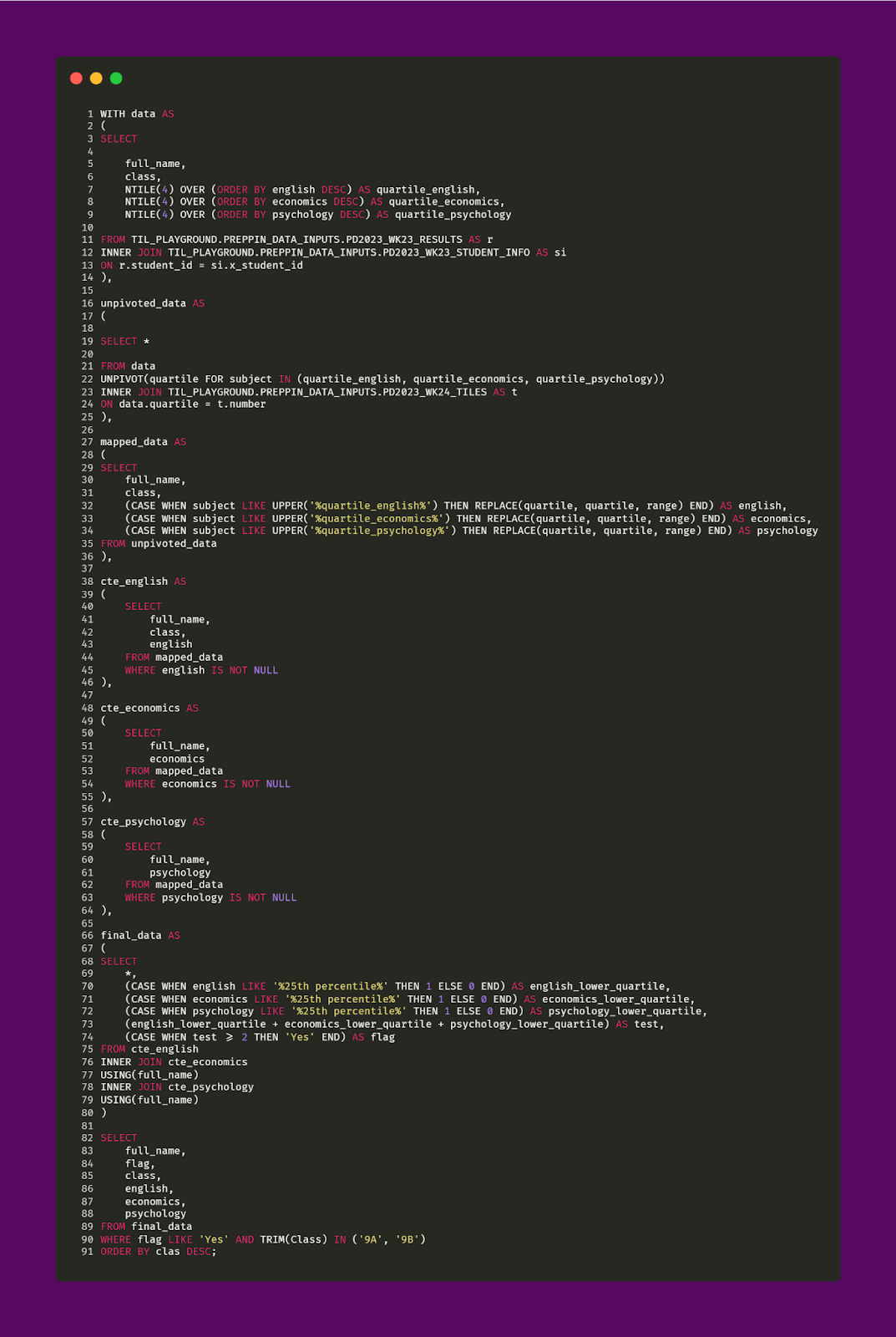
The major difference between the solution above (nearly 100 lines of code) and the prior solution (nearly 50 lines of code) is the logic of mapping and creation of the Flag field. As you can see above, three CTEs were made (cte_english, etc. — shown in lines 48 to 64 of the query above). These CTEs were originally made to filter out null values from each of the remapped subjects (each subject field containing the quartile “label” (25th percentile) instead of the original quartile value of 4. After that, another CTE, final_data, is used to actually determine which students need remediation based on the logic outlined earlier in this article (shown in line 90, of the query above, through the WHERE statement). Finally, the three CTEs were joined together.
Even though both solutions get the same desired output, it’s pretty clear which solution is easier to read and understand! This was a great learning experience about optimizing code and streamlining logic.