


We started the day learning about; Accessible, Inclusive and Universal Design.
- Accessible Design: Mainly focusing on accommodating different disabilities.
- Inclusive Design: Focuses on mainly human differences - cultural norms for example.
- Universal Design: A design aimed for everyone without needing to adapt the design to a particular group
Focusing on Accessible design dashboards, first you need to think who are we catering for:
Neurodiversity: ADHD, dyslexia etc.
Visual impairments: blindness, colour blindness
Cognitive differences: hearing, sight, colour impairments, EAFL
Motor Impairment: paralysis, tremors, epilepsy, long term injury, dexterity, muscle control etc.
How can we cater to them in a dashboard:
Neurodiversity:
- ADHD - Make the dashboard less 'noisy' and as easy to follow to avoid their attention being lost. This can be done by have a clear dashboard layout (Top -> Bottom / Left -> Right). Try not to clutter the dashboard to much as it can be seen as 'noisy'
- Dyslexia - Avoid using all upper case in a sentence. Font Verdana would be best to use as it is a sans-serif font (each letter is distinguishable - the 'a' wont be confused with an 'o' because of the way the 'a' has the little curve at the top)
Visual impairments:
- Blindness - The narrator tool (Ctrl + Window + Enter) can be used for this. The narrator tool does not read out what is shown on the canvas, only reads the title and the caption - If you have a KPI (only numbers on a canvas) that you want to be read, you will have to type a title - MAKE SURE NOT TO HIDE THE TITLE! If you don't want the title to be seen - just colour the title the same colour as the dashboard background so its invisible, you can do the same thing with a caption so the narrator will explain the KPI for you.
- Colour blindness - There are multiple tools out there to help with this. Download Color Oracle . Once downloaded you can select a type of colour blindness and see what they would see. This tool isn't 100% accurate as contrasts can still be an issue for some, that's why this website helps determine if the colours you choose for the dashboard will be easily able to be read/seen.
Cognitive differences:
- Sights - Making the fonts bigger than the standard tableau font size.
Motor Impairment:
- tremors - Tab can be used to be able to navigate the dashboard without the use of a mouse. Make sure the way the dashboard is laid out, 'tabbing' it would get you to the filter straight away without having to go through the whole dashboard first. Make the navigations/download buttons big. Avoid having charts that you would need to focus on clicking a small circle etc.
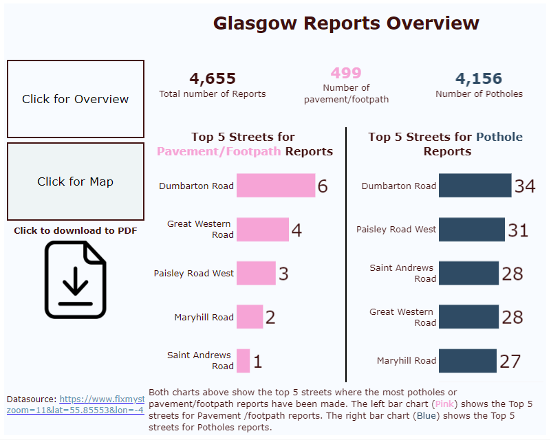
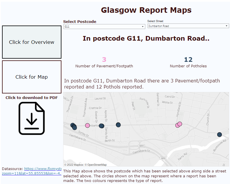
Using all these things I've learnt above, I was able to make an accessible dashboard:
Things I need to improve on: Getting the narrator to work properly by adding in the hidden titles and captions.