


On the third day of dashboard week, DS52 and I were tasked with analysing data about UK Street Crimes between July 2024 and July 2025. This challenge consisted of several stages:
- Build an Alteryx app that allows the user to pick a specific date range, category, and area or postcode to update the crimes datasource uploaded to the server.
- Build a dashboard that visualises this data and updates accordingly when the datasource is updated.
The Plan
Here is a very brief overview of how I planned the tackle the challenge today:
- Download the crime and crime outcomes data between July 2024 and July 2025
- Create an app that allows the user to filter and update the data on Tableau server
- The user should be able to choose what months, crime types, and which area they want to look at in the dashboard
- Create an app that allows the user to filter and update the data on Tableau server
- Create a dashboard on Tableau that visualises the data
- Ensure that the two are linked so that when the datasource is updated by the Alteryx app, the dashboard is also updated
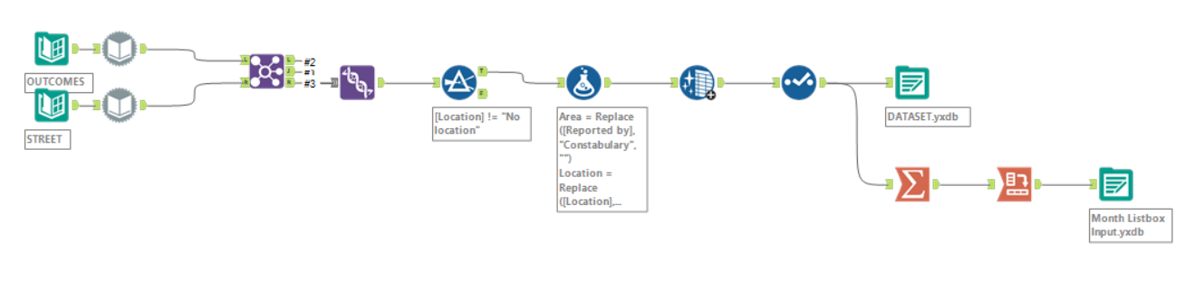
Here are some screenshots of my final Alteryx workflows:
General Data Prep
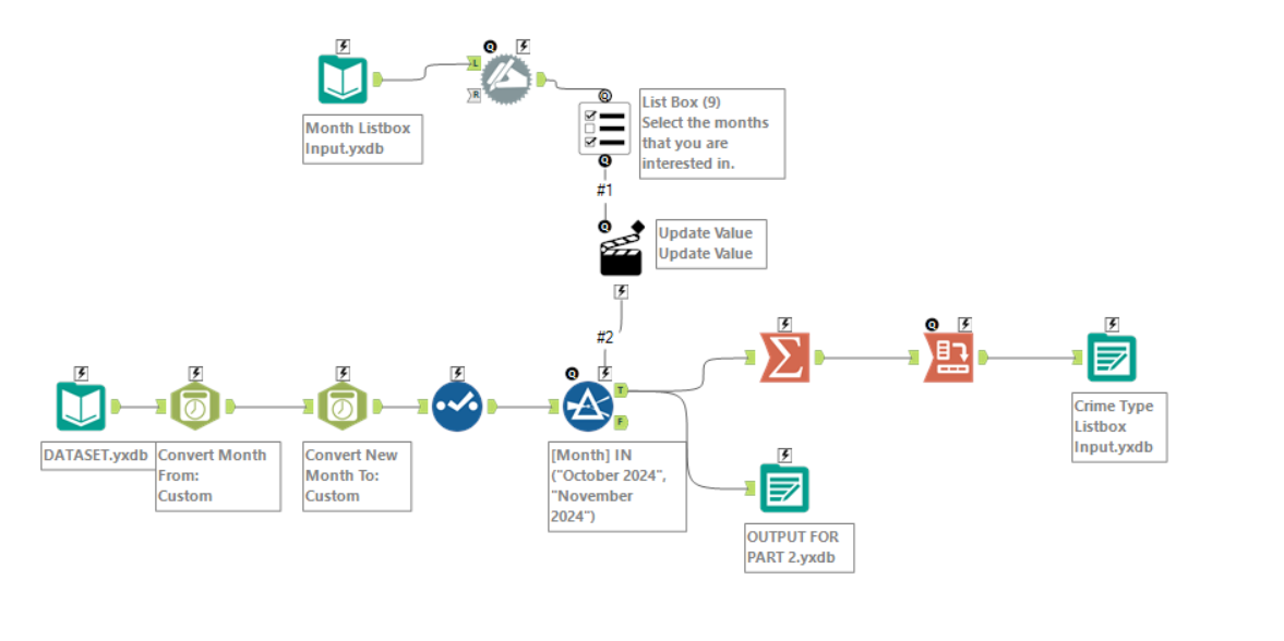
Chained App Stage 1
This workflow simply reads in the cleaned data from the earlier step and allows the users to choose the months that they want to view data from. It uses the list to dynamically populate the list box that is shown to the user to ensure that they can only select months available in the dataset.
It also outputs a file containing the names of all crime types after the data has been filtered for months.
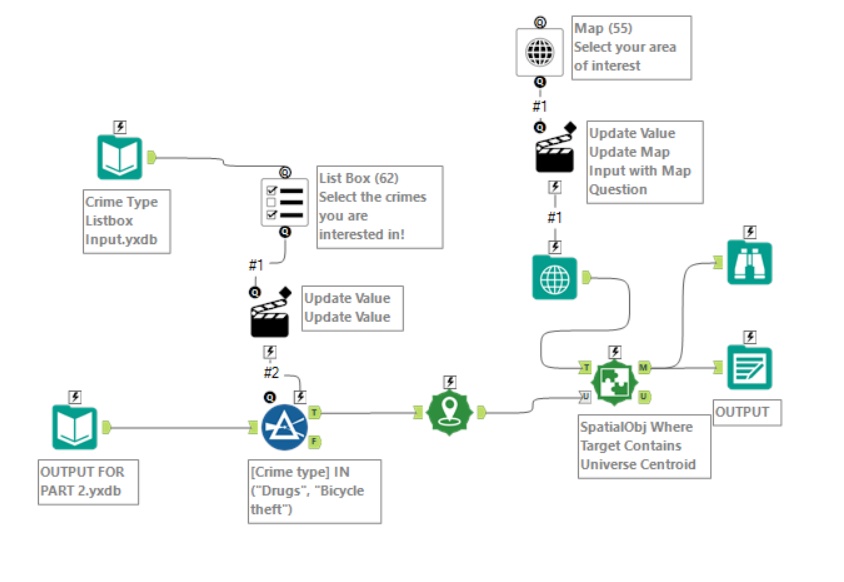
Chained App Stage 2
This workflow reads in the data outputted from stage 1 of the chained app and allows the user to choose which crime types (pulled from the data filtered in stage 1) as well as which area of the UK they are interested in viewing. This data is then outputted and loaded into Tableau.
Challenges
As expected, there were quite a few things that did not go according to plan:
- I initially had data cleaning and Alteryx app steps in a single workflow as this made it easier for me to see everything that the app was doing in one screen. However, I quickly realised that it made more sense for the app to be a chained app so that the values that the user chooses will be dynamic (the user cannot select a date that does not exist in the dataset). Converting my main app into several chained apps took a little longer than expected so this ate into the time I had allocated to creating the dashboard in Tableau.
- Another issue I faced whilst converting the singular app into multiple chained apps was that I would often forget to re-configure setting based on small changes I made later on (such as not changing what values are updated after I changed the name and data type of a field etc.). This was really frustrating at times since I would waste time trying to fix small silly issues.
- When it came to outputting the data, I faced quite a few unexpected issues (partially due to the time pressure messing with my train of thought) such as the data being unable to be overwritten (turns out it was always in use because I had accidentally set Alteryx to just open the file after completing the app). All these issues were fixed after I took some time away from the workflow and came back to it with a clear head.
- I ended up outputting the final dataset into my Google Drive and connecting Tableau to Google Drive to ensure that updates are reflected in the dashboard once the Alteryx app is ran.
- Again, some processes (such as loading in the data and running the app) wasted a considerable amount of time as I simply had to wait for my laptop to run. Some of these issues I could fix by restructuring the app (using a separate workflow to load and clean the data so that all these steps are not run every time the app is ran etc.). However, much like Monday, this often limited me to only working on my blog or researching other potential solutions whilst I waited (I think that is a sign to restart my laptop…).
Sketches
I only completed a very basic sketch today to help me get my thought together (which is much needed when working on such a big dataset):
As we will shortly see, I deviated from this plan quite a lot whilst I begun diving into the data as I found more and more metrics of interest I wanted to include.
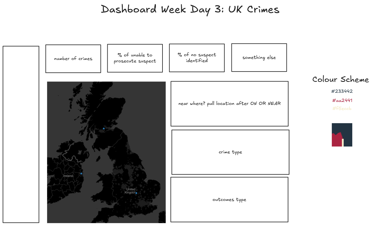
Dashboard
Here is the final dashboard that I managed to come with:
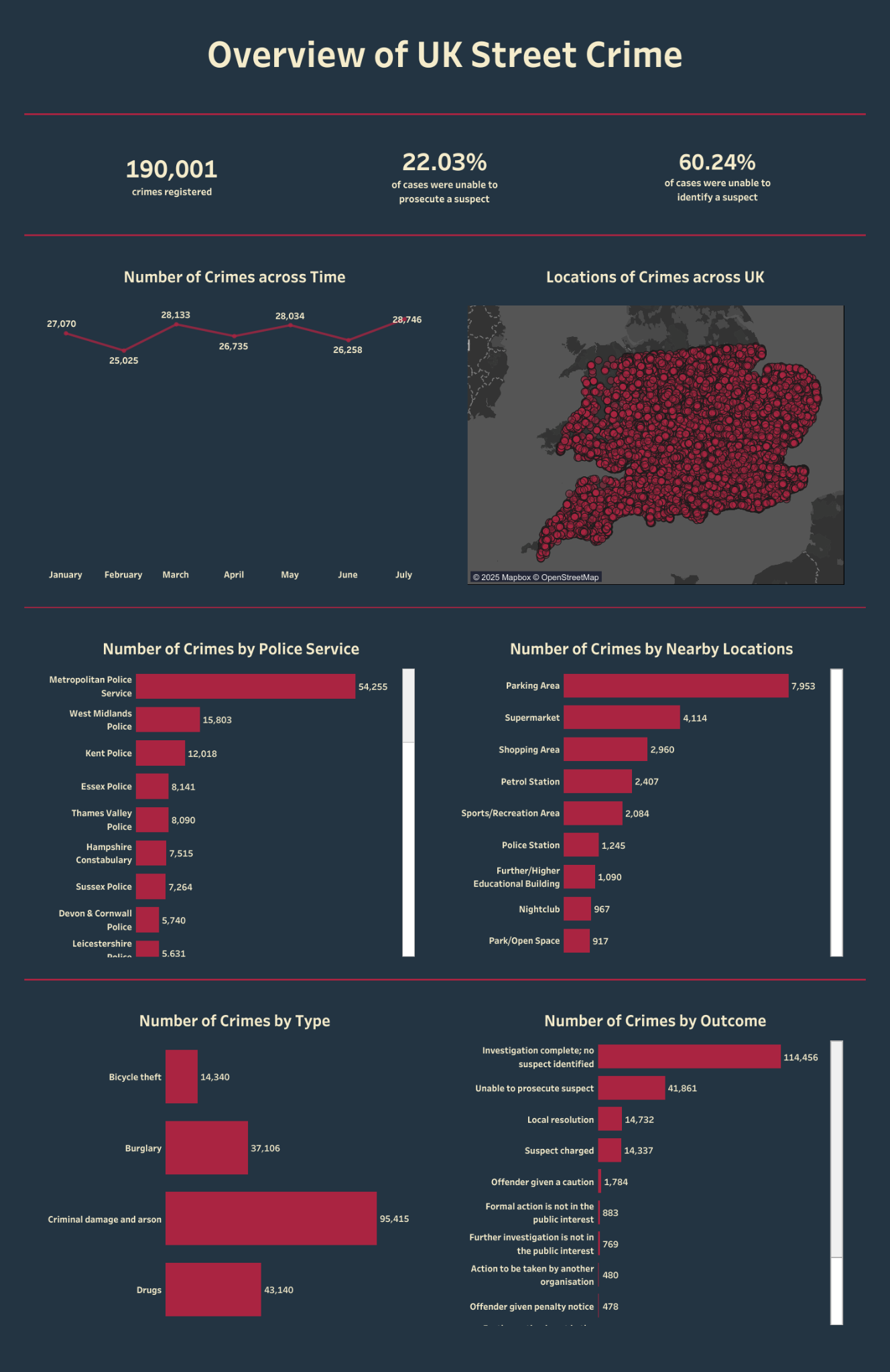
Check out the cleaned version of this dashboard on my Tableau Public!
Reflections
I can confidently say that today was just as intense as the previous 2 days.
- To make the experience of using the app more user-friendly, it would likely be beneficial to allow the user to: select time period > select area > select crime type. This would prevent the user from selecting an area where there are no crimes for the select types (as the app currently does). I did consider this whilst I was creating the chained app but as I had gone with the select time period > select crime type > select area order in my original app, I decided it might take too much time to reconfigure it so late in the day.
- Ideally, I would have had more time to polish the dashboard and nail the design that I had in mind. But of course, delays in the Alteryx side of things led to this being pushed further back until it was 15 minutes before our presentations and I was still adding in padding for my charts. I did have fun designing the dashboard when I could though!
I definitely need an early night after this one. Excited (and slightly terrified) by what day 4 is going to bring!