


On the 4th day of dashboard week, DS52 and I were tasked with analysing anime view statistics from MyAnimeList. The dataset that we’ll be working with contains over 5000 anime since I was a kid, I’ll admit that I was quite excited when I saw the challenge today!
The Plan
- Familiarise yourself with the data:
- Anime_cleaned = list of anime with title, genre, studio, producer, duration, overall rating, airing date etc.
- AnimeLists_cleaned = anime lists of all users where each record has a username, anime ID, score, and timestamp of when this was updated
- Users_cleaned = user information registered on the site including username, joining date, birth date, gender, location etc.
- Perform any cleaning (if necessary for the charts I want to make)
- Create the dashboard in Tableau (and be creative if time allows it!)
Challenges
The main challenge that I faced today was the fact that there were so many records in the 3 datasets so it initially felt really overwhelming to try and decide what direction I wanted to take this. I did try searching for the shows that I am currently watching but I quickly realised that this dataset is quite outdated (last updated 7 years ago). I think I spent around 2 hours sketching out ideas and playing with different charts in Tableau.
As a result, I chose to focus on an older anime that I like: Durarara!! (only the main show - Durarara!!, Durarara!!x2 Shou, Durarara!!x2 Ten, Durarara!!x2 Ketsu).
Sketches
Check out my sketch for this challenge below!
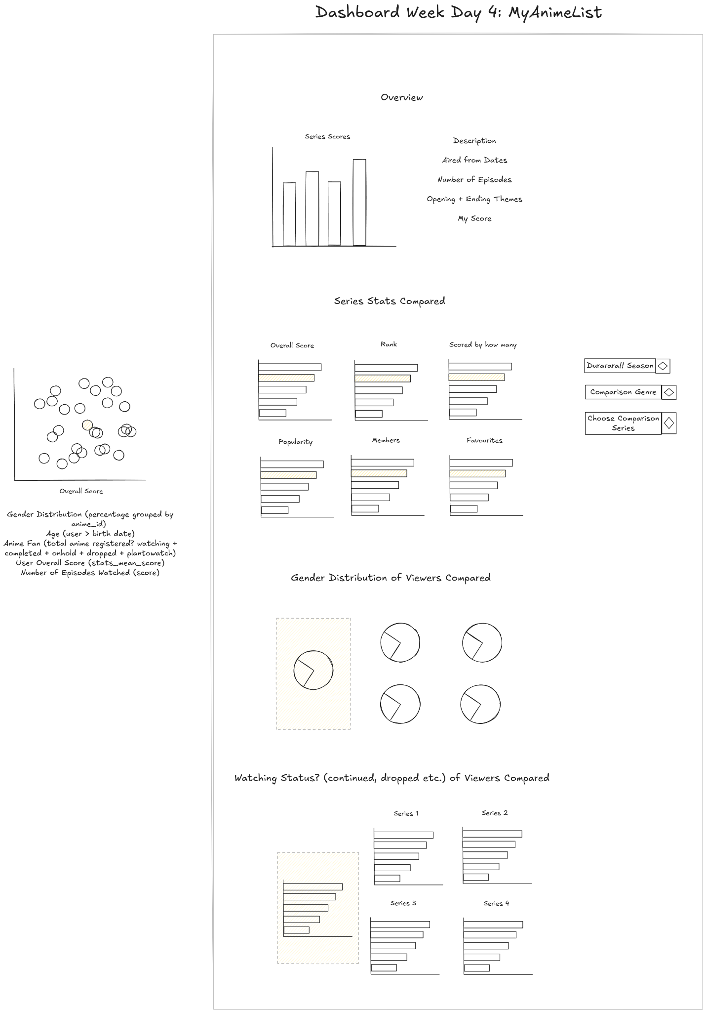
As mentioned above, I was initially quite indecisive on what direction I wanted to take this project so I deviated from this sketch a lot in the end. However, this was still useful in helping me figure out what charts I wanted to include.
The Dashboard
Here is the final dashboard that I managed to come up with!
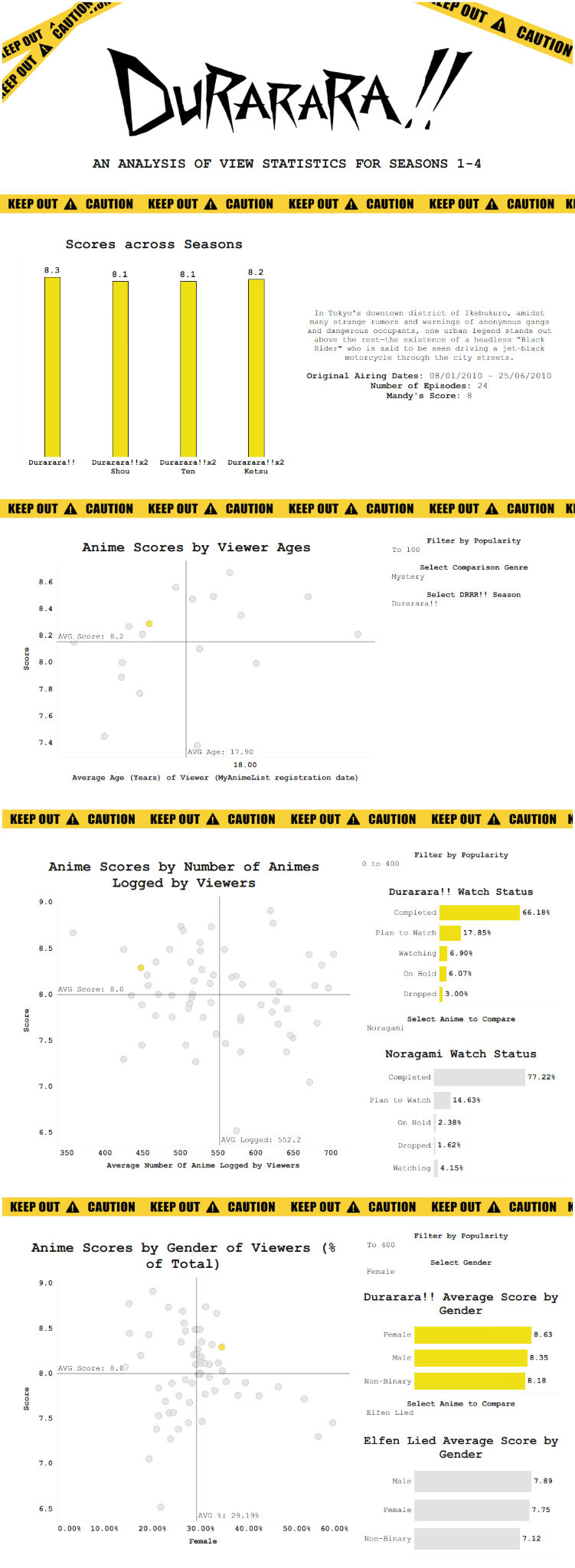
Check out the cleaned version of this dashboard on my Tableau Public!
Reflections
As expected, although this day had its own challenges, I did have a lot of fun:
- I’m pretty happy with the design that I came up with for this dashboard - of course, it still needs a bit more aesthetic polishing (in terms of positioning the filters and parameters, custom fonts, etc.). I think it would also be beneficial to include annotations on the charts to make the insights that I wanted to show much clearer.
Roll on day 5!!