


Finally, we are at the last day of dashboard week and today, we have been tasked with pulling data from one of the many APIs available on NASA’s website. To avoid the feeling of being overwhelmed with the sheer amount of data, I made sure to check what APIs were available early in the day to narrow down my scope. After looking through the options, I quickly decided to focus on the Exoplanets API.
Specifically, the Mission Stars + ExoCat table which has data regarding nearby stars that have been identified as potential targets for future exoplanet direct imaging missions. ExoCat () is a collection of stars within 30 parsecs that have been compiled to aid in planning these missions - this has been added to the Mission Stars data for additional context.
As a space nerd, I was quite excited to see this brief this morning!
The Plan
- Construct the API link so I could pull in the data I wanted (which luckily for me, was all of it so I simply used: https://exoplanetarchive.ipac.caltech.edu/cgi-bin/nstedAPI/nph-nstedAPI?table=mission_exocat&format=json)
- Grab the data using Alteryx and clean any of the fields in preparation for visualisation
- Create a fun and interesting dashboard in Tableau (and hopefully have time to add in fun design elements and annotations this time!)
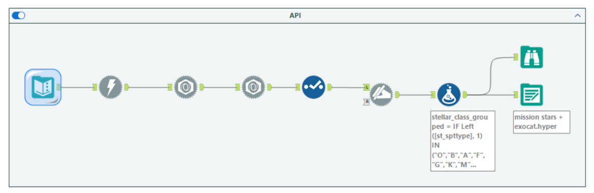
Here is a screenshot of my Alteryx workflow in which I pulled the data from the API and performed the following calculations:
- Conversion of the distance in parsecs into light years
- Stellar Class = grouping detailed stellar classifications into broader groups (B-type stars etc.)
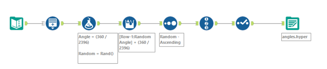
Here is a screenshot of my Alteryx workflow where I created the Angles required for my radial jitter plot (more info coming soon!):
Challenges
As always, I had to quickly open up some past Alterys workflows we created when learning APIs to remind myself on how to actually start this challenge!
- The fields rastr (Right Ascension of the planetary system in decimal degrees) and desctr (Declination of the planetary system in decimal degrees) were pulled in the following format: -42hh40m21.32s. As I don’t think I will be including these values in the final visualisation, I chose to skip the process of formatting this field into something usable.
- Just to make things harder for myself, I decided to tackle a type of chart that I had never made before: a radial jitter plot! I had seen it multiple times across different Tableau Public vizzes before but never had the chance to try it out. After looking at a few examples, I eventually managed to figure out how to create my own (creating an Angles table, calculating an angle for every record in the main dataset, randomising the angles when connected to the main dataset in Tableau). I will hopefully make another blog soon talking about how I created this chart in more detail!
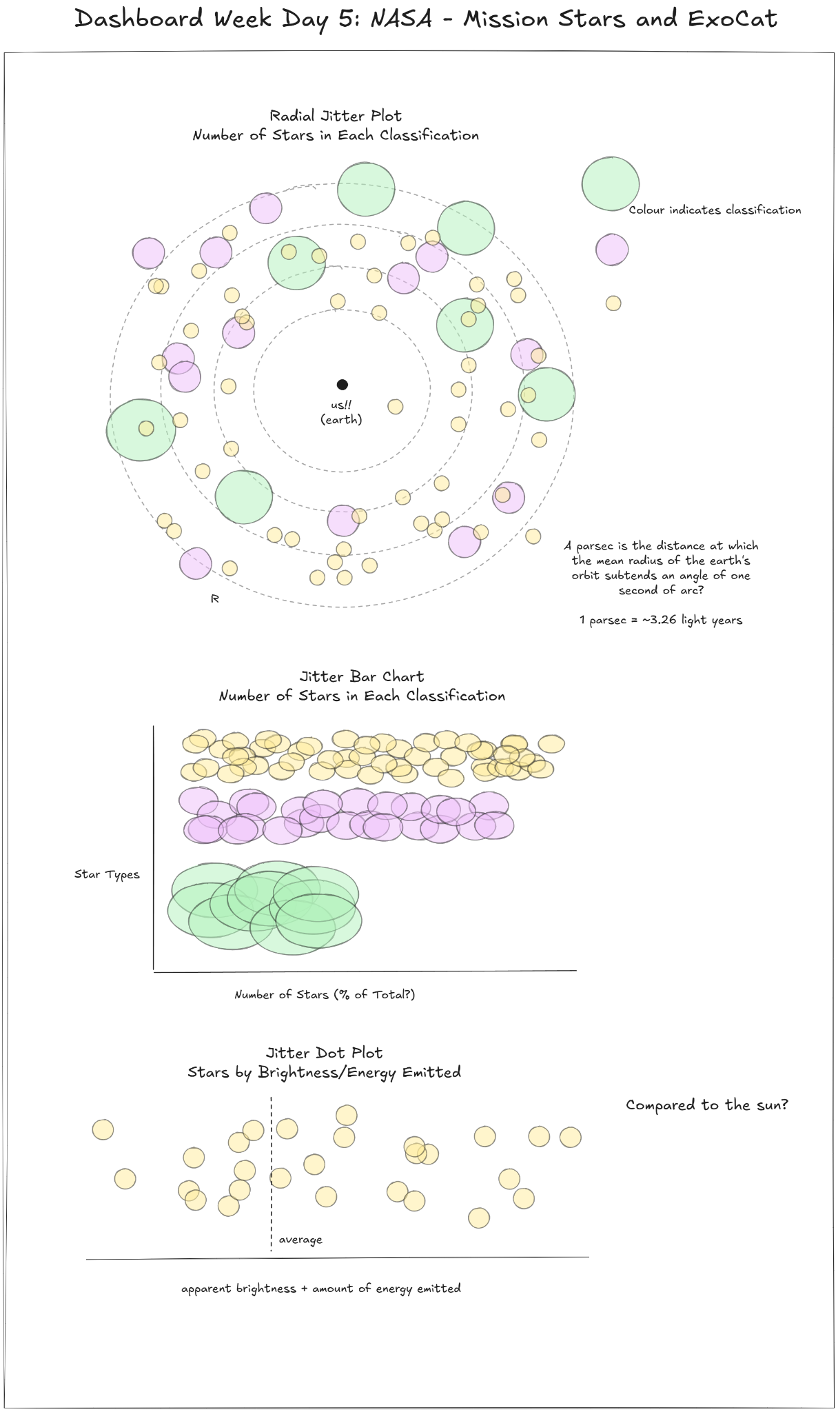
Sketches
The Dashboard
Here is the final dashboard that I managed to come up with today! I’m really proud of this one (particularly the design and the story I was able to tell within the time limit) - I think this is my best work this week :)
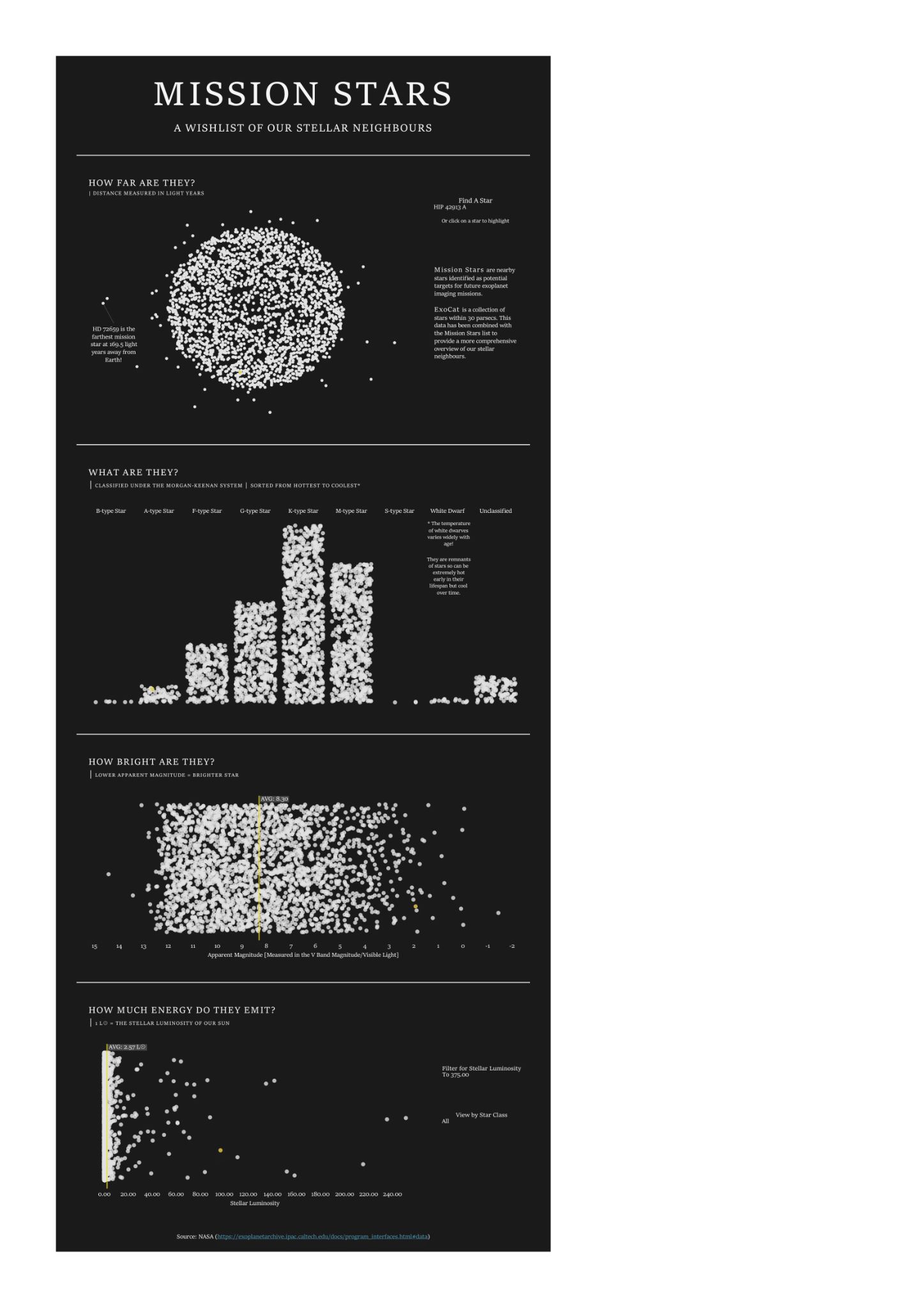
Check it out on Tableau Public here!
Reflections
All in all, I really enjoyed the challenge today! As mentioned earlier, I really like astronomy so this was right up my alley. I also really liked how I was able to challenge myself creatively and make some charts I haven’t tried before. To create the jitter bar charts, I followed this tutorial by Toan Hoang.
And that brings us to the end of my first 4 months training at the Data School! It’s certainly been an intense but rewarding experience with more highs (and some lows I’ll admit) than I can count on one hand. I couldn’t have done it without the rest of my cohort (in no particular order: Amy, Joe, Elizabeth, Zain, and Younes!!!) and our amazing coach, Robbin!
Stay tuned to see what I get up to in life after training :)