


A jitter plot is a type of data visualisation that displays individual data points to show off the distribution of a dataset. Additional ‘noise’ (random horizontal/vertical displacement) can be added to each data point to separate them and prevent overlapping for ease of viewing.
Not only are these types of charts useful for showing individual variation and identifying outliers but they can also look really cool and be fun for the user to explore! For example, here is one I made on the last day of Dashboard Week to show the distance of mission stars away from us (the centre of the circle):
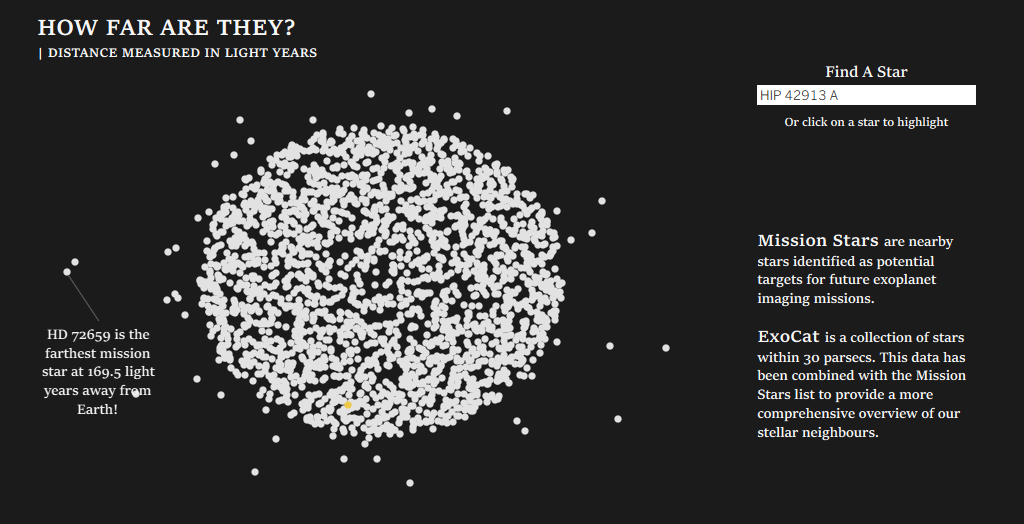
(Check out the rest of this dashboard on Tableau Public!!)
If you want to learn how I created this chart, just keep reading!
Step 1 - Creating the Angle Data in Alteryx
Here is the full workflow I created in Alteryx in order to create the angles required to plot my main dataset onto:
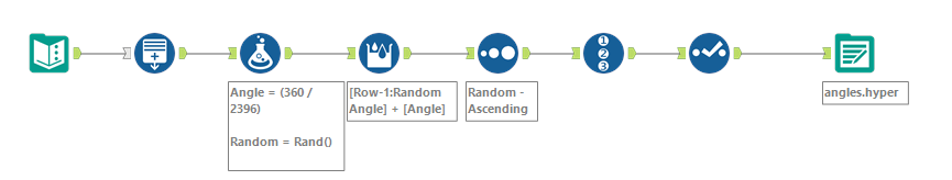
Let me walk you through this one step at a time.
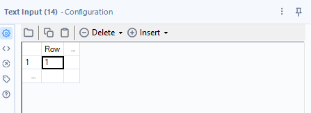
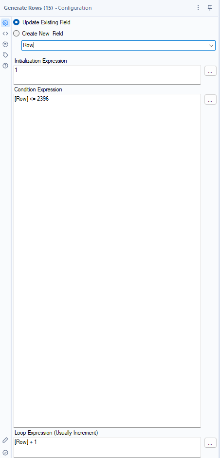
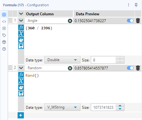
I first initialise an empty dataset so I can generate the same number of rows as I have data points. Specifically, I had 2,396 mission stars (each with an ID from 1 to 2,296) that I wanted to plot on my chart. Therefore, I needed to create 2,396 angles to distribute them evenly. So, I used the Generate Rows tool with the following expressions to create these rows:
I then calculate the base angle for each point using the following formula: 360 / Number of Data Points. In the same Formula tool, I also create a Random field using Rand() - I will use this later to ensure that the angles assigned to each mission star are randomised. This helps avoid any clustering on the chart due to the order in which the data has been entered in the dataset (perhaps all stars with larger IDs are farther away etc.).
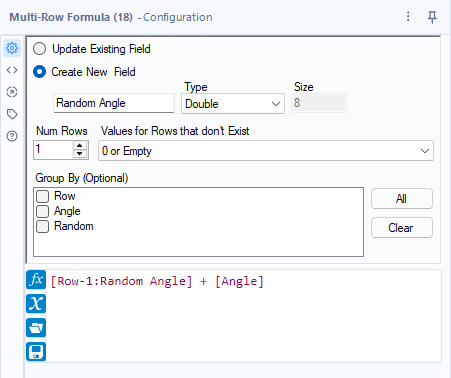
After creating these fields, I use a Multi-Row formula to generate an angle for each data point. This ensures that the points are evenly distributed around the circle.
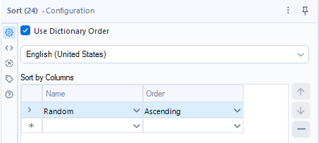
In order to vary the angle assigned to each star (which, as a reminder, is represented by an ID from 1 to 2,396), I now sort my Random field by ascending to quickly shuffle the data:
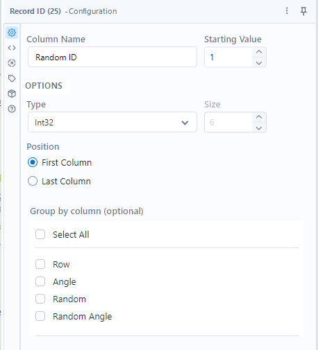
From this, I use the Record ID tool to create a Random ID for each star, randomising* the angles in a quick and easy way.
* Of course, the data isn’t truly random (if such a thing exists) but this will do for this chart.
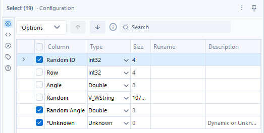
Finally, I use the Select tool to get rid of the fields that I no longer need for the chart before outputting the data into a hyper file (since I already know I will be putting it straight into Tableau):
Step 2 - Creating the Chart in Tableau
Now that we have the angles data we need, we can jump straight into Tableau. Make sure you link this data and your main dataset (in my case, this was the mission stars data) together with the random ID created in the last few steps of the data preparation process.
There’s just 2 more calculations that we need to do before we can build our chart - the calculations for our X and Y coordinates on the chart:
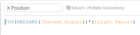
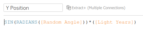
Let’s break these calculations down:
- [Random Angle] is the angle for each point, measured in degrees.
- RADIANS() converts [Random Angle] from degrees to radians because trigonometric functions like SIN() expect angles in radians, not degrees.
- COS()/SIN() then calculates the horizontal (X)/vertical (Y) component of the vector that points in the direction of [Random Angle].
- Multiplying by [Light Years] scales this vector by the distance from the center (the "radius") so points farther away represent greater distances.
All we need to do now is drag our X and Y Position fields onto Columns and Rows respectively before putting our unique identifier (in my case, this is the Star Name field) onto the Detail marks pane to create our radial jitter plot.
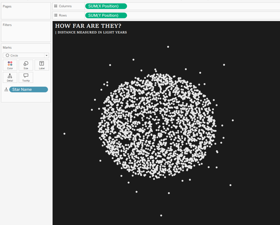
And it’s as easy as that!