


I recently built a new Tableau dashboard that’s a little different from your usual project tracker. And yes, it’s loosely inspired by the Domino’s Pizza Tracker. [Check it out by clicking here!]
Instead of watching your pizza go from oven to doorstep, this dashboard tracks a project as it moves through six stages:
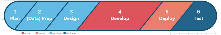
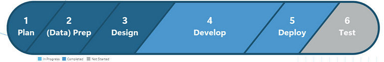
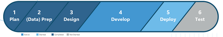
Plan → (Data) Prep → Design → Develop → Deploy → Test
The idea is to give teams and stakeholders a quick, visual way to see where a project currently stands, without needing to dig through a spreadsheet.
A Quick Look at the Workflow
This dashboard is part of a three-step pipeline:
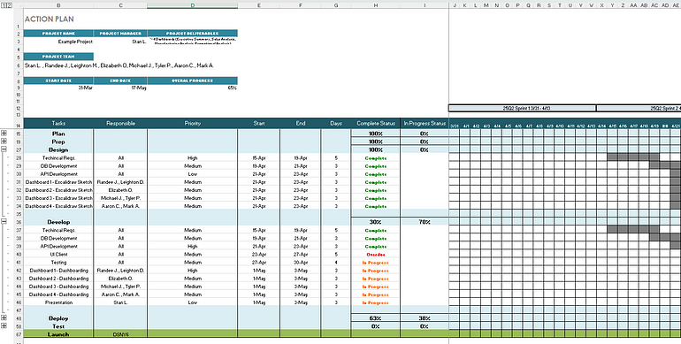
1. Excel Spreadsheet — Where all the tracking happens. It includes sections for subtasks in each stage, their start/end dates, status (like “Not Started”, “In Progress”, “Complete”, or “Overdue”), and a calendar view showing when things were worked on. There’s also an area for team questions to stakeholders.
2. Alteryx Workflow — Currently used to prep the data before bringing it into Tableau. It helps clean up the structure, though this step might be replaced by another ETL method or even dropped later as Tableau can pull directly from Excel.
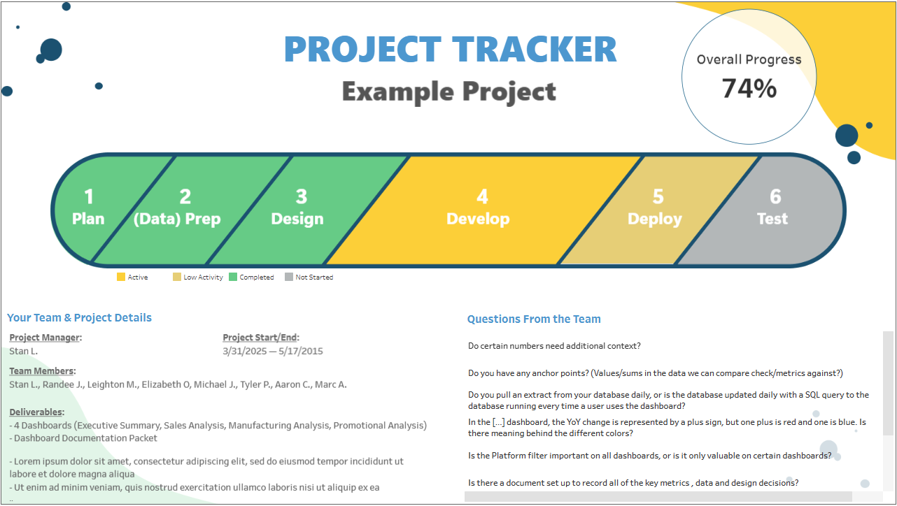
3. Tableau Dashboard — This is where the tracking comes to life. The main visual shows each project stage in a horizontal bar format. Each stage updates based on real-time progress pulled from the spreadsheet. Below that are two side sections: one for project/team info and one for stakeholder questions. Both of those sections can of course be replaced or modified with any other information that may be important. Unlike a linear tracker, this one can show multiple stages as active or in progress at the same time, which better reflects how teams often work in parallel. But if too many stages are showing as active, it’s a sign that things may be slipping out of sync — something for project managers to keep an eye on.
A Few Design Hiccups
- Layout Challenges in Tableau:
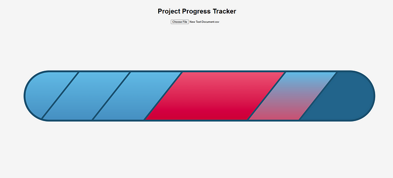
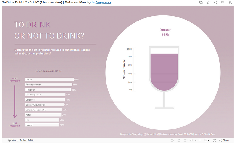
I originally mocked up the design in Figma, using rhombus-like shapes to represent each stage. But when I tried to recreate it in Tableau (while avoiding floating containers, as I’d been taught), it wasn’t working. At one point, I was even creating an HTML version of the dashboard to bring the design to life (I may still do that). After talking with some friends at work who happen to be data viz geniuses, one remembered a creative dashboard built by another brilliant colleague (To Drink Or Not To Drink? (1 hour version) | Makeover Monday by Shreya Arya), which used floating containers as layers so effectively. That helped me rethink the approach and get the layout working, no major compromises needed!
- Color Scheme Tweaks:
My first idea was to use a warm-to-cool color scheme to show progress, but with limitations on how to color a mark in a gradient like in the HTML version, some choices led to confusion — especially with red tones being mistaken for errors. After testing a few versions and getting feedback, it was recommended to move to a cleaner scheme using familiar project management colors. Grey for “Not Started”, muted tones for early progress, and stronger colors for more active stages helped make everything more intuitive.
Final Thoughts
Within a busy schedule filled with reports, numbers, and xerox copies, this project was a fun excuse to flex some creative dashboarding muscles while solving a real project visibility challenge. Hopefully, it’s useful for others too. If you find it useful, or even mildly amusing, I’d love to hear your thoughts!
Originally Published on Medium