


For the Data School application I was given a dataset containing meter readings for a variety of buildings across London including: 10 Downing Street, Great Ormond Street Hospital, Tate Modern and a number of Parliament buildings. There were a number of issues in the data:
- Missing data for some of the utilities (gas, electric, water) for some years/buildings
- Extreme outliers – e.g. meter readings in the hundreds of billions, where the average reading was in the thousands
- Negative meter reading values
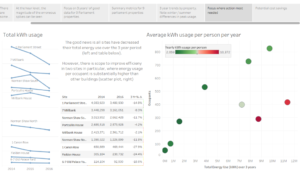
After probably spending too much time thinking how I could work with all the data as it was, I decided to focus on a subset of the data for the 8 parliament buildings where the data was in decent shape. There were some seasonal trends for the different utilities – usage of gas peaked in the winter months (presumably for heating) and electricity peaked in the summer months (presumably for air conditioning).
To find more insights I blended in the number of occupants for each building along with the unit cost of electricity and gas per kWh. This enabled the cost of energy per person per year for each building to be calculated, which highlighted two outliers. Finally, a table shows what cost savings could be made if these 2 building cut their energy usage.
Original version: https://public.tableau.com/views/EnergyUsagev3/Story?:embed=y&:display_count=yes
Considerations for the makeover:
- Story Points was an OK format for the multiple slides but it was quite long-winded
- My thought process as I worked through the data issues was shown, which I wanted to remove for the makeover
- There slides were not very ‘visual’ – minimal colour, no images etc.
- There wasn’t a clear cohesive message to the visualisation that stood out
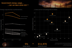
For the makeover I decided to focus on a single message – there were 2 buildings using a lot more energy than all others and annual savings of almost £12k could be made if energy usage was reduced by 5%. The viz was reduced to one slide with a more visual theme. Larger titles and hey highlighted numbers were used:
Made over version: https://public.tableau.com/views/EnergyUsage-Makeover/nDash3?:embed=y&:display_count=yes
While it loses the interactivity, I think the single image is more impactful and would hopefully be more engaging for the viewer.