


Following yesterday's Day 1 of the Dashboard Week at The Data School, Day 2 tasked us with creating a business KPI dashboard using the Tableau Superstore dataset, but this time in Power BI.
The Challenge
The task was to develop a dashboard showing at least three KPIs (including profit) while creating a cohesive narrative around the data. With limited time to sketch, build, and present, I needed to balance complexity with feasibility.
My Approach
For this dashboard, I wanted to do something slightly different from the classic sales dashboard, so I drafted a use case centred around customer loyalty and retention, exploring how these factors relate to profitability. While researching options, I discovered RFM (Recency, Frequency, Monetary) analysis – a powerful segmentation method for understanding customer value.
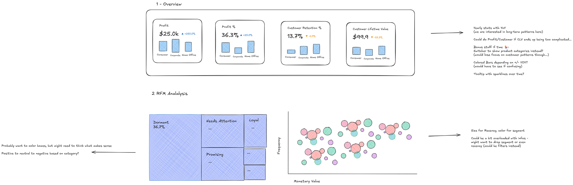
My initial sketch focused on creating a clear hierarchy of information, starting with key metrics and then diving into customer segmentation. I planned for a minimal viable product that could be expanded in the future.
The Implementation
The most challenging aspect was implementing advanced DAX calculations for the RFM analysis in a relatively short time frame. These calculations allowed me to segment customers into meaningful groups like "Champions," "Loyal Customers," and "At Risk." While the frontend design remained somewhat minimal due to time constraints, I was quite happy to solve some of the more tricky DAX calculations for the RFM analysis - something that could easily be expanded on in the future.
The final first version of the dashboard provides:
- Performance metrics with year-over-year comparisons
- Customer segment distribution based on purchase behaviour
- Visual representation of frequency vs. monetary value by segment
Reflections
Working with Power BI for this challenge pushed me to quickly adapt DAX skills to create complex calculations. While the visual design is more minimal than I would have liked, the foundation is solid, with robust calculations that could support more sophisticated visualisations in future iterations.