


For my Tableau Public I built an “Overview Dashboard” using Superstore data. In this dashboard, I had the idea that Sales should have one color for every visualization, and if I switch to Profit, it should use another color. But when I tried to edit the color in the legend for the map, it didn’t work in this way—it switched for both measures.
To achieve this idea we have two different ways. The first one is to build two different sheets and combine them with Dynamic Zone Visibility. But today I would like to explain the easier way on one sheet.
What do we need to do?
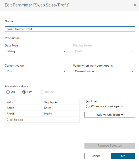
Build a parameter with measures. In my case it would be Sales / Profit.
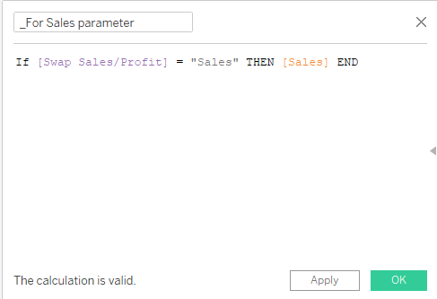
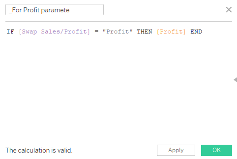
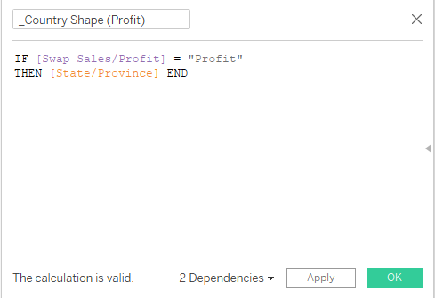
Now we build a separate calculation for every measure in the parameter: first for Sales and then for Profit. See the screenshot below.
Now we build the first calculation for our map. We do this calculation because we want to have two separate maps at once.
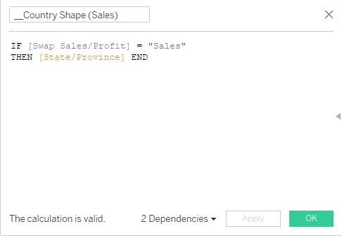
Then the second one.
This helps us achieve our idea.
Now we can start building our map. I normally put Country and Region on Detail, and the first calculation for map also on Detail. For Color we use the calculation for the Sales parameter.
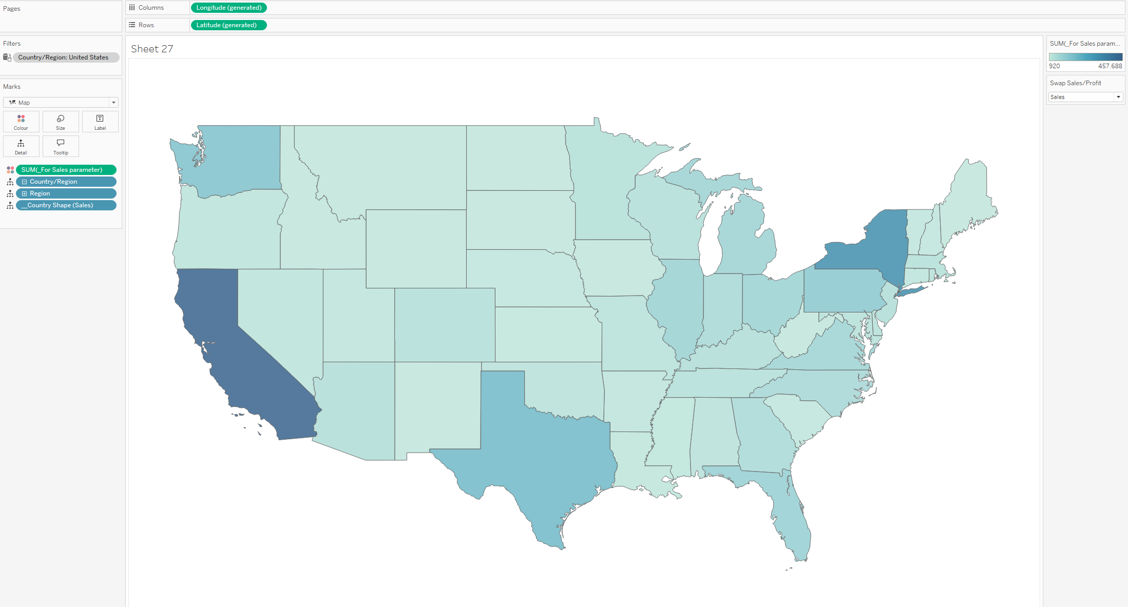
The next step is to put Country in the Marks layer.
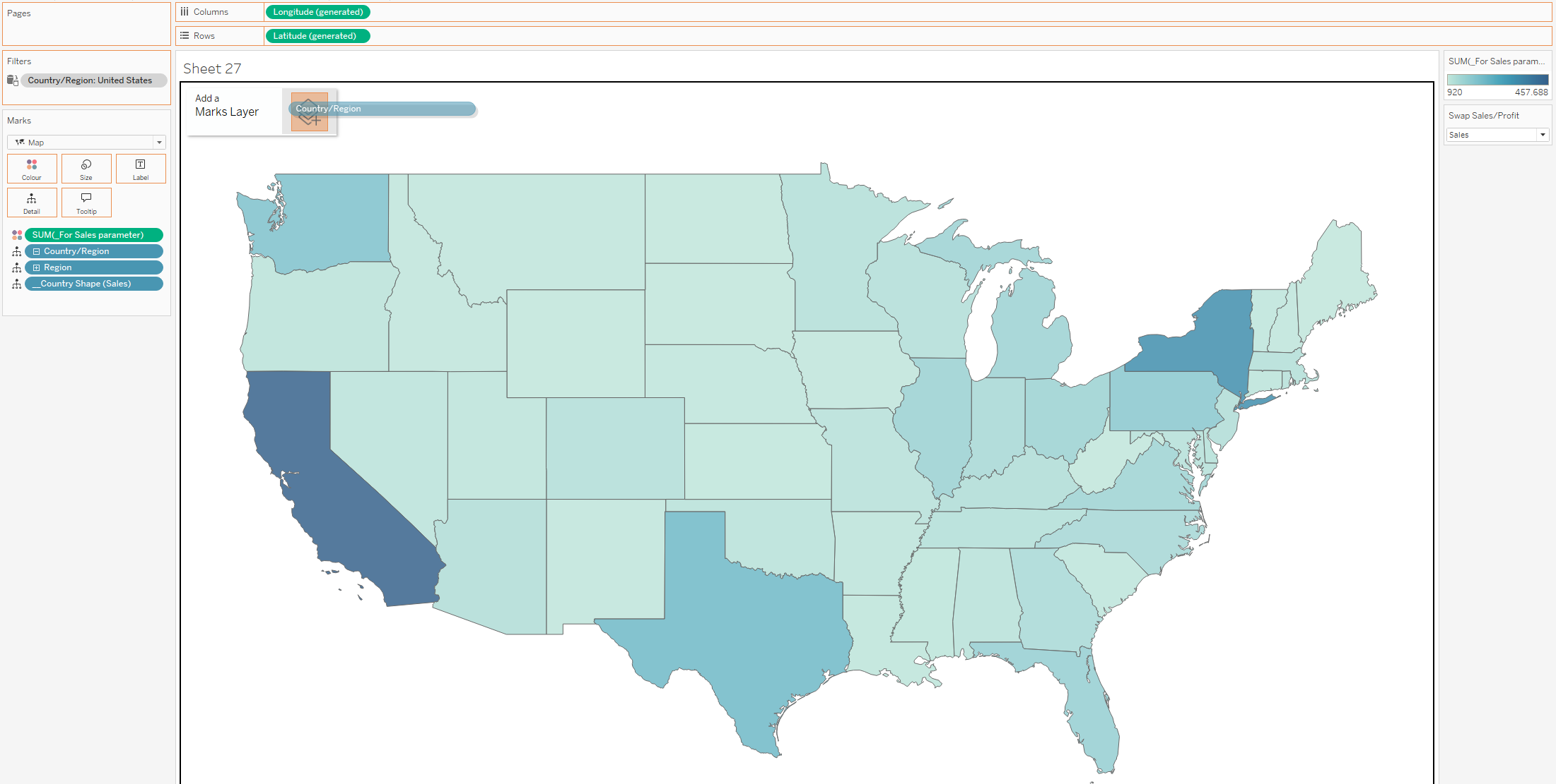
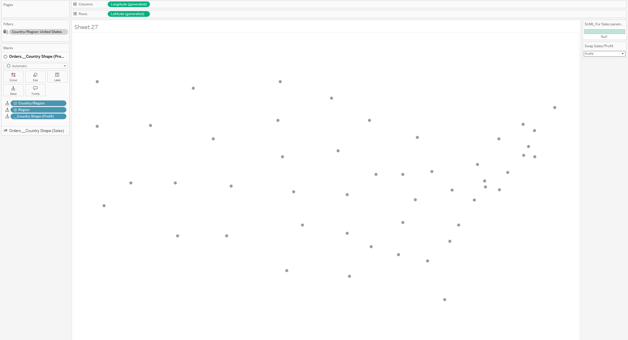
It will look like there is only one circle on the map .
Then we switch Country from Color to Detail, add Region and the second calculation for Profit to Detail, and change our parameter to Profit. You will see something like in the screenshot, but we need to switch the Marks card from Circle to Map.
It looks better, but we also need to put the calculation for the Profit parameter in Color.
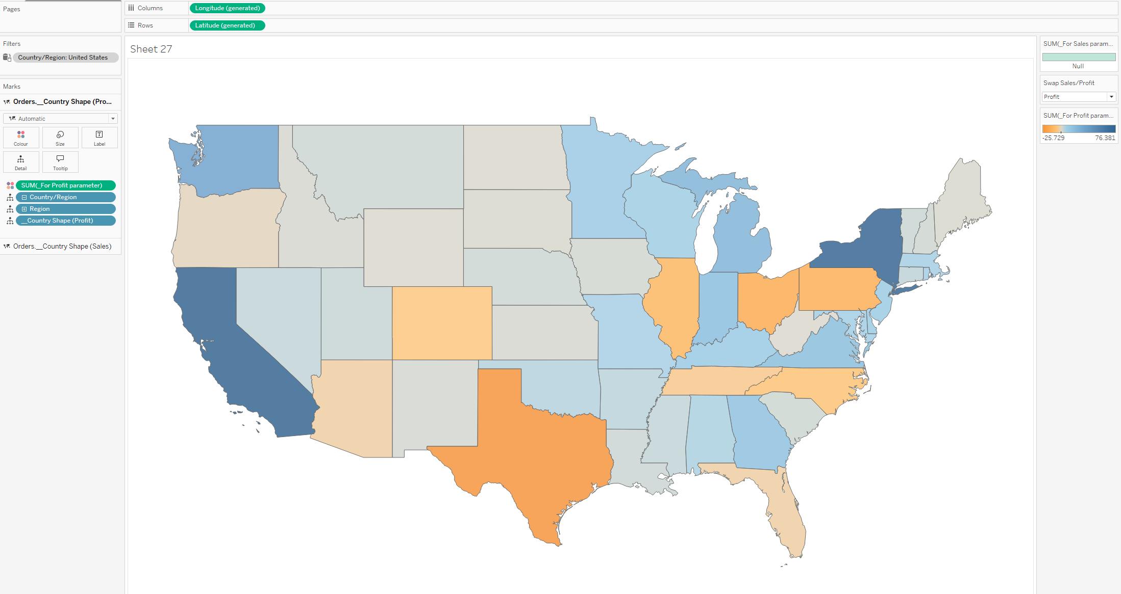
Now you have two separate legends for each measure in the parameter, and you can change the color of each one individually.
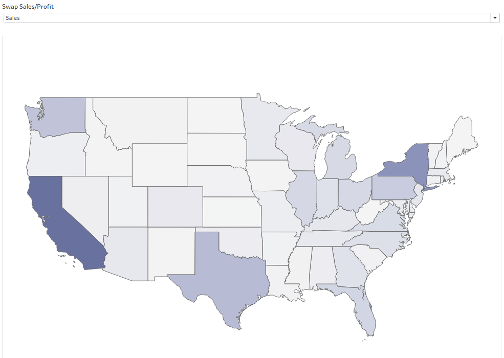
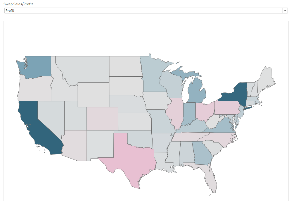
You can see my result below.
Have fun 🙂