


First step I want to know, what is a chart?
A chart is a graphical representation for data visualisation, in which "the data is represented by symbols, such as bars in a bar chart, lines in a line chart, or slices in a pie chart". A chart can represent tabular numeric data, functions or some kinds of quality structure and provides different info.
Which basics charts wie haw and for what?
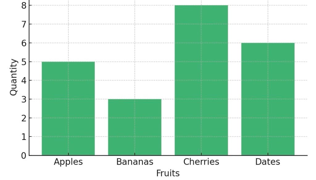
Bar Chart
Bar charts enable us to compare numerical values like integers and percentages. They use the length of each bar to represent the value of each variable.
A good bar chart will follow these rules:
- The base starts at zero
- The axes are labeled clearly
- Colors are consistent and defined
- The bar chart does non display too many bars
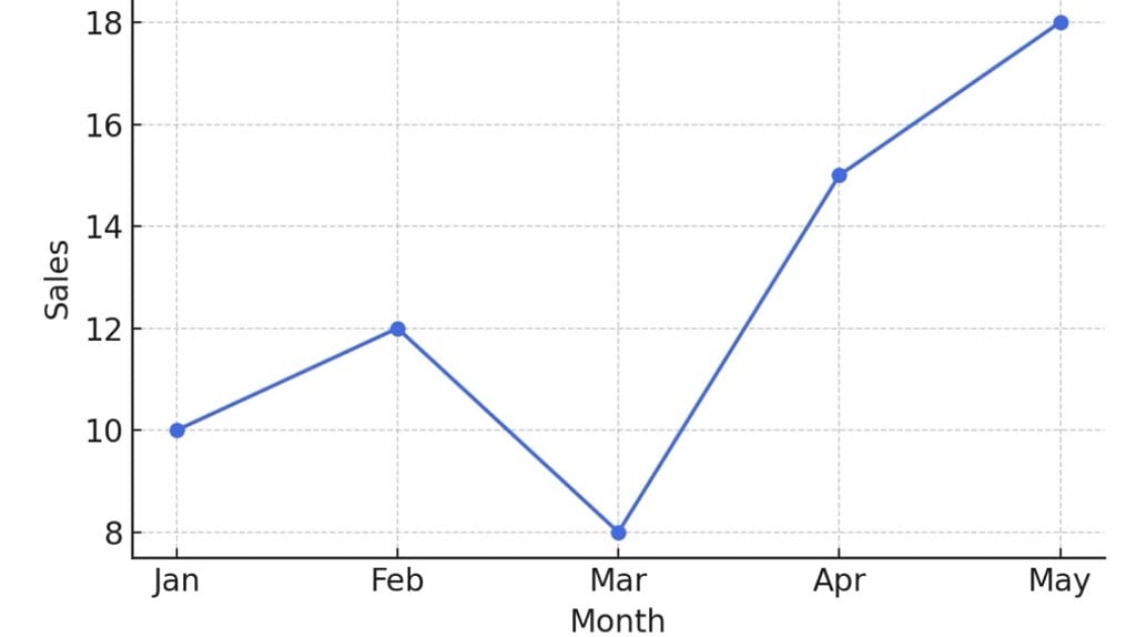
Line Chart
The line chart, or line graph, connects several distinct data points, presenting them as one continuous evolution. Use line charts to view trends in data, usually over time. The result is a simple, straightforward way to visualize changes in one value relative to another.
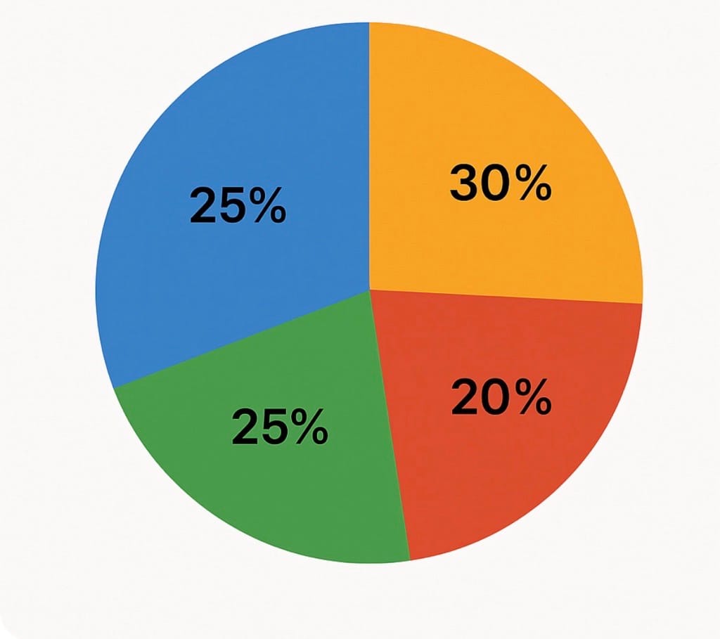
Pie Chart
Pie charts are powerful for adding detail to other visualizations. Alone, a pie chart doesn’t give the viewer a way to quickly and accurately compare information. Since the viewer has to create context on their own, key points from your data are missed. Instead of making a pie chart the focus of your dashboard, try using them to drill down on other visualizations.
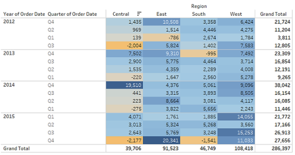
Text Table (Crosstab)
Text tables, otherwise known as matrices, pivot tables, or crosstabs, present numerical data in rows and columns. These tables support adding up and reviewing specific values within a data set. They also organize values and percentages so users can find the numbers they need.
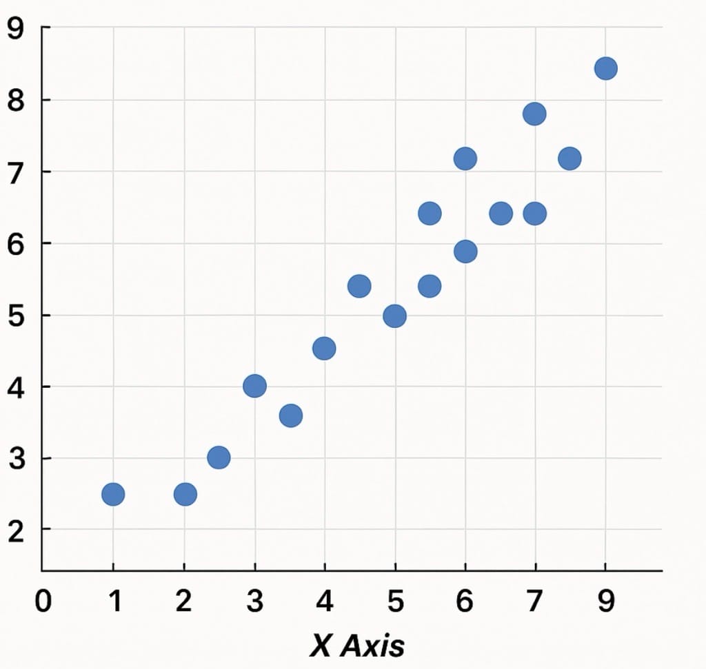
Scatter Plot
Scatter plots are an effective way to investigate the relationship between different variables, showing if one variable is a good predictor of another, or if they tend to change independently. A scatter plot presents lots of distinct data points on a single chart.
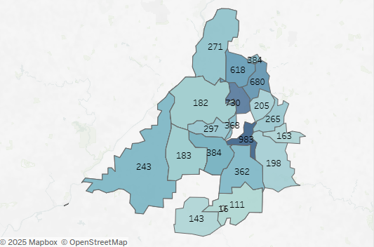
Maps
Maps are a no-brainer for visualizing any kind of location information, whether it’s postal codes, state abbreviations, country names, or your own custom geocoding. If you have geographic information associated with your data, maps are a simple and compelling way to show how location correlates with trends in your data.
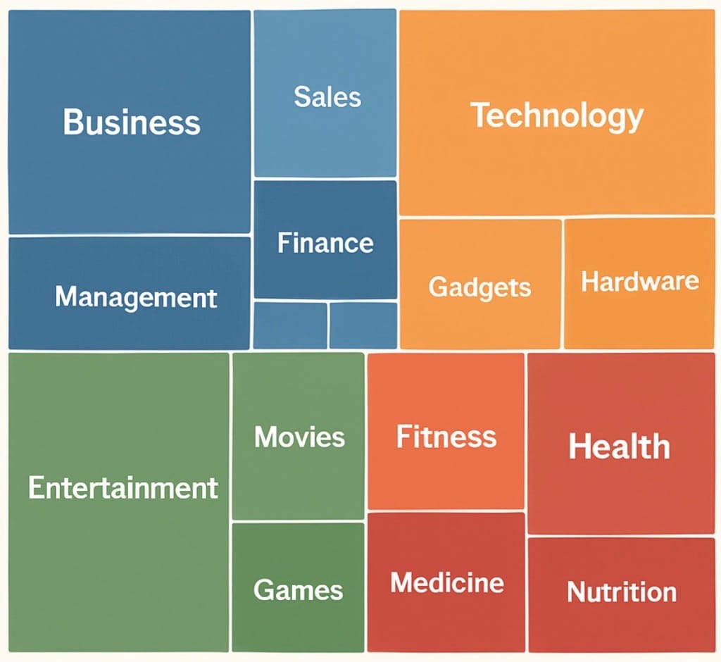
Treemaps
Treemaps relate different segments of your data to the whole. As the name of the chart suggests, each rectangle in a treemap is subdivided into smaller rectangles, or sub-branches, based on its proportion to the whole. They make efficient use of space to show percent total for each category.
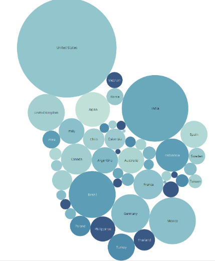
Bubble Chart
Although bubbles aren't technically their own type of visualization, using them as a technique adds detail to scatter plots or maps to show the relationship between three or more measures. Varying the size and color of circles creates visually compelling charts that present large volumes of data at once.
Thanks for reading!