


Dashboard week is finally upon us, and for our first day we’ve been tasked with making a Viz from data sourced from the 2019 Design Census. We must prep the data, create the Viz, and write a blog on the experience all before 5pm or something terrible happens…
I’ve heard some horror stories about people’s experiences with Dashboard Week, so I decided to make my life a bit easier on the first day by severely narrowing the scope of the Viz I was planning to make. I ended up looking at AI within the Design industry, basing my analysis of the oddities within the survey data. However, to make things a bit more interesting, I went for a long form Viz, reminiscent of my IronViz entry, meaning I had lots of analysis to do, and lots of space to fill. In hindsight, I shouldn’t have made it as long as it eventually turned out…
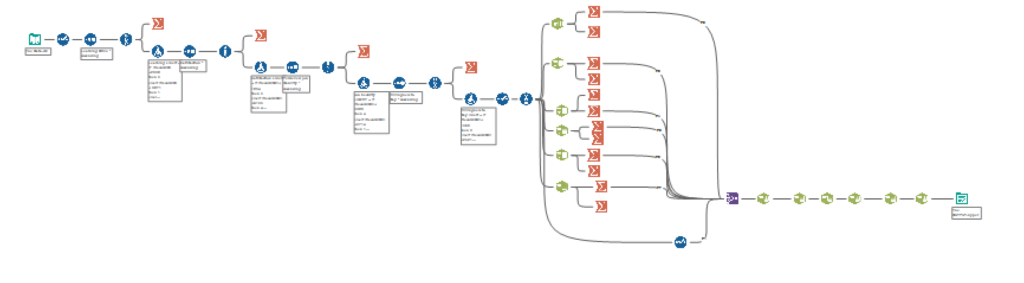
Survey data is notoriously complicated to wrangle, but I was pleasantly surprised by how little data prep was needed to get the information I needed, and I only ended up spending 2 hours in Alteryx (with 1 hour, 50 minutes of that 2 hours waiting for my workflow to run):
Once in Tableau it was all about exploring the data. I
already had a rough idea with the AI avenue, but I still had no idea what I
would find.
With time ticking down, I finally stumbled upon some insights worthy of noting,
and went to the design stage. I’m a fan of adding a lot of written analysis in
my Vizzes, to help guide the reader through the story of the Viz, which was a
major hinderance in this context.
Having spent entirely too long creating and writing the analysis, I didn’t have much time to consider diversifying my chart selection, so the result was 5 Bar charts. Not the most visually diverse selection, but they do the trick.