


In this tutorial, you'll learn how to create a responsive stacked-bar chart in Tableau that automatically sorts based on the selected item in the chart. This allows users to interact with the chart and bring any category to the front along the x-axis.
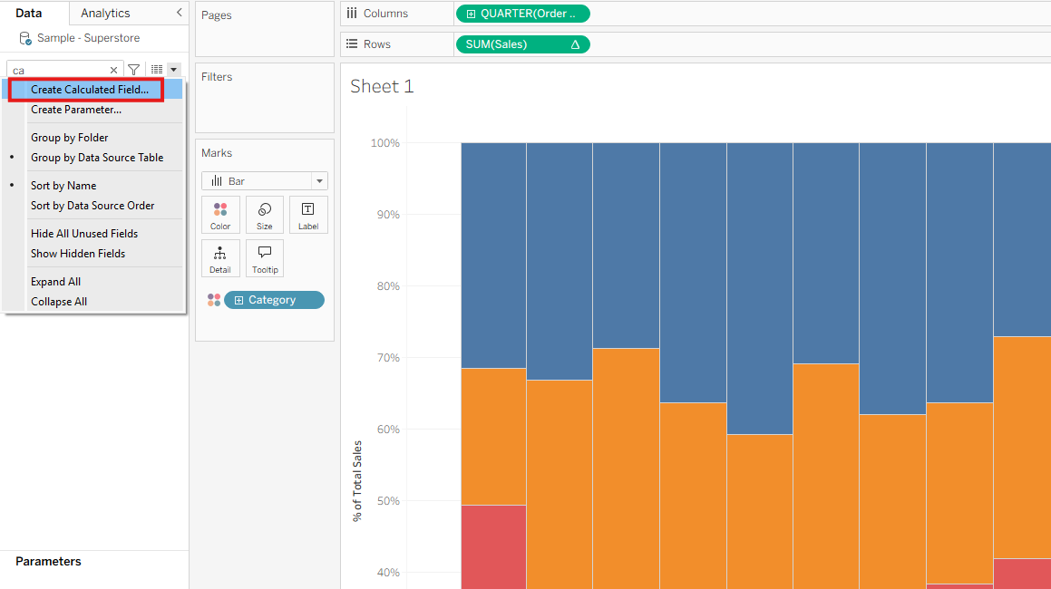
Step 1: Build the Stacked-Bar Chart
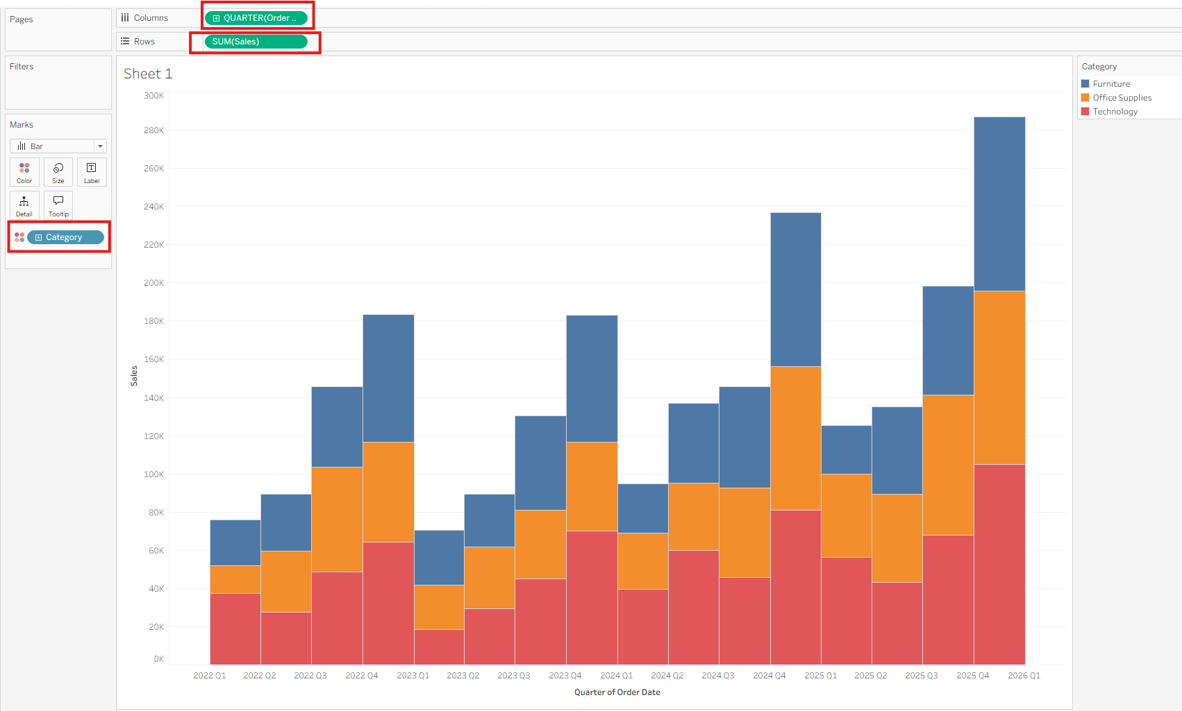
- Drag your time dimension (e.g.,
Order Date) to the Columns shelf and set it to Continuous Quarters. - Drag your measure (e.g.,
Sales) to the Rows shelf as SUM(Sales). - Drag your dimension (e.g.,
Category) to the Color mark.
You now have a basic stacked bar chart.
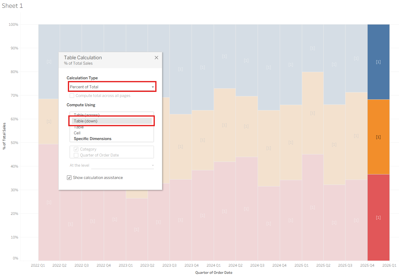
To convert it into a percentage view:
- Right-click the
SUM(Sales)pill, choose Add Table Calculation. - In the Table Calculation dialog, select Percent of Total and Table (down).
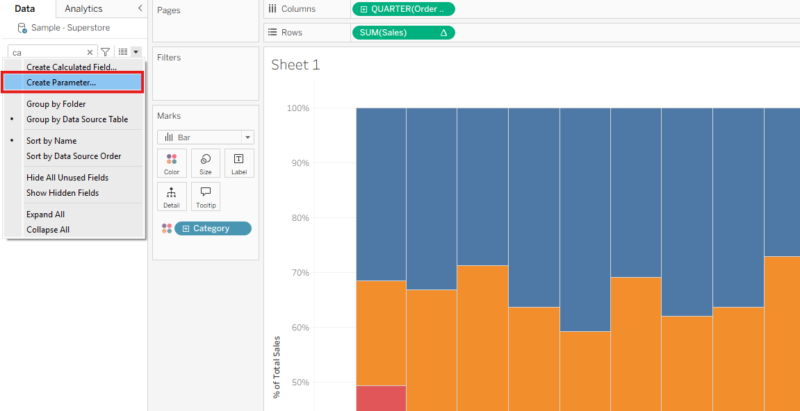
Step 2: Create a Parameter
- In the Data Pane, click the dropdown and select Create Parameter.
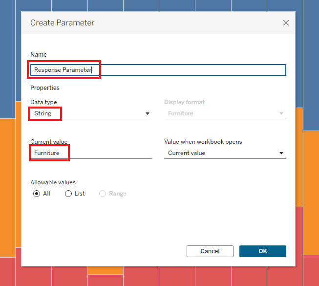
- Name the parameter (e.g.,
Response Parameter). - Set Data Type to String.
- Set the Current Value to a default value from your dimension (e.g.,
"Furniture"fromCategory).
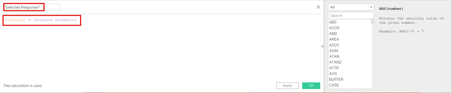
Step 3: Create a Calculated Field
- In the Data Pane, select Create Calculated Field.
- Name it something like
Selected Response?(use?to denote Boolean logic). - Use this formula:
[Category] = [Response Parameter]
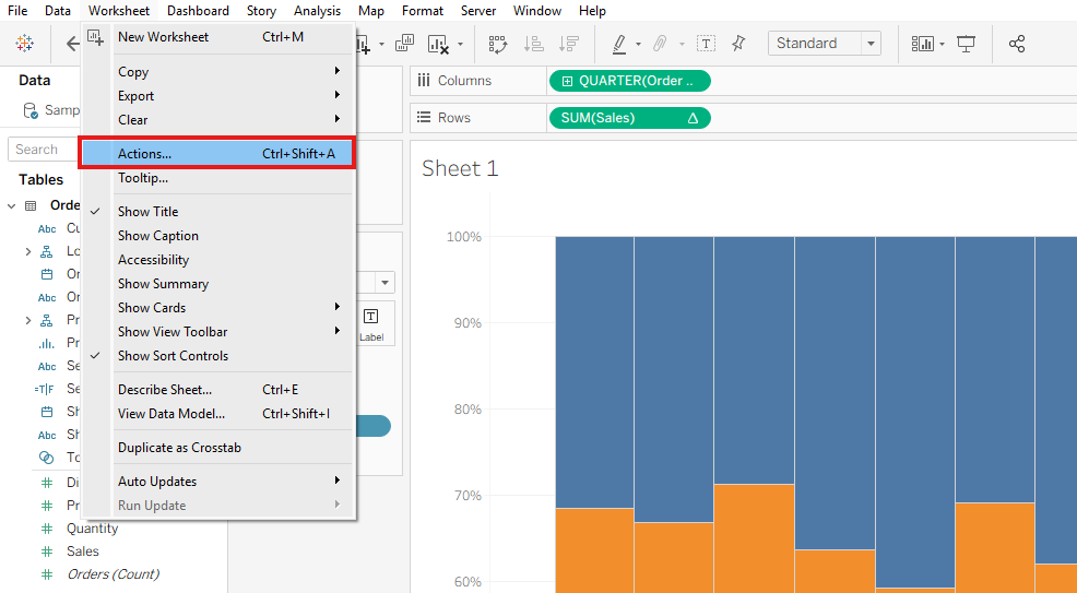
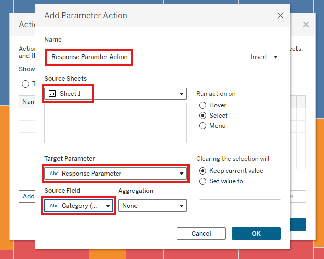
Step 4: Create a Worksheet Action
Note: If you're working in a dashboard, go to Dashboard > Actions.
- Go to Worksheet > Actions.
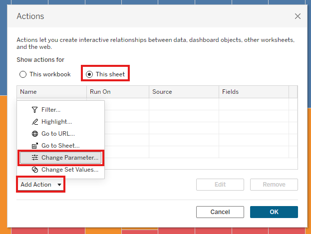
- Click Add Action > Change Parameter.
- Name the action (e.g.,
Response Parameter Action). - Set:
- Source Sheets: the current worksheet.
- Target Parameter: the one you created earlier.
- Source Field: the dimension on Color (e.g.,
Category).
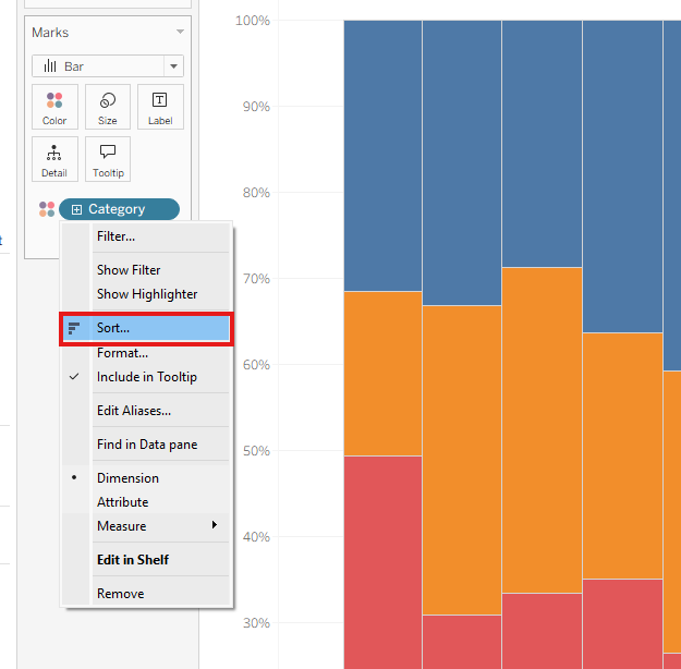
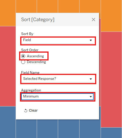
Step 5: Sort Based on the Selected Response
- Right-click the dimension on Color (e.g.,
Category) and select Sort. - Set:
- Sort By: Field
- Sort Order: Ascending
- Field Name: your calculated field (
Selected Response?) - Aggregation: Minimum
Now, clicking a section of the bar chart will bring that value to the front on the x-axis.
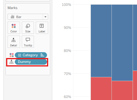
Bonus: Prevent Unselected Items from Greying Out ("Dummy" Trick)
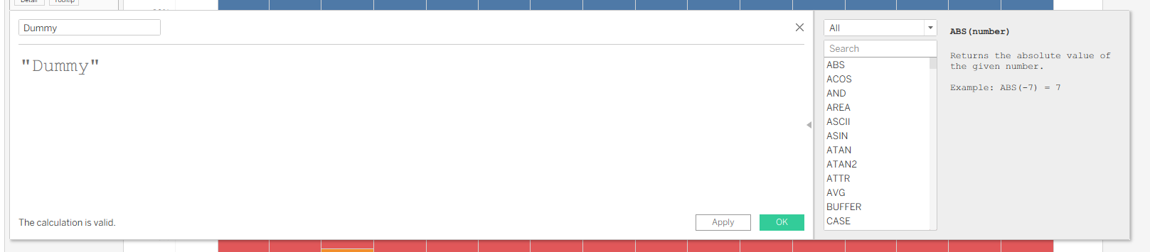
- Create a new calculated field named
Dummywith the following formula:"dummy" - Drag the
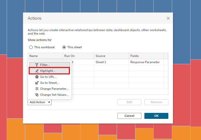
Dummyfield to the Detail mark. - Create a Highlight Action:
- Go to Worksheet > Actions > Add Action > Highlight.
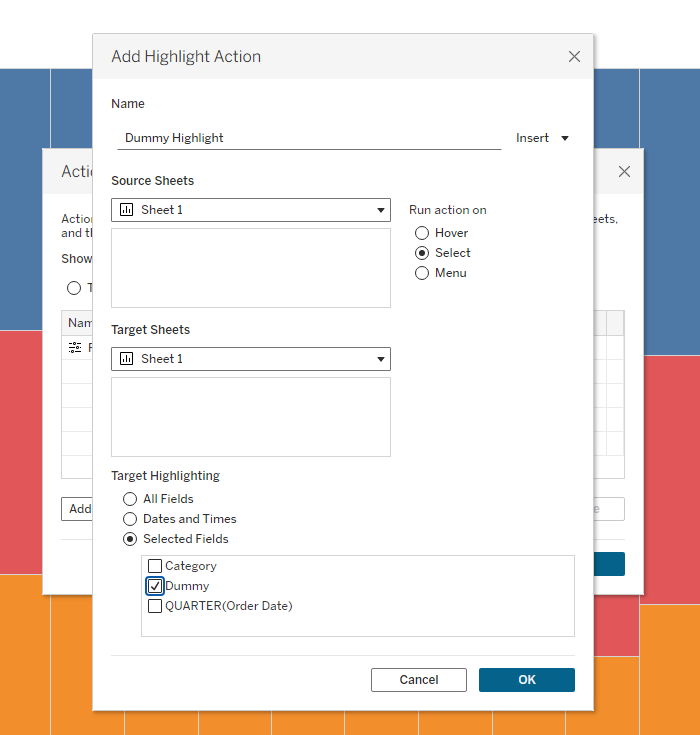
- Name it (e.g.,
Dummy Highlight). - Set both Source Sheets and Target Sheets to your current sheet.
- Under Target Highlighting, choose Selected Fields and check
Dummy.
This ensures that unselected parts of the chart don’t get dimmed when interacting with the chart.