


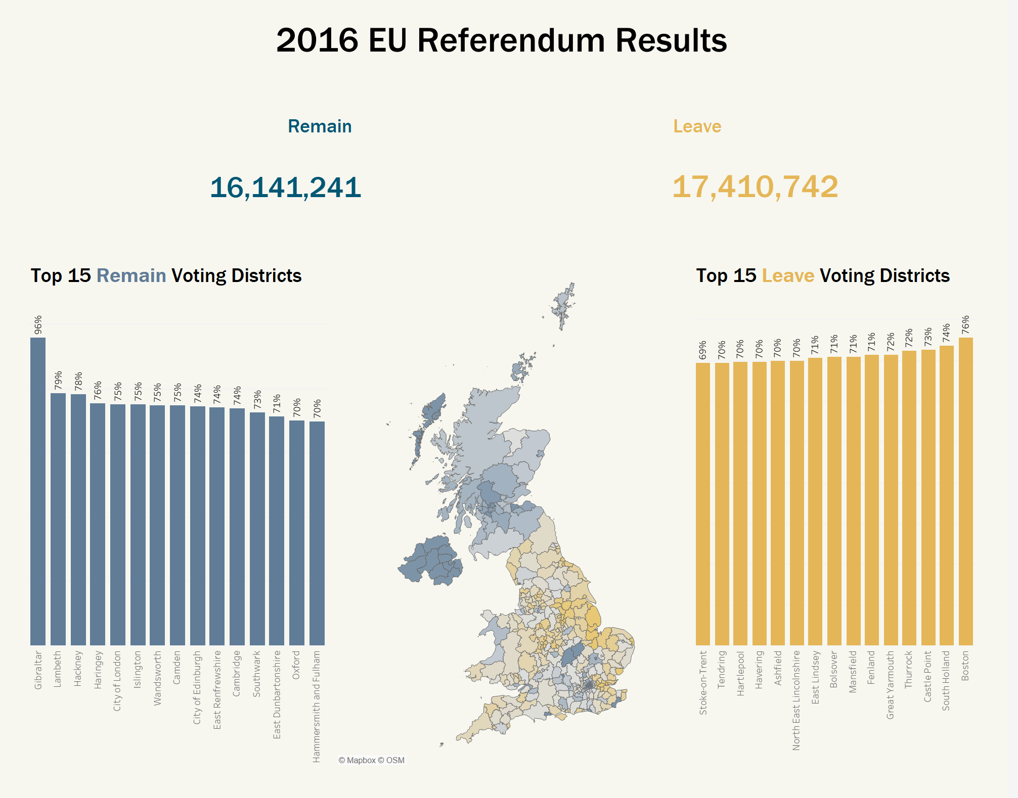
Today we were working with the results from the 2016 EU referendum here in the UK. The data gives the election results in each local authority district (slightly more detailed than county-level), so there was no opportunity to look at a demographic breakdown of the results without bringing in a number of other datasets. Given that we only had two and a half hours for this exercise, I decided to simply present the results geographically, using shape files for each local authority district. Once in Tableau, I formed a relationship between these two datasets using the name of the local authority district, and produced the following dashboard:
Unfortunately there was not a perfect match between the two datasets. For example, Northern Island was only presented as one result in the referendum data, so a more local breakdown here was not possible.