


For my personal project (which is always presented during the last week of training), I decided to analyse Michelin-listed restaurants in Hamburg. Since I love discovering new food spots, this felt like a cool topic. Here’s how it went:
First Day (30/10/25)
My initial idea was to take a data-driven look at what people in Hamburg enjoy eating the most. I planned to use a 2021 dataset based on TripAdvisor ratings, which already include some internal weighting to make the scores more reliable.
I wanted to explore questions such as:
- Which restaurants are the most popular based on number of reviews?
- Is there a relationship between how many people rate a restaurant and its average rating?
- Do restaurants with many reviews tend to have higher or lower scores?
Second Day (06/11/25)
But then… I realized I really wanted to work with spatial data.
So I changed my plan!
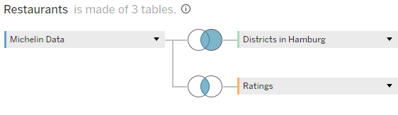
Instead of TripAdvisor restaurants in general, I focused specifically on Michelin restaurants in Hamburg and decided to build an interactive dashboard where users can both explore and analyse the data.
The dashboard includes three main sections:
- Restaurant Finder – Filter by cuisine, price level, Michelin rating, and neighborhood to discover the perfect spot.
- Neighborhood Insights – Combine Michelin data with demographic information from Hamburg’s districts.
- Public Ratings – Compare Michelin evaluations with TripAdvisor reviews to see how expert ratings line up with public opinion.
Dashboard Sketch:

Third Day (20/11/25)
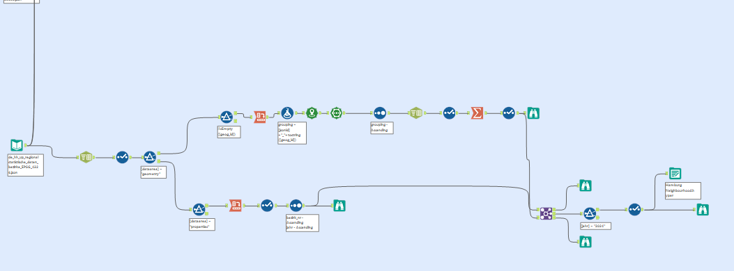
I finished prepping and joining all three datasets and started building the visualizations.
Fourth Day (24/11/25)
I wrapped up the first and second dashboard and began working on the final one.
Fifth and Final Day (25/11/25)
This day was dedicated to final touches, small fixes, and polishing the interactions.
In the afternoon, we presented our results.
Here’s my final dashboard if you’d like to take a look :D