


Treemaps are best used when you want to show how parts of a whole are divided up and how those parts compare to each other, especially when you’re dealing with hierarchical or nested categories. Here’s how to build one in Tableau.
Building A Basic Treemap
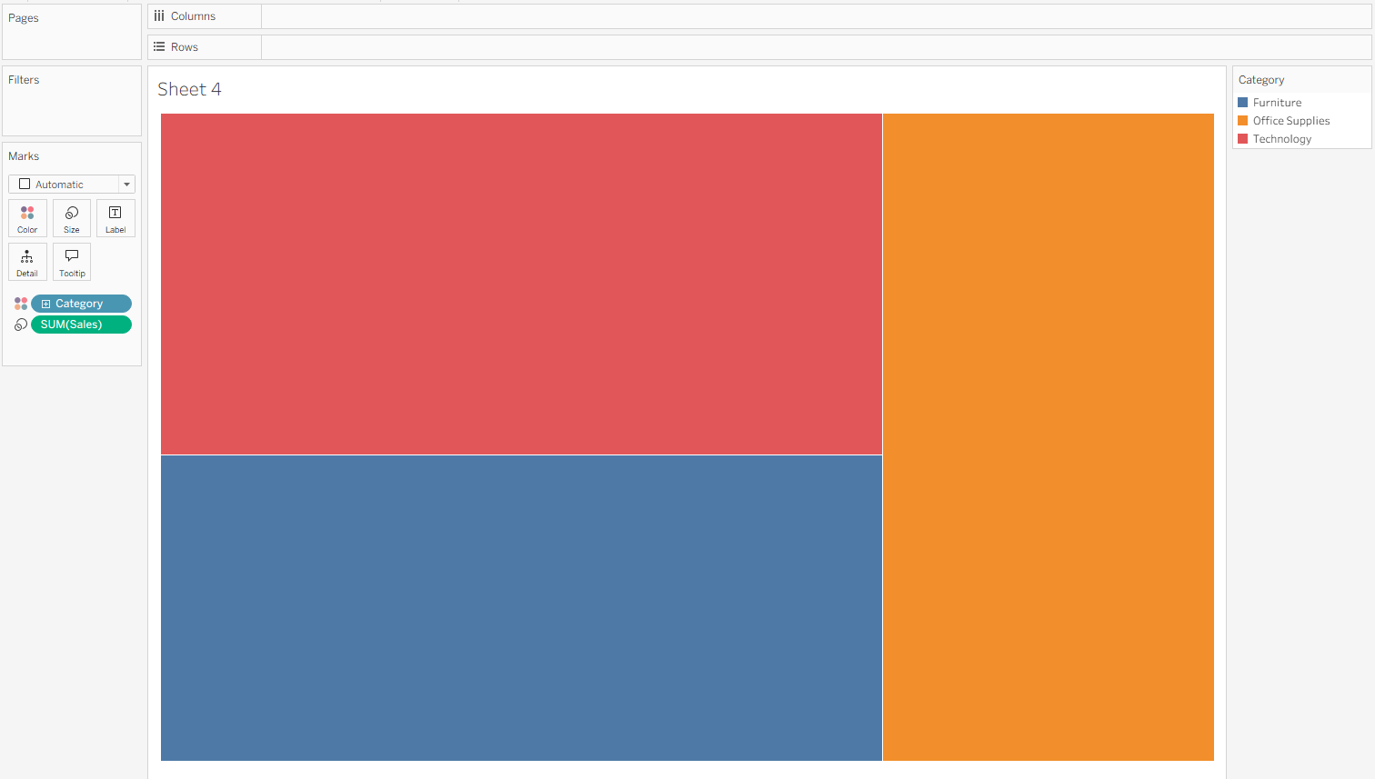
Let’s start with a simple treemap using Tableau’s Superstore dataset. We’ll visualize sales by category and sub-category. Drag Category to Color and Sales to Size—that creates the base of the treemap, and Tableau will automatically switch the mark type to square. From here, we can see that Superstore’s sales are split fairly evenly across Furniture, Office Supplies, and Technology. By default, treemaps place the largest category at the top, with smaller ones arranged left to right and top to bottom, so we know that Technology is our biggest category by sales.
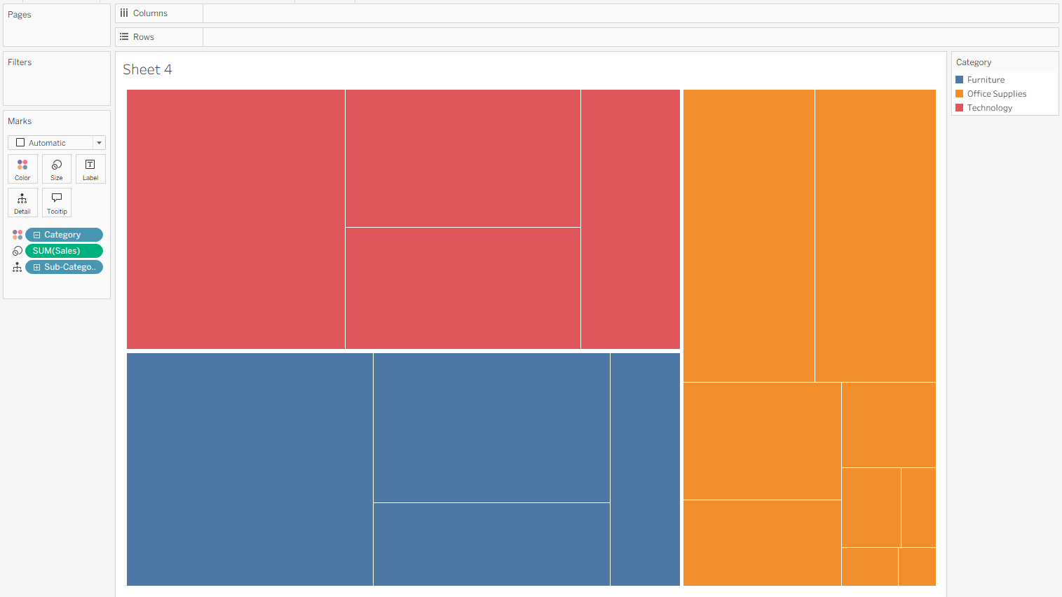
To add more detail to the view, drag Sub-Category onto Detail.
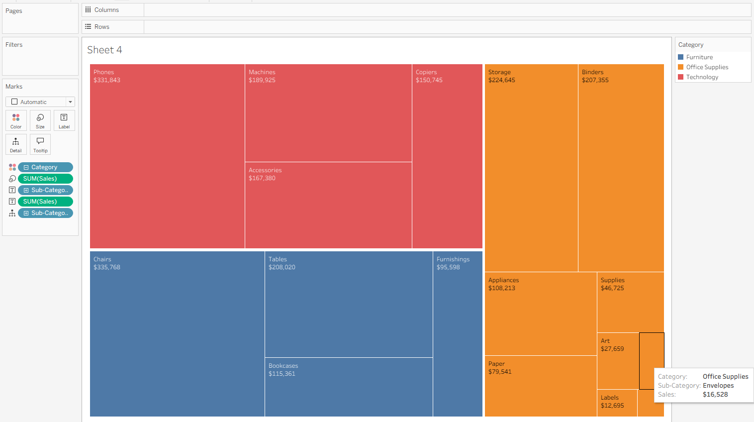
To see what each box represents, hold Control and drag SUM(Sales) and Sub-Category onto Label as well. This adds both fields to the treemap. Some of the smaller tiles won’t have room to display all the text, but you can always hover to see the Category, Sub-Category, and Sales in the Tooltip.
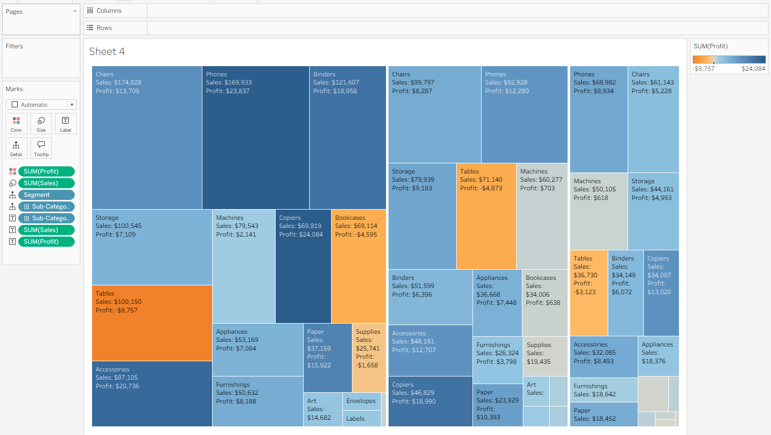
Using Multiple Measures in a Treemap
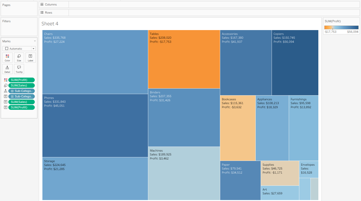
We can also use color and size for different measures. For example, if we want to explore the relationship between sales and profit within each sub-category, we can move Profit to Color instead of Category. This applies a diverging color palette, making it easy to spot insights—like the fact that while Tables is one of Superstores top-selling sub-categories, it’s also the least profitable.
We can also add another layer of categorical detail to the treemap. Too many groups can make the view visually overwhelming, but for demonstration purposes, let’s drag Segment to Detail and place it above Sub-Category in the Marks pane. Now the treemap is split into three groups—Consumer, Corporate, and Home Office. The order of the Segments is based on sales (on the Size shelf), not profit (on the Color shelf). This makes it easy to see that Table sales performed poorly across every segment. Even though Tables ranked among the top two sub-categories by sales overall, within each segment they dropped to fourth or fifth—and were consistently the least profitable.
A few tips about the Marks card: dragging a new dimension onto Text breaks down the chart the same way as dragging it onto Detail, but it also adds labels—often a quicker way to get both at once. The order of fields on the Marks card also matters. The dimension at the top is broken down first, with the others following in sequence.