


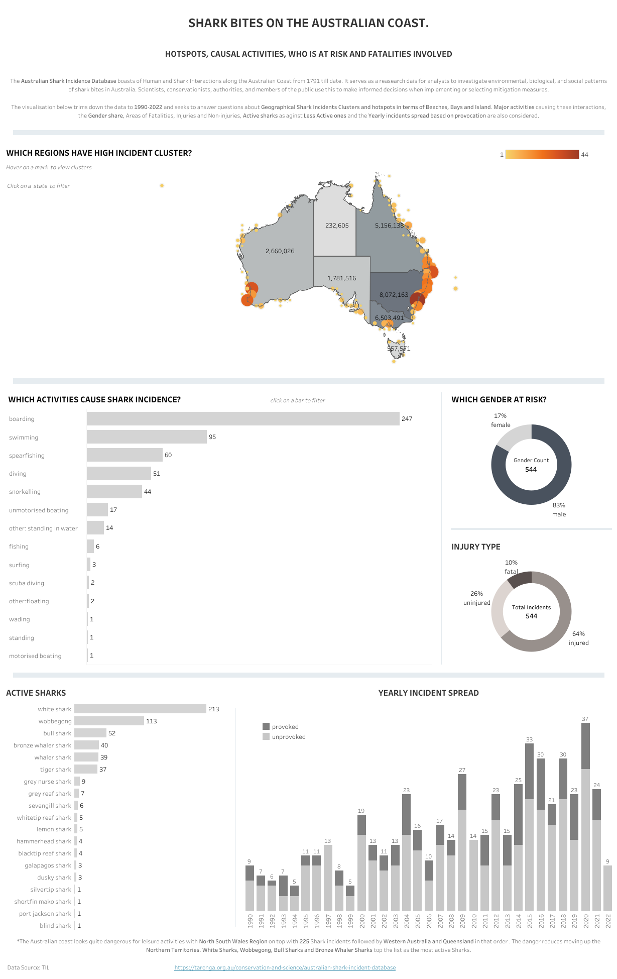
This week, the presentation task for my cohort was to remake our application vizes. In doing this, I considered feedback during the interview, what I had studied in class, and lastly feedback from my colleagues in the office today.
Summing all together, these were my major changes:
- I had to make sure I had a user story which considered my audience, the question I want to answer, my findings and how my finings could help my target audience make decision.
- I made sure my title was being answered in my new viz..
- In answering my question about shark incidence clusters, I brought in a secondary data source (population data).
- In terms of coloring, I change my diverging colors on my map to continuous.
- I also took off my numerous filters since the charts could also be used as filters.
- I also reduced the scope of my work by taking off my work on beaches.
- I eliminated double encoding from my activity chart.
- I also had to consider my chart selection for active sharks. I changed it from heatmap to bar chart.
- In my yearly spread chart which was stacked by provoked and unprovoked, I used a parameter action to show the real effect when a filter is applied.
- I applied sorting on my donuts and bar charts such that they always showed descending.
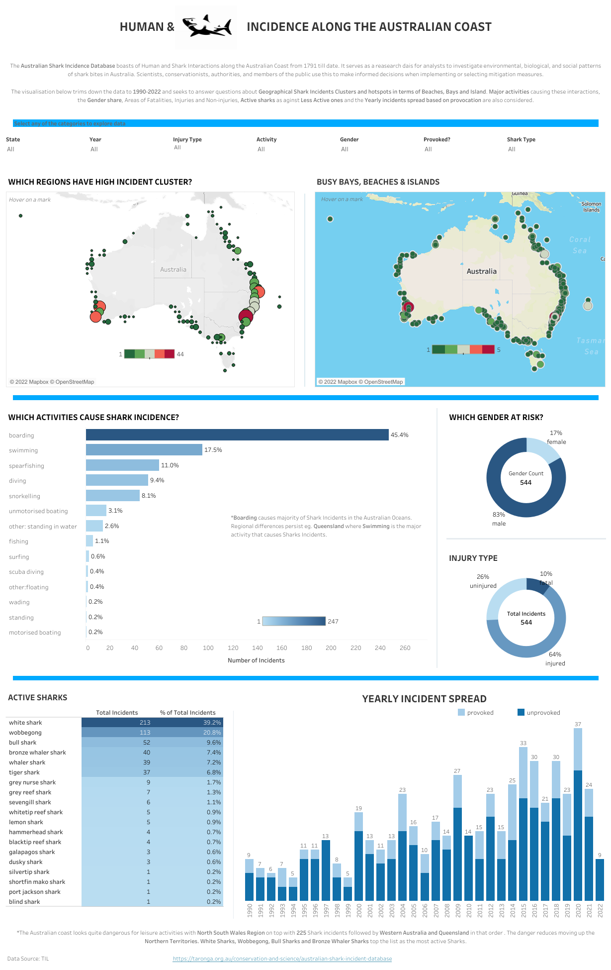
It has been a great learning curve at the data school for the past 2 weeks. Below, you can view my original and redone application viz.
Thanks for reading.