


Today is the 3rd day of dashboard week and the task was to create an infographic using Marvel data from FiveThirtyEight.
I started by making a plan for the day:
1.Look at the requirements of the task and Research infographics and what Avengers was about.
2. Look at the data set to make meaning of it.
3. Write a user story and make a sketch of my output
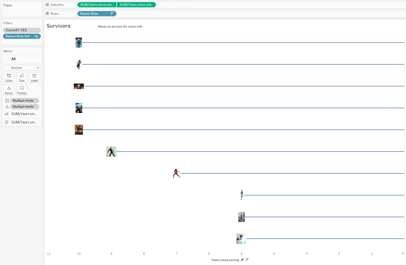
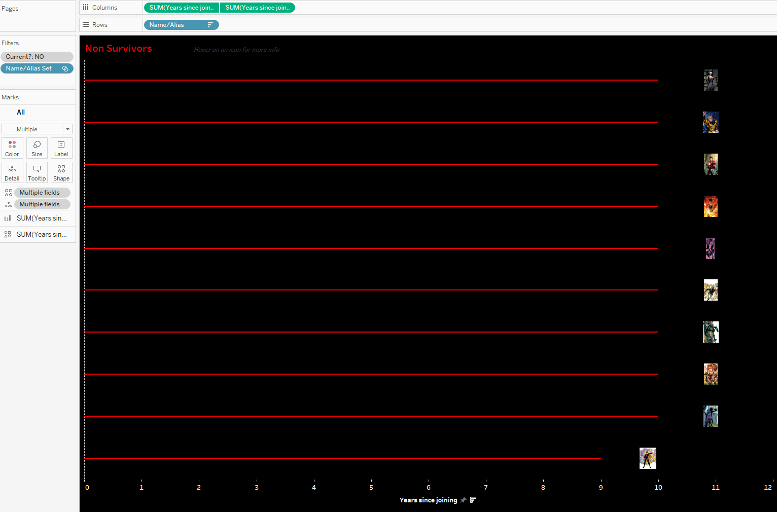
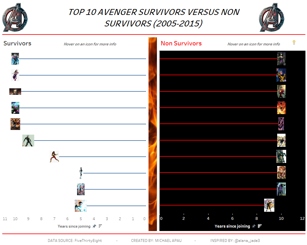
After Going Through the data, I want to create an infographic dashboard that will focus on the year range of 2005-2015 looking at the Top 10 survivors and non survivors. Looking at this infographic will help one know further information about these characters.
4. Went on tableau public for inspiration and sketched my final view.
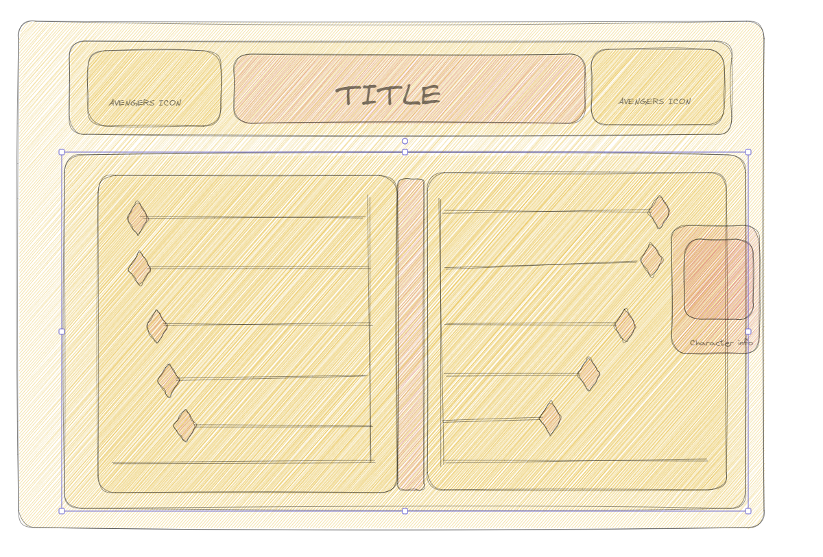
5. Create my infographic
After going through points 1-4, I went for this simple format which sort to give detailed information on the non surviving and surviving characters between 2005 and 2015. Without scraping the images, I manually downloaded the images online after knowing the characters which fell in the selected range. I put all the images in my tableau repository to be used as shapes later in the dashboard.
The creation of the dashboard was basically creating two charts (one using a bar and the other using shapes) and creating a dual axis for both. This process was done for both survivors and non-survivors.
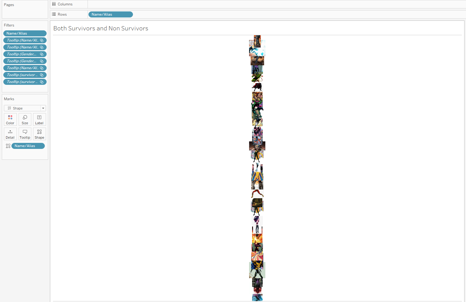
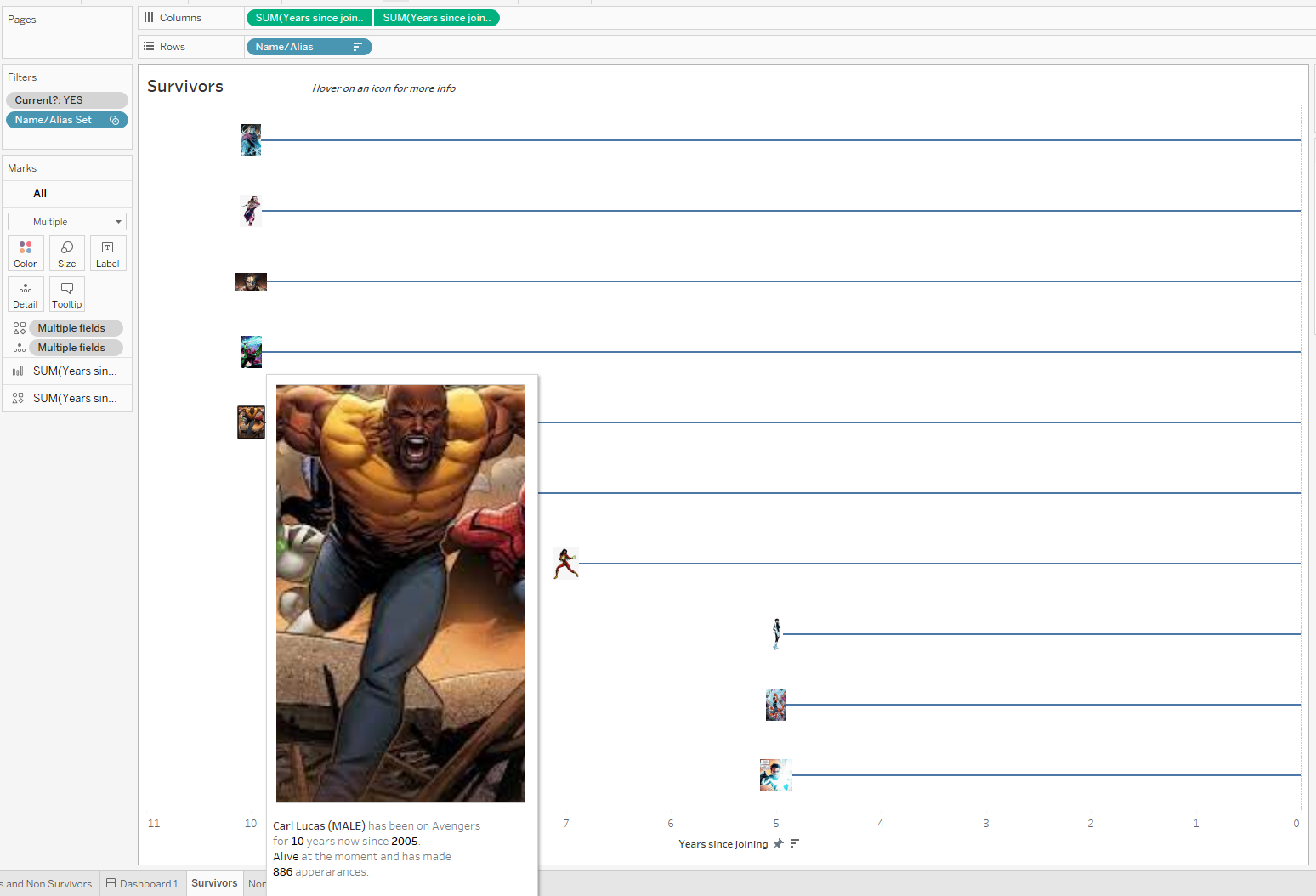
After this I created another sheet which simply contained the images of my characters. This sheet was later used in my tool tip. It looks not so clear but when used in the tool tips with adjusted pixels, it comes out perfect.
The final dashboard was uploaded to Tableau public and below is a snapshot.
Lessons: I learnt that infographics shouldn't be interactive and I wouldn't repeat that given another opportunity.