Day 3
Yesterday we worked using our own blog post data, to try to find insights or provide a dashboard that would allow a user to check different things such as views, number of posts, countries viewing posts etc. I’ve chosen not to post here what I created yesterday due to the information it shows however I can confirm, I finished on time! Therefore I finally had a new aim coming into day 4.
Day 4
Aim for day 4: To trust in my own ability.
Before joining the Data School I read a blog about by Marcus Grant of DS6 where he reflected on his time at he Data School (You can read it here). In this post he referenced something called ‘Impostor Syndrome’, which essentially being in a situation where you feel like you don’t belong or aren’t good enough. I’m not the type to get this, and I don’t feel that this is exactly what I’m feeling because I know i’m here for a reason; however when you’re in the Data School and you’re set on a challenge which is the same for everyone it can feel like you’re taking a long or slow route early. This is true even more so for both Dashboard Week and when you’re using Alteryx. As a result you listen to what others are saying when they think out loud and it sways you to copy or follow their way of doing things.
So far this week my aims have been to finish on time, and now that I have finished on time I realise that one of the things taking a long time was exactly what I have described above. I would have an idea on how to build out my Alteryx workflow to get the data how I wanted it, but would overhear things and begin to question whether what I was doing was correct… but the fact is there is no “correct” way! And so today, I stuck with my own plan regardless of what I heard, gave my help and advice where it was wanted – and it paid off. My data prep was done in enough time for me to find another API to call to improve my data, and I found myself done with plenty of time play around with formatting, creating dynamic tool tips and to assist the others with what they were doing where required – which is one of the things I enjoy most about Tableau and Alteryx!
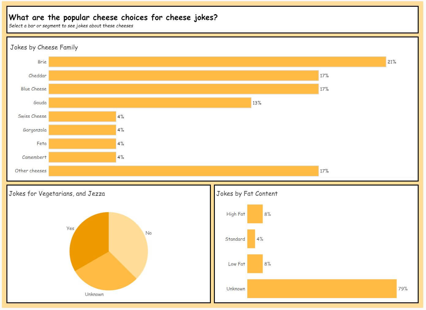
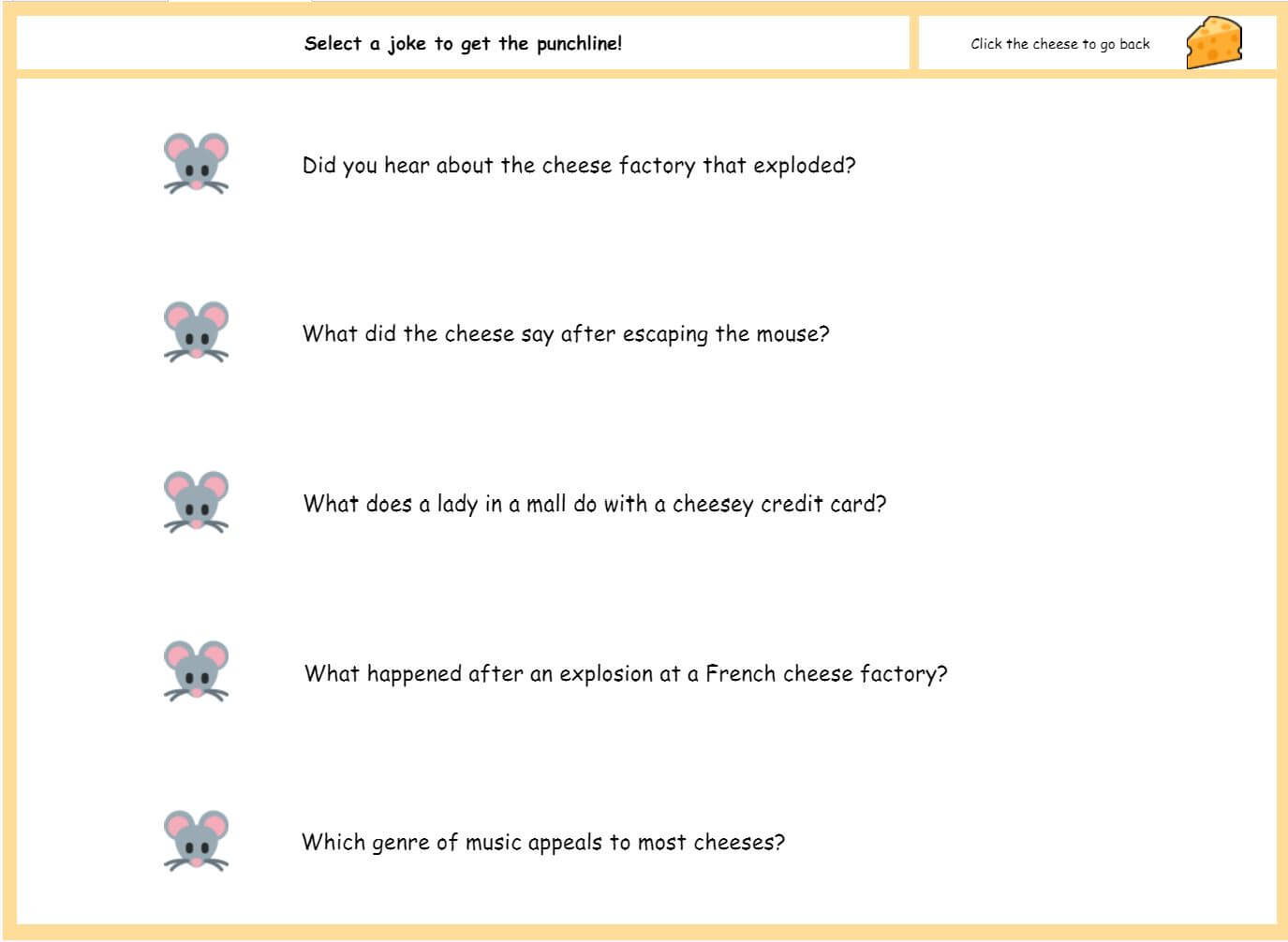
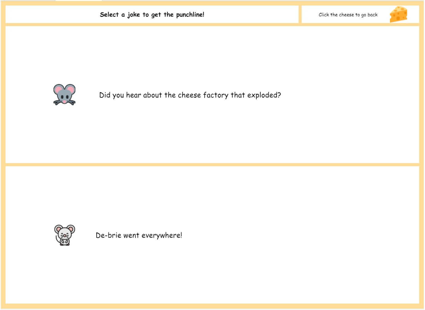
Cheese Jokes
Our challenge was to create a dashboard using an API or scraping data from Cheese.com. There wasn’t a lot of data that I felt I could use to create an insightful dashboard so my plan from the beginning was to bring more data in and luckily I was able to work fast enough today to make this a possibility!
I scraped a load of jokes from the internet relating to cheese, then joined them to the list of cheeses from our original data. I joined them where the cheese name or cheese family name were contained within the joke or punchline and then visualised it in a slightly ‘out there’ design.
My completed dashboard really doesn’t fit my normal style – I even went as far as to change the font to Comic Sans MS for the first time since school!! But I wanted to show that I can build dashboards to fit requirements, and to push from my comfort zone.
The interactive version can be seen viewed on my Tableau Public profile.