


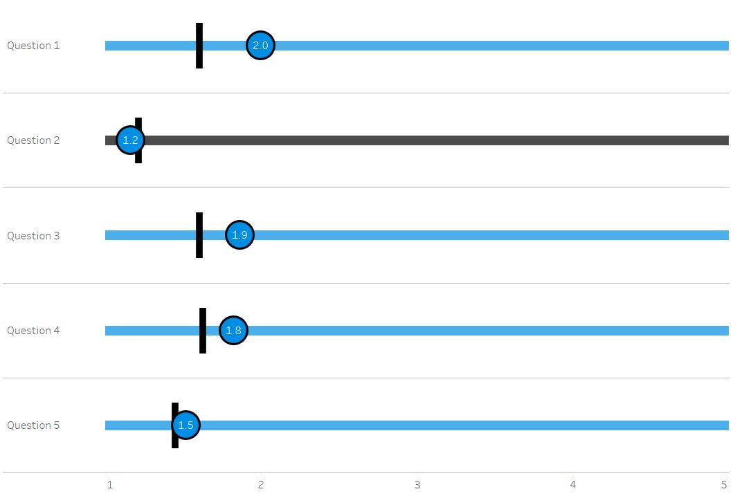
I’ve been looking at survey data and had the idea to plot each question on a scale for the respondent, against a national average for all respondents. I wanted to be able to have a gant and a circle on one scale so it was easy to differentiate between the respondent and the national average without using colour, as it was already being used, or size as it wouldn’t look as clean.
This is my desired outcome:
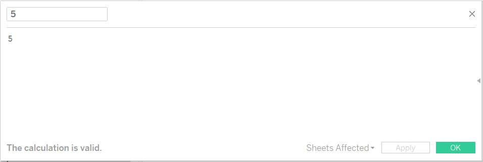
To do this first of all I need the scale which my points will sit on. All of the questions in the survey data were from 1-5 which meant this was quite straight forward. Create a calculated field called which was just ‘5’.
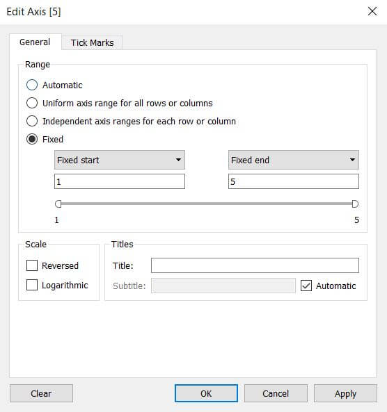
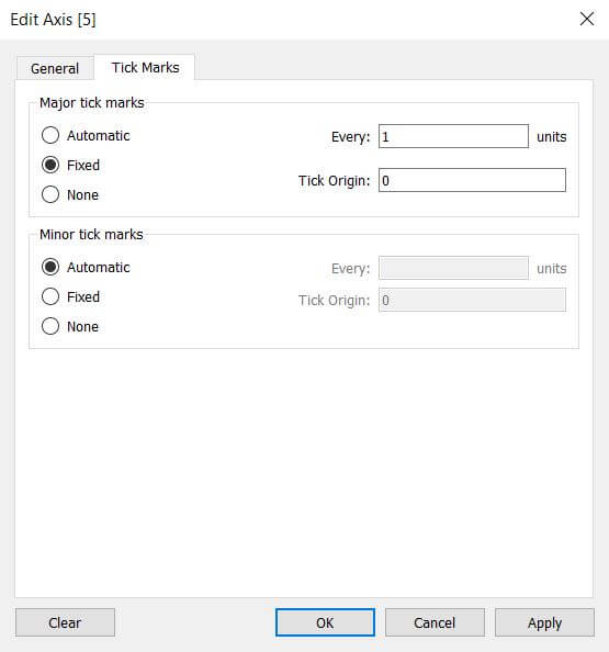
Place this onto columns and format your axis so it’s from 1 to 5 and then you have your scale.
Your second pill should be measure values. This can be created in multiple ways but one was is to drag measure values from the data pane and place it on columns, you can then proceed to remove any unwanted measures either by dragging them from the measure values shelf, or by right clicking measure names which should now have generated on the filter shelf to edit the filter and remove them there.
If you have used a different method to get your measure values pill onto columns, make sure that measure names is not on rows.
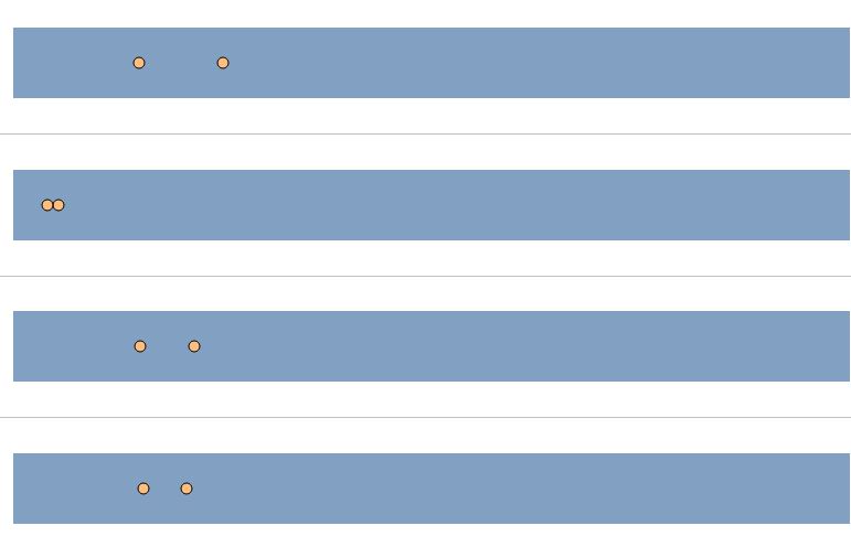
Now right click on measure values and make this a dual axis.
![]()
You’ll then need to add any dimensions you want to split your view by to the rows shelf. I’ve used my question number and question text.
![]()
Following these steps you’ll probably now have something similar to this.
At this point it’s all down to formatting – These are the steps I’ve taken for my result but from here you can adapt it however you like.
Size: Change the size of the bar and the circles so that the circle is big enough to fit a label, and the bar is thinner than the circle.
Colour: Decrease the opacity on your bar to make the circles stand out more.
Label: You’ll notice on my example I have a label on only one point. This is an additional trick which I detail in another blog here.
Mark Type: Change the circles to shape and measure names on shape, this way you can make it look like you’re using a gant and a circle. I found an image of a vertical line online and created a circle with a thick border in PowerPoint for mine.. Making your mark type a shape and having the knowledge to use custom shapes means you can be really creative at this stage and fit your dashboard to suit your use case.
For help on any of the method I’ve used in this post you can take a look at my other blogs here, and if there is anything you can’t find please feel free to reach out to make for help.