Day 2 of dashboard week and today we tackled Accessibility. My task was to be as accessible as possible whilst displaying COVID data.
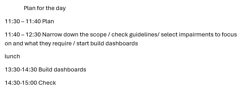
First, the plan! This time I stuck to my plan much better than on day 1!
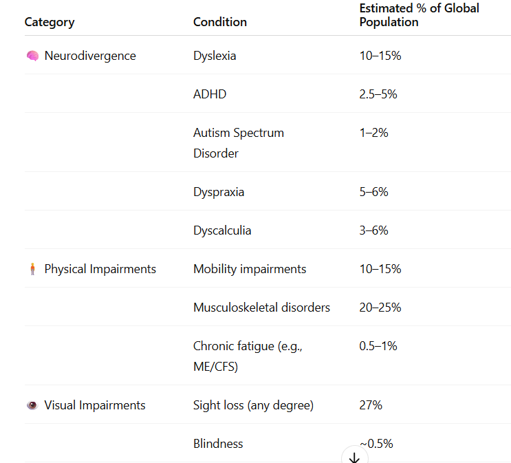
Next I started by trying to narrow down which impairments to include. In order to do this I asked ChatGPT what was the estimated % of those with different impairments. Seeing as the brief specified as many individuals as possible I thought focusing on impairments with a larger percentage would be a good place to start.
I then selected the impairments I wanted to focus on, what their difficulties interacting with Tableau may be and what design choices to implement to address these difficulties.
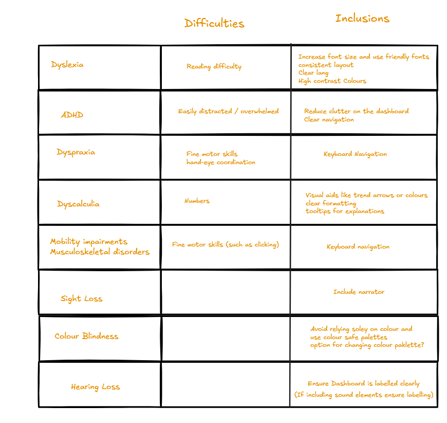
I did realise that this was still quite a lot of inclusions so in order to make it a bit more manageable I decided to not include keyboard navigation.
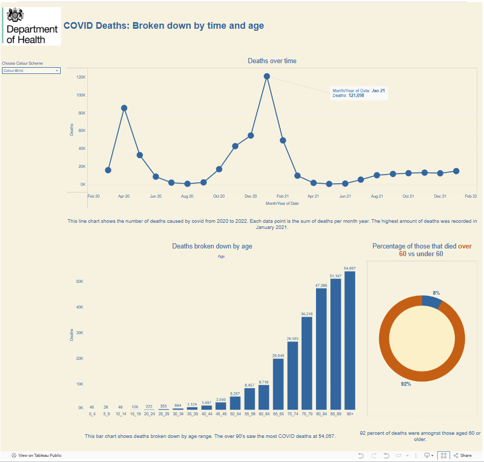
This was the dashboard design I decided on:
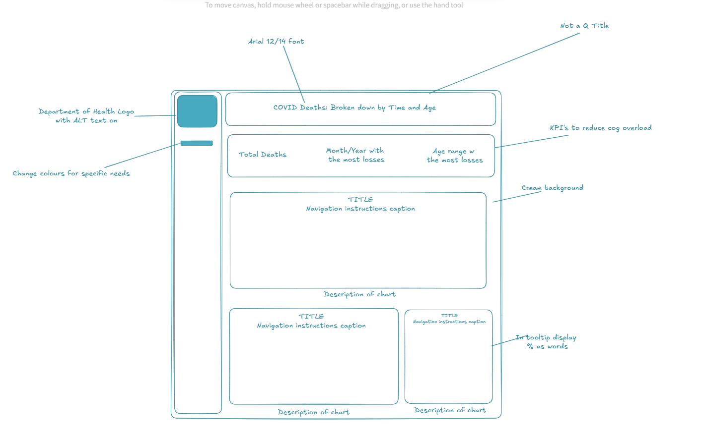
I tried to ensure that a screen reader could be used, that titles were clear and that colours were colour-blind and dyslexic friendly. In the tooltips I also planned to display numbers as words for those with dyscalculia.
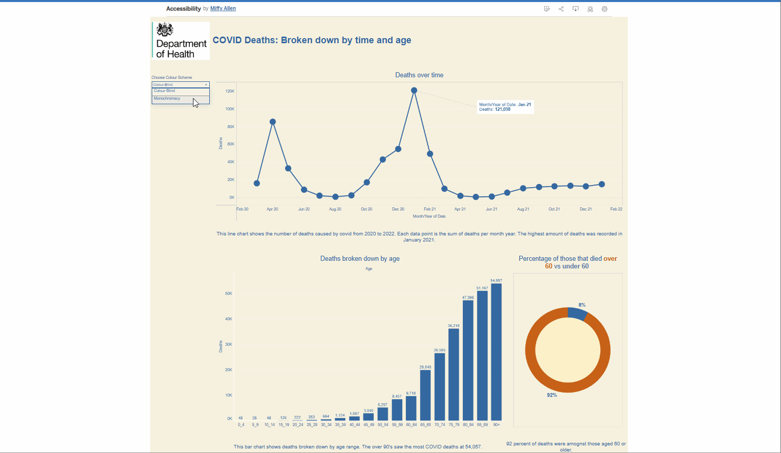
Although I managed my time much better this today, I was still a bit too ambitious with what I wanted to achieve. I didn’t manage to complete the KPI’s and I only included colour-blind friendly and monochromatic friendly options in the toggle option. I also only managed to complete one tooltip to be dyscalculia friendly. Another issue I encountered was spending too long trying to use a screen reader in desktop. Once I had published on tableau public the screen reader started to work but at that point a fair bit of time had been lost.
Future steps would be to implement all the ideas I had, neaten up the charts with whitespace and consistency of font size, and include a longer description of the chart embedded in the chart for those using a screen reader.