


Last day of dashboard week! Today we were tasked with downloading data from one- or many- of NASA’s free APIs and creating something in Tableau.
As per usual I created a plan:

Shoutout to Sandy Wlodarczyk for the best donut I’ve had in ages 😊
My skills in scoping the project had been honed over the last week and today it all came together as I kept to my plan very well.
After looking at the available APIs I decided to focus on the asteroid data. I wanted to create a dashboard that was visually quite pleasing and create an interesting chart in the mix.
Here is my sketch:

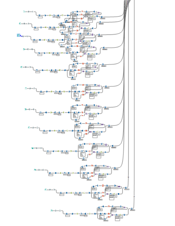
After creating my sketch I went into Alteryx to call on NASA’s asteroid API and get the data prepped how I needed for the spiral chart.
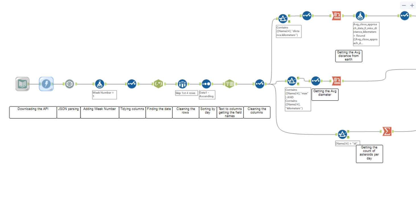
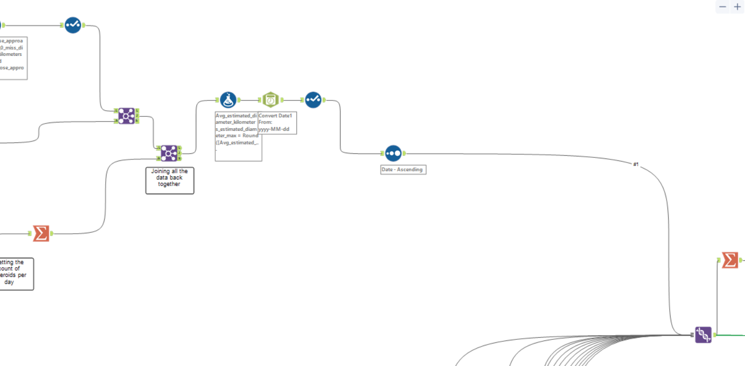
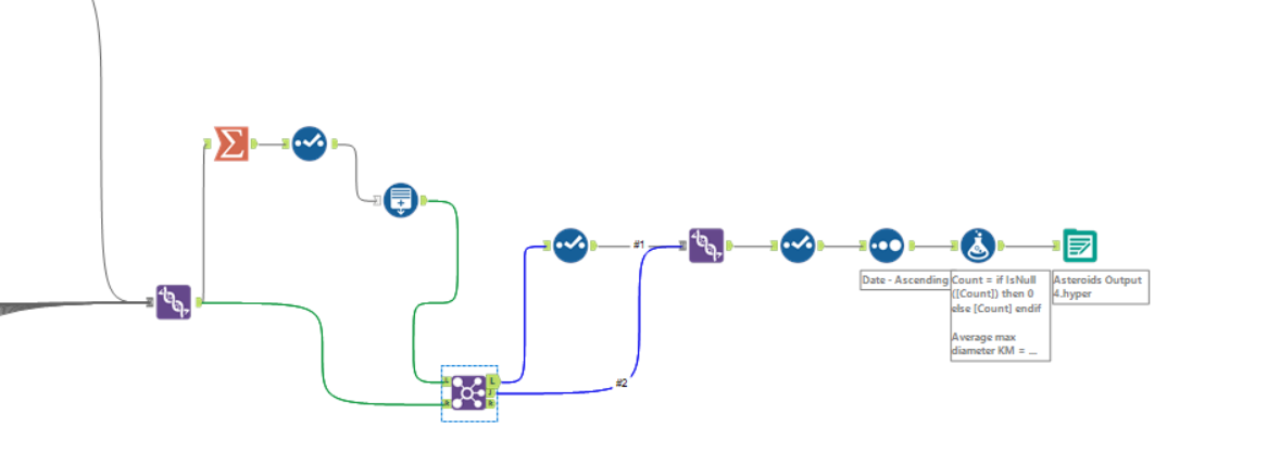
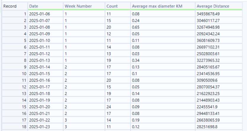
This flow gave me (for every day) the count of asteroids, the average max diameter and the average distance from the earth :
As the API only allowed a weeks’ worth of data to be pulled at a time I copy and pasted the flow above 12 times to get 12 weeks of data.
Whilst making the chart I decided to order them according to how close they were to earth and to make the dot coloured by count of asteroids and size by the average size of the asteroids (this made more visual sense to me). I also used Figma to design my background, utilising the gradient function and stars plug-in to emulate space:
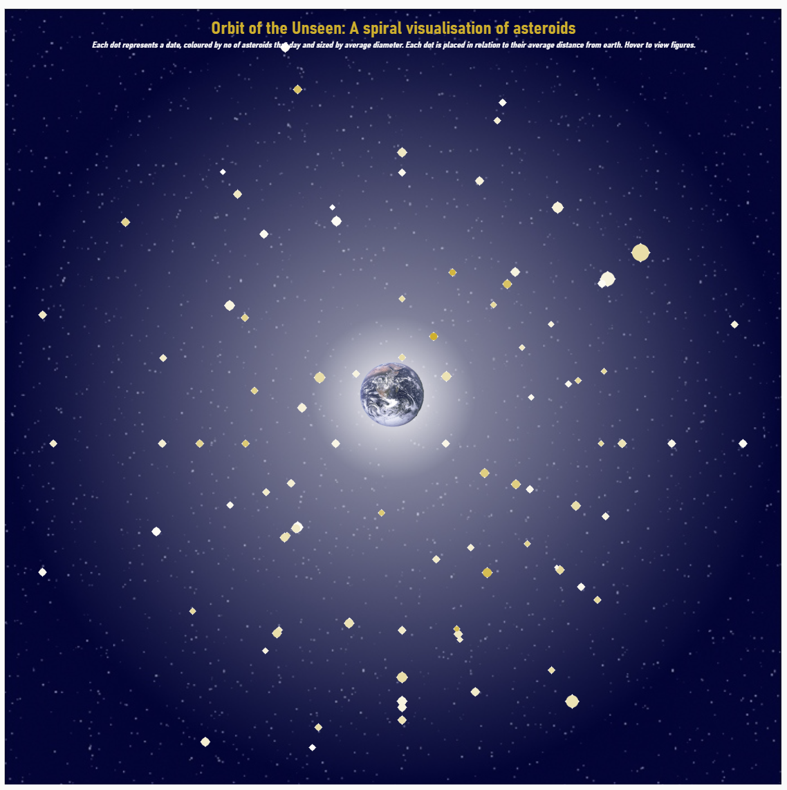
I feel quite proud of this chart but I’m also very glad this dashboard week is over!