


The primary goal of data visualization is to communicate insights accurately and efficiently. For professionals who rely on assistive technology, Alternative Text (Alt Text) ensures these insights remain accessible when a visualization cannot be seen.
Alt Text is a text-based description of visual content read aloud by screen readers or displayed when images fail to load. Under the Web Content Accessibility Guidelines (WCAG) Section 1.1.1 charts are considered complex images. As such, Alt Text must offer the same information and functionality as the visual itself. This presents a unique challenge in Tableau, where data changes dynamically based on filters and user actions.
While Tableau meets basic compliance through automatically generated Alt Text and the View Data pane, this is often insufficient for actually providing the user information about what the chart is intended to convey.
What Makes Alt Text for a Chart Effective?
Effective descriptions lead with the chart’s main insight, then outline interactive elements and layouts to aid keyboard navigation.
The WCAG provides this example for the image of a bar chart:
A bar chart compares how many widgets were sold in June, July, and August. The short label says, "Figure one - Sales in June, July and August." The longer description identifies the type of chart, provides a high-level summary of the data, trends and implications comparable to those available from the chart. Where possible and practical, the actual data is provided in a table.
Implementing this in Tableau is challenging as the Alternative Text field is static; it cannot use calculated fields to reflect changes to the view from filters or actions.
Therefore, the actual Alt Text element (customizable via Worksheet > Accessibility) should be the short label. Then the longer description can use Captions (Worksheet > Show Captions) or Titles built into each sheet. Unlike the Alt Text field, these areas can host dynamic parameters and calculated fields that update in real-time.
How Screen Readers Interpret Tableau Visualizations
While screen reader softwares vary in their navigation of Tableau, the standard reading sequence begins with the chart Title, followed by the Alt Text, and then the Caption, if the caption is present. From there, the user can interact with marks and tooltips via keyboard navigation, or open up the View Data pane (Shift + Enter) to view all the information as a table.
Note: If the caption is not shown on the dashboard, it will not be read by a screen reader. To create captions accessible via screen reader that are not visible to other users, the text must be made the same color as the background in 1pt font.
When deciding what to write, designers should consider the primary goal of the chart and the pre-attentive attributes (like color, size, or position) used to highlight key insights.
Example 1: Bar Chart
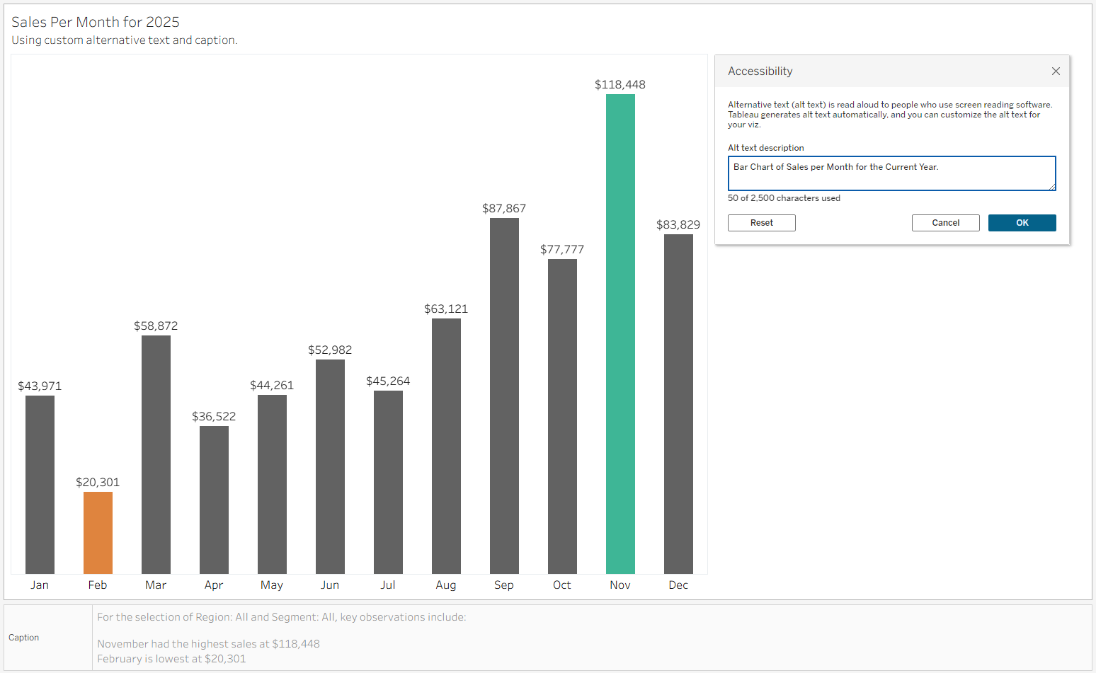
A bar chart is designed to show the highest and lowest sales during a specific year.
The Alt Text should summarize the visualizations structure (Bar Chart) and interactivity (None).
As a user viewing the chart can determine which months had the highest and lowest sales in the first 5 seconds of viewing, the caption should provide the same information.
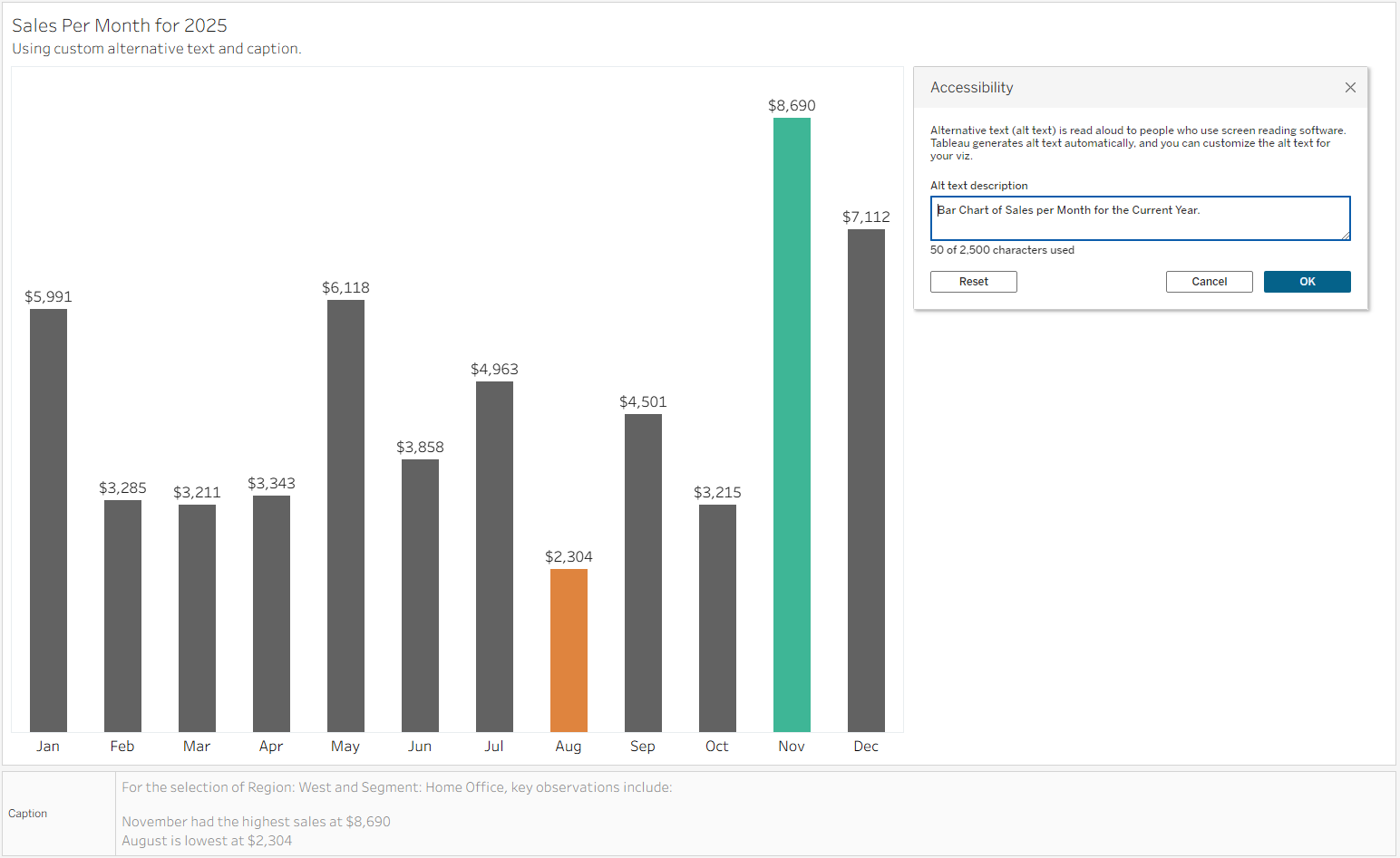
Creating calculated fields using the WINDOW_MIN and WINDOW_MAX functions provides descriptions that update with filters applied, ensuring that all users have access to the same high-level takeaways on their first pass of the dashboard.
The caption should also include what filters are applied to the data.
In this example, Highest Sales was calculated as:
WINDOW_MAX([Current Sales])Then the Month of Highest Sales was calculated as:
WINDOW_MAX(
   IF [Current Sales] = [Highest Sales] then
        min(DATENAME('month', [Order Date]))
   END
)
Lowest sales was calculated in a similar manner using the WINDOW_MIN.
Example 2: Min(0) Chart for KPIs and Text
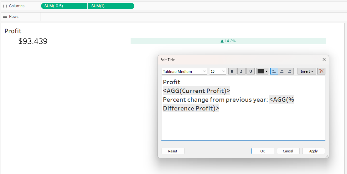
It is common to use MIN(0) and similar calculations in sheets to create KPI cards and text notes. In these situations, the information that is conveyed in the chart is not actually meant to be a chart.
Considering the sequence that a screen reader reads the elements of a chart, add the text represented in the mark in the title using size 1pt font the same color as the background. This will be read before the Alt Text, allowing the user to get the insight quickly.
In this situation, Alt Text is redundant, but could be written as “Profit and Percent Change in Profit versus Previous year”.
Try it yourself
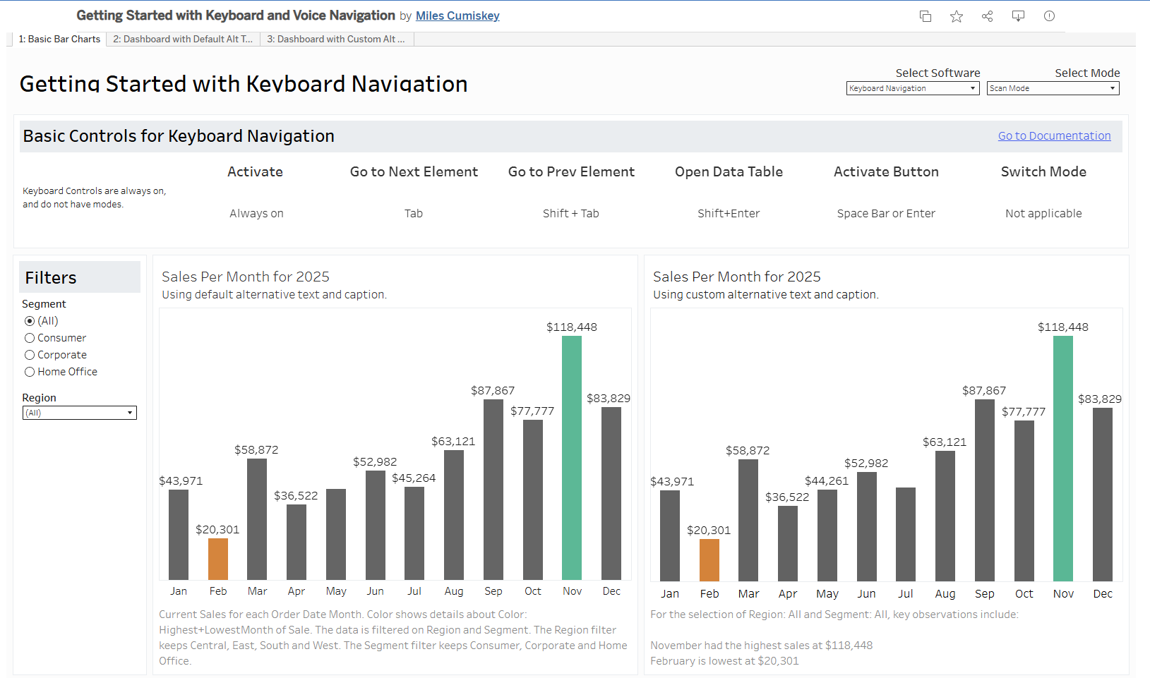
Recently, I created a project for teaching others the basics of navigating a dashboard with keyboard navigation and screen readers.
This dashboard provides a quick reference for individuals using screen readers for the first time, and contains three worksheets: an initial page reviewing how to navigate using a screen reader, then a dashboard using only tableau defaults, and a variation of that dashboard with custom Alt Text.
This project is still a work in progress, so I’m actively looking for feedback and ideas for future revisions. If something stands out to you, please let me know via LinkedIn.
Best Practices for Screen Reader Accessible Dashboards
When designing for accessibility, make the dashboard's main takeaways clear and provide predictable path for navigating interactive elements.
When possible, group interactive controls (such as filters and parameters) together in one section. This allows users to configure their data in one place and provides a singular location to verify which filters are currently being applied to the data.
When selecting filter types choose dropdowns or radio buttons over sliders, which can are notoriously difficult to navigate with keyboard controls.
While features like cross-filtering and brushing-and-linking are powerful for visual analysis, they are not commonly used outside of data visualization. As of Tableau version 2025.1, keyboard controls can be used to take action in visualizations, but it may not be intuitive. If the intent is for a user to click on a mark to filter another chart, clearly call out that interaction in the Alt Text. This could look like “Scatter Plot of Number of Orders and Total Sales, where each mark represents a unique client. A mark can be selected to filter the related table “Orders placed in 2025” to that client.”.
Limitations
Ideally, a dashboard should function like a well-structured website, utilizing a consistent Document Object Model (DOM) structure. This formatting allows screen reader users to gain a quick overview of the content and quickly navigate to what is relevant to them rather than tabbing through every individual element. In web design, this is achieved through HTML tags (specified with <H1> headers or <nav> links), and can be seen in a standard Wikipedia article.
Unfortunately, Tableau does not currently offer a way to easily customize this structure.
Authors are at the mercy of Tableau to determine the sequence in which a screen reader traverses the dashboard. While older versions of Tableau read elements in the order they were added to the canvas, modern versions have improved this by automatically reordering elements to read from top-to-bottom, left-to-right. However, this can still be unpredictable, leaving developers with limited control over the order of navigation.
Additional note
There is no one size fits all solution for accessibility.
A dashboard may have the world’s best alternative text for a blind or low-vision stakeholder, but that user prefers to use a large monitor and assistive technology for magnification when looking at Tableau Dashboards, the dashboard is not more accessible. That user may benefit more from a custom layout with larger text and improved contrast instead.
Therefore, it is important to customize the approach for your audience.
References and Further Reading
- WCAG 2.1 Guidelines
- WCAG 2.1 Understanding Non-Text Content
- Tableau: Navigate Visualizations with Assistive Technology
- Tableau: Azimuth Research Paper
- MIT: User-experience design for accessing data visualizations
- NN/g: Alt Text usability (has a particularly great example of Alt Text for a map!)