


With the ability to generate a points with our custom image, the last step is to connect the X and Y data to the data we wish to visualize.
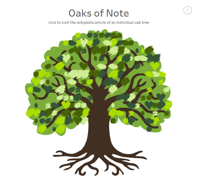
As a reminder, this is the final vis:
Using Python makes this process very easy.
import pandas as pd
oaks = pd.read_csv(r"data\NeatTrees.csv", encoding="latin-1")
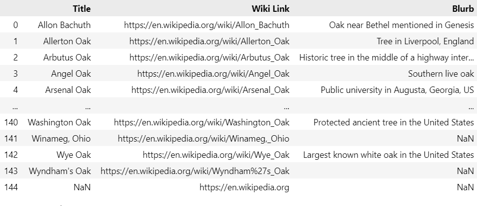
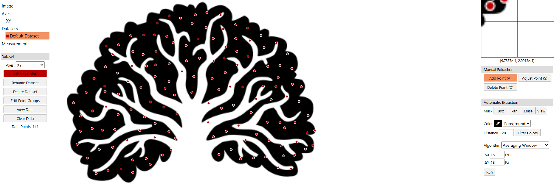
This is a collection of wikipedia pages for notable oak trees, and since there are 144 records, there are not a ton of points to work with for the vis.
image_path = r"images\canopy_variation.png"
points_df = image_to_equally_spaced_points(image_path, num_points=144, max_attempts=32)
plot_points(points_df, 10)
points_df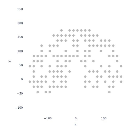
In situations like this, I personally prefer the grid spacing method.
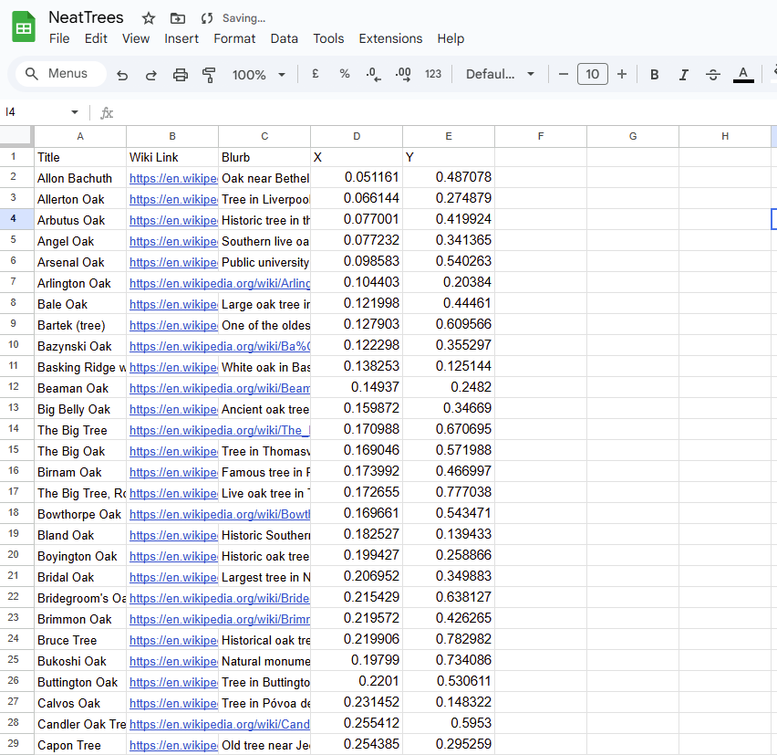
To append the data to our points, we will append them together via index. Since we already generated the exact number of points we need, we can simply use join to append our X and Y onto the oak DataFrame.
final_df = oaks.join(points_df)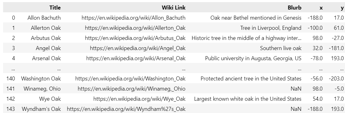
Then export as a .csv for use in Tableau.
In Automeris, I used the following settings:
Then had to manually add points to get up to 144.
Without using Python, the easiest way to append your Automeris points is via excel or google sheets by copying the X and Y coordinates from your export and pasting them next to your dataset.
If your Automeris export has more points than your original dataset, you may end up with a portion of your image missing!
With either CSV ready, setting up the Vis in Tableau is easy.
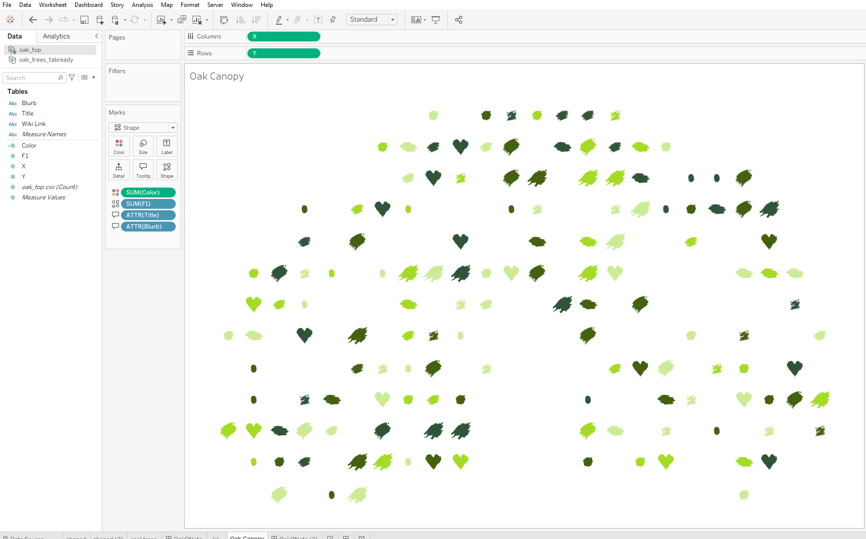
It is a scatter plot! I've added a calculated field of Random() in order to assign some fun shapes and random colors.
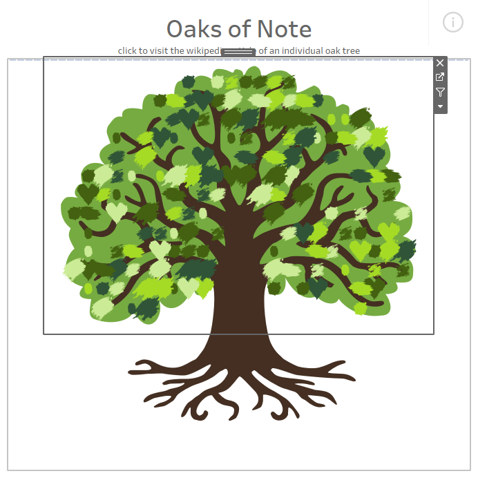
The scatter plot is then layered on top of my tree image as a floating container!