


Before I jump into today’s dashboard project, let me give a quick, day 2, status update:
Most of my challenges for this project came in the form of making a decision. Deciding on data, the kind of analysis, the kind of style/design the dashboard will have, etc. I will take you along the mini-journey I have had in making this week’s dashboard
The challenge
Take either the beer or wine data and visualise it. Since it was implied the beer data set would be calling an API I made sure to take wine so more people had the opportunity to try APIs (unfortunately the “beer team” had issues calling the API in the end).
Deciding on a data set
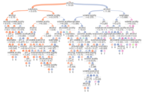
Initially, Andy provided a wine data set which was fairly interesting. The problem was that I wanted to do a different kind of analysis from what data was being provided. I searched around on kaggle until I found a data set on the quality of red wine alongside other chemical indicators, i.e. alcohol, acidity, density, etc. At first, I wanted to try and perform some sort of statistical analysis and get some sort of insight, I ran various predictive models but then realised since I had no data about what the wine was that it was not very interesting for forecasting. Still, Alteryx returns rather impressive diagrams of its logic in making decisions.
I returned to a tool I had used to identify my variables for regression: correlation matrix. The methodology for interpreting and using the matrix is to look for the highest absolute values to identify significant variables, then check that those variables do not correlate much with each other. In this process, I eliminated the variables down to a handful but then removed a further 2 (other acidity types) by checking for correlation amongst the explanatory variables.
Deciding on an idea
It took most of my time to settle on doing an explanatory variables analysis and a bit more time to settle on simply using a histogram and means as the method to visualise this. This was such a simple idea and simple to execute that the entire rest of my time was dedicated to formatting and researching the measures.
Design struggles
Last week I had to struggle with the pains of floating everything, this week I got a bit stuck in container hell. I also had the reoccurring issue around colour. My final colour choices took so long to finally arrive at. I tried a variety of putrid browns, horrific purples and bright yellows from vineyard pictures. I really struggled until I went with a red/white colour scheme (this was to change one final time). At this point it looked a little like this:

Feedback from Andy that the white might imply white wine re-enforced my fear about using white and eventually I settled on a toned down version of the main red. The dashboard then ends up being entirely monotone besides some of the text.
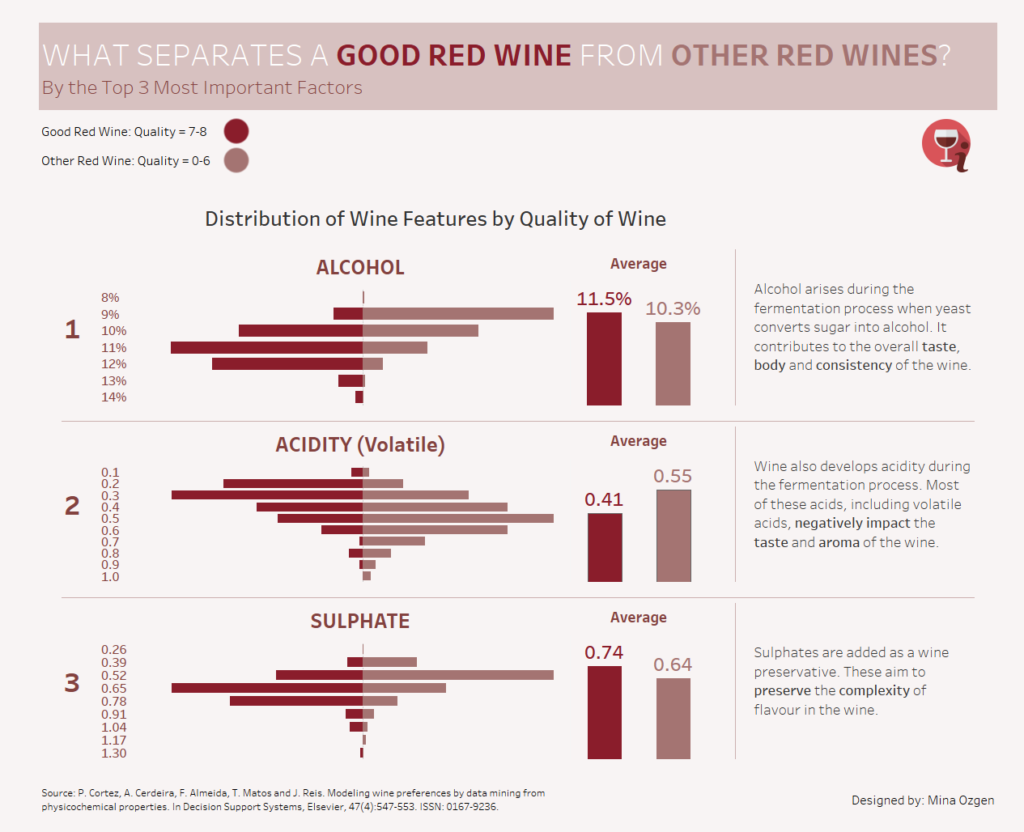
My final touches (besides more formatting) were to add some flavour text alongside each factor after asking colleague and sommelier Simona Loffredo (and researching online) since I knew almost nothing about the importance of these factors with regards to wine. I also added some methodological background into the information button at the top so that there was a more comprehensive understanding of the significance of those 3 factors and the quality measure.
Final thoughts
I feel a lot more content with how this turned out as a piece compared to my first dashboard. The only things I would still want to tinker with would be entirely cosmetic, the design, in order to make some things pop and work better.
Wine Dashboard: https://public.tableau.com/views/WhatDistinguishesaGoodRedWine/winehistodash