


Dashboard Week Wrap-up
Final day of dashboard week! Of all the weeks in data school so far this has been the one which I am saddest to see the end of. It has been an amazing experience, I loved every second of it because I felt challenged and I felt I learned so much. It really makes you feel like you can be efficient and productive yet still be imaginative and creative. It really is great to see how much you have improved at the dataschool by engaging in these challenges and delivering dashboard after dashboard of different topics.
Now without further ado, on to the final day of dashboard week.
The Challenge
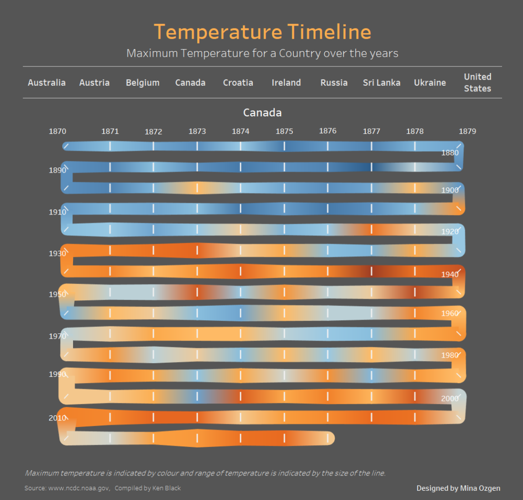
On our final day of dashboard week we were given large historical global records of temperature via an Exasol data connection. This meant that there were no data cleansing requirements in order to make this day’s visualisation. However, we still had a large time constraint since we had to present at 3 pm (and once you take out lunch time, morning presentations and other miscellaneous interruptions we had 4-5 hours. So there was room to go crazy but not too crazy. I think almost everyone tried to go crazy. Some went down the path of looking at global warming and its impact on certain regions to tell a story, Jamie tried out to recreate a crazy chart type. As for me, I tried to create a visualisation I had not seen in Tableau before, a winding timeline.
Once I had this clear image in my head it took me no more than 40 mins to get the visualisation complete. I had to make a few calculations and adjustments in order to hack my way to victory but in the end, I achieved what I set out to make.
Stay tuned in the future for a blog post on how I built this timeline chart.
Temperature Timeline: https://public.tableau.com/views/TemperatureTimeline/TemperatureTimeline